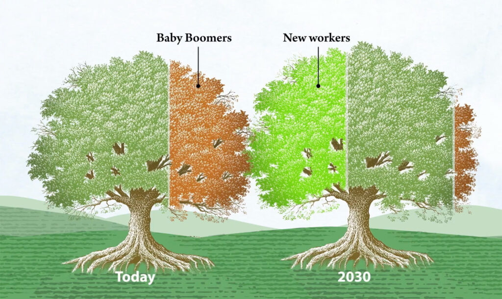
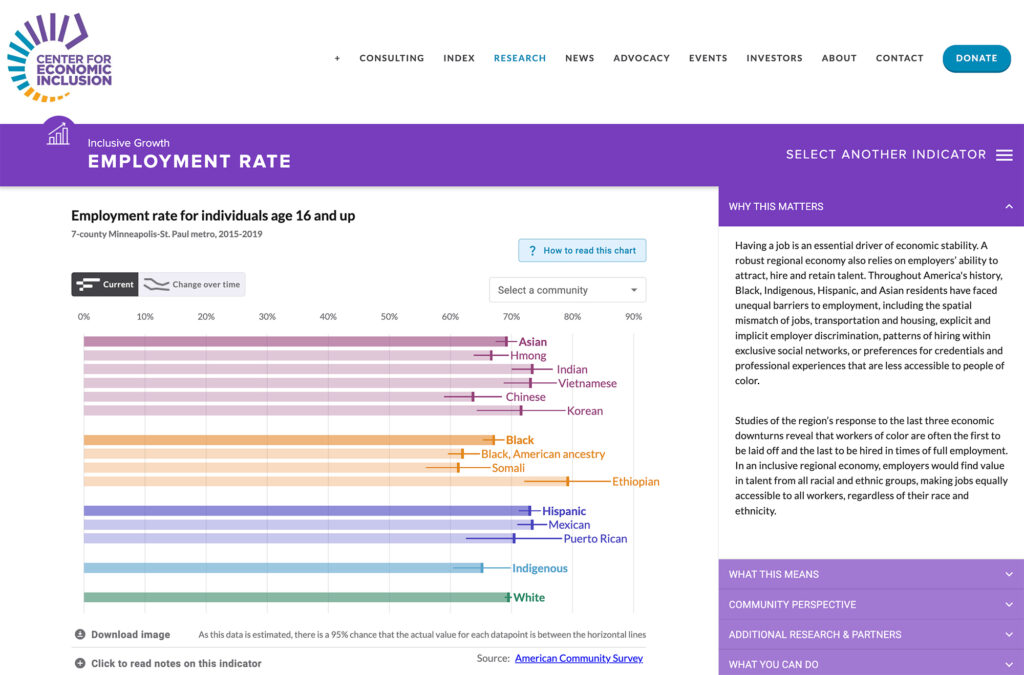
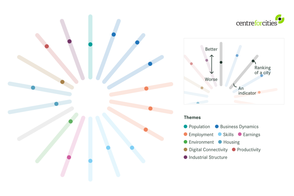
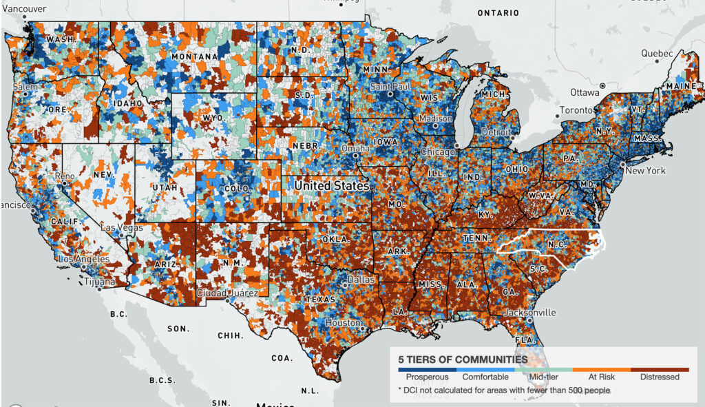
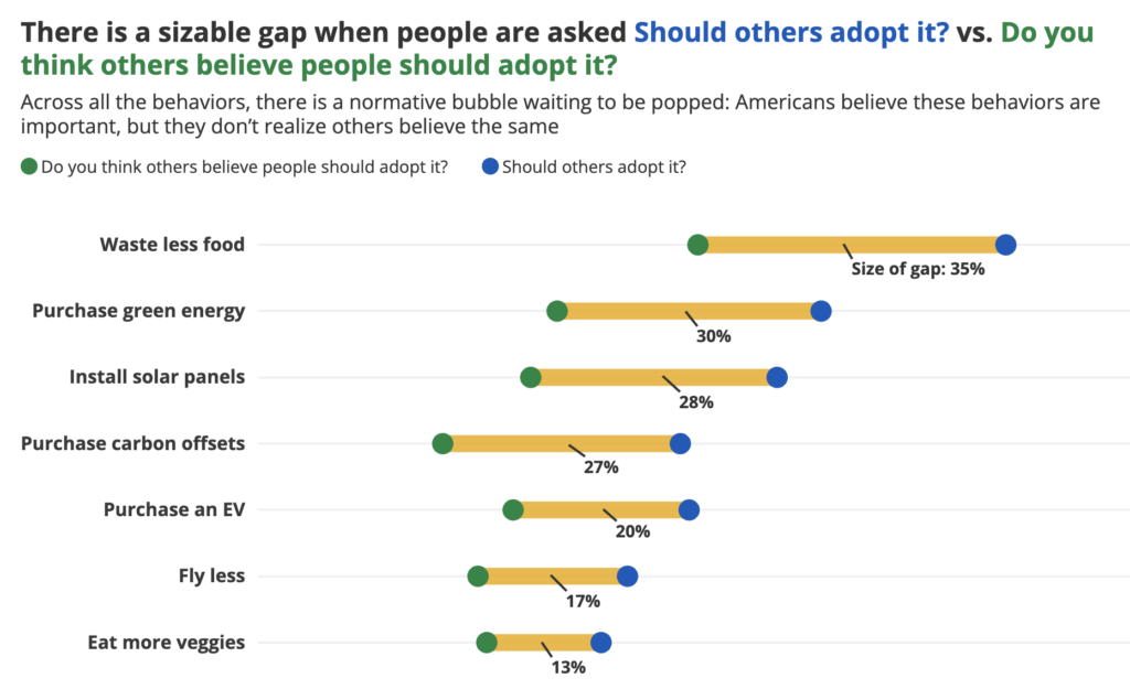
Visualize Economic Justice
Economics drives a large part of the justice movement – but telling that story in a clear, accessible, and actionable way takes some work. That’s where Graphicacy stepped in, helping organizations like the Economic Innovation Group Center for American Progress, and the Centre for Cities tell their important and nuanced economic stories through data.
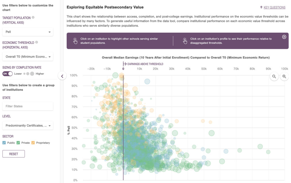
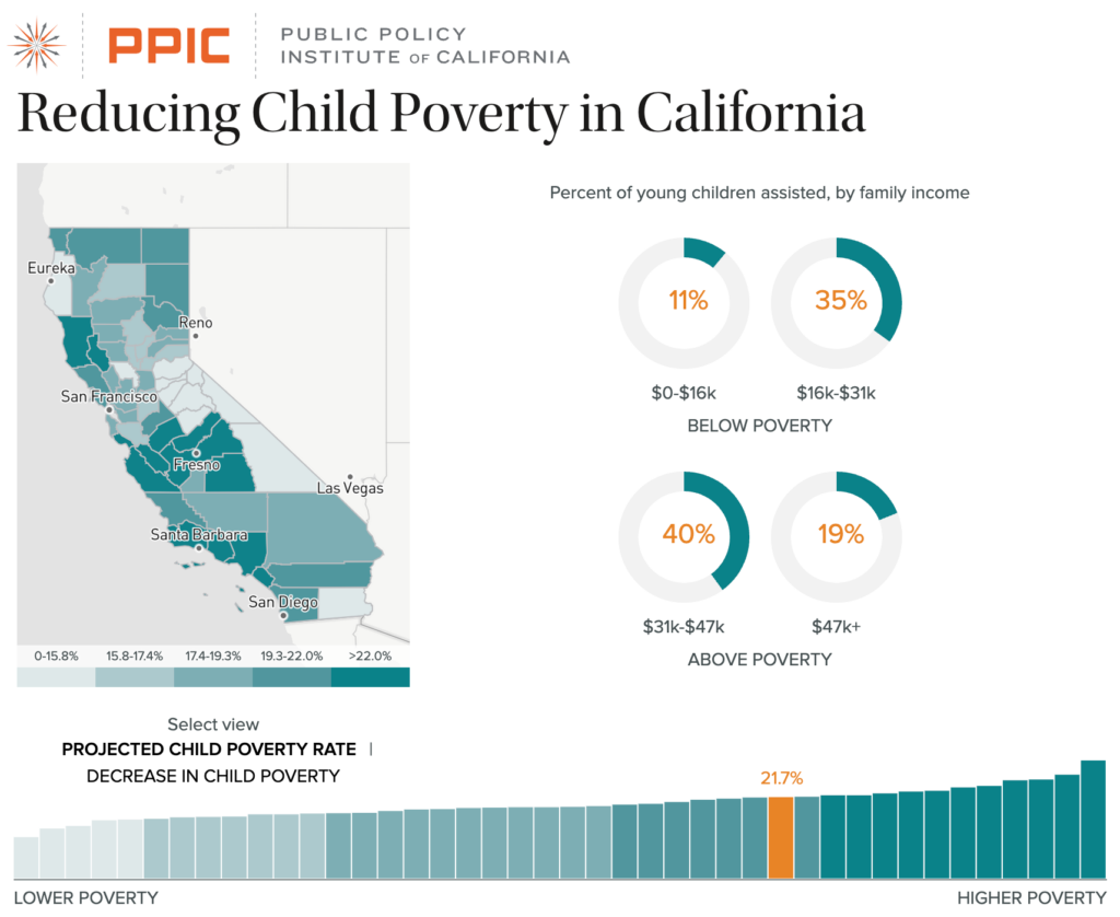
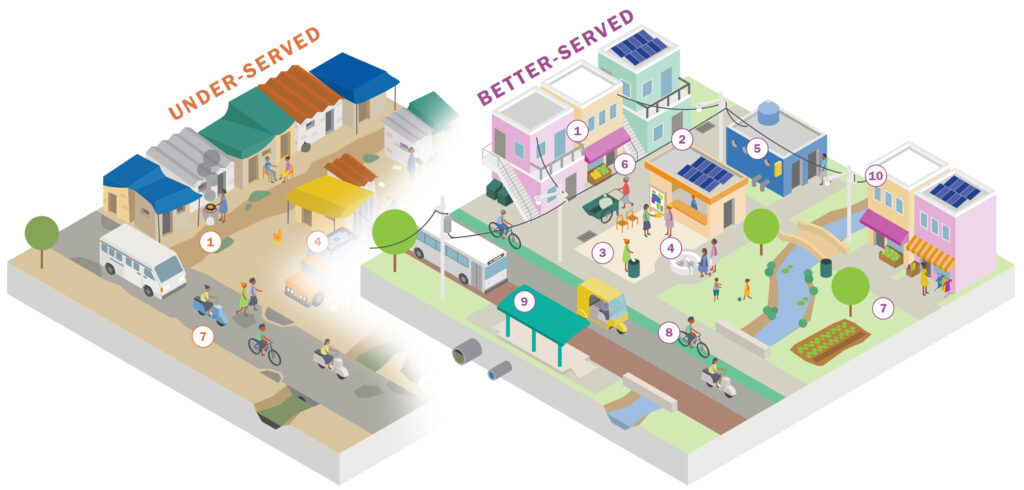
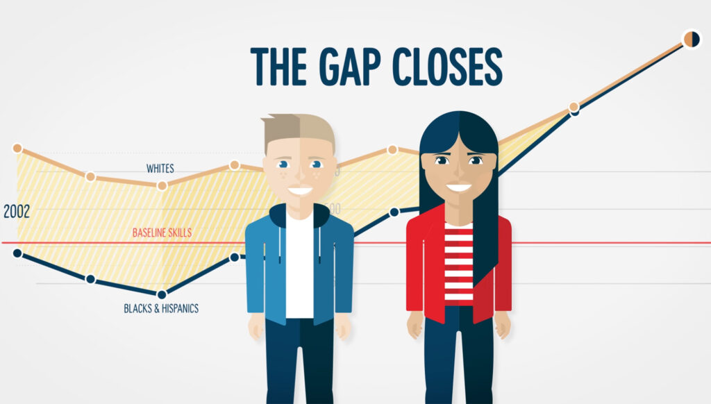
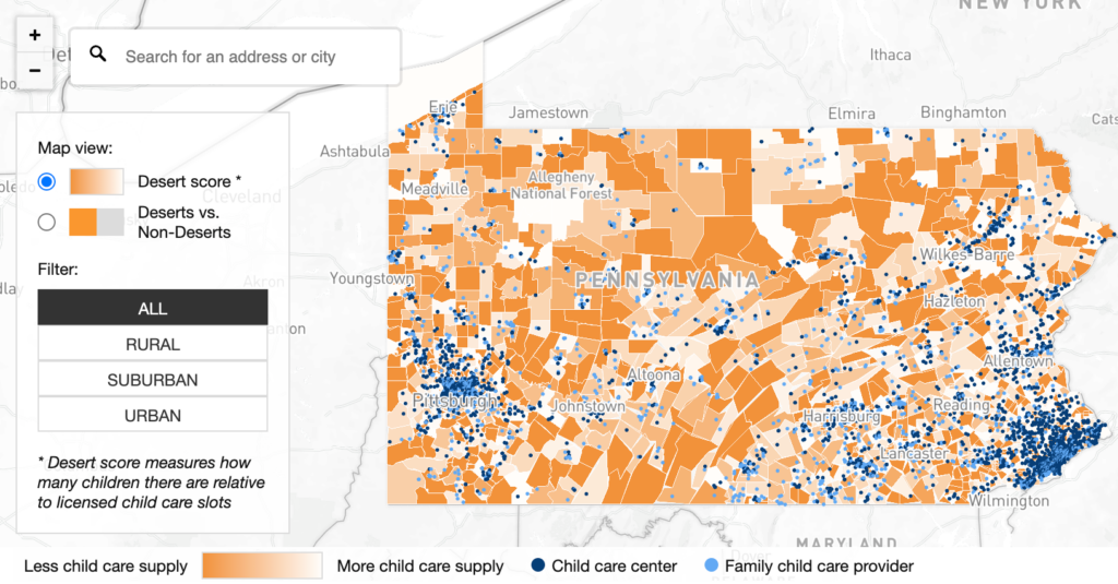
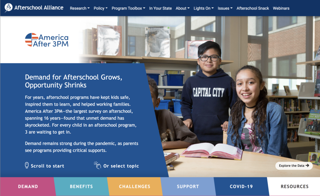
Visualize a New Path Forward in Education
Graphicacy helps elevate issues in education, provoking important conversations and highlighting critical insights. Higher education institutions and non-profit organizations alike turn to our team to help them tell their stories through data.
Headline for Economic Work by Graphicacy
Visualize
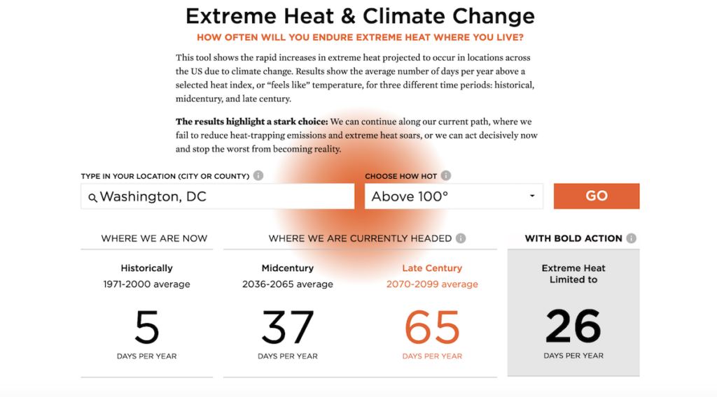
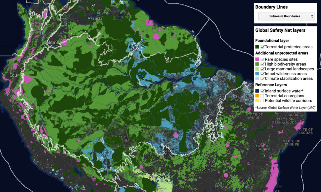
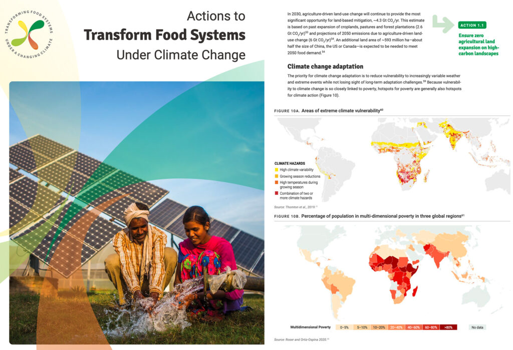
a Sustainable Climate Future
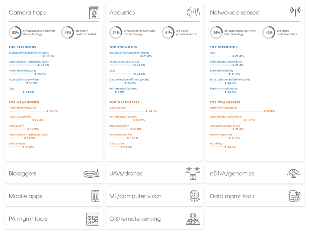
With threats to our planet mounting, telling the story of climate change and its effects on the environment is critical to our collective future. See how Graphicacy helped impact-driven organizations use their data to visualize a more sustainable future.
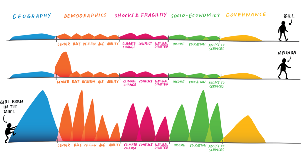
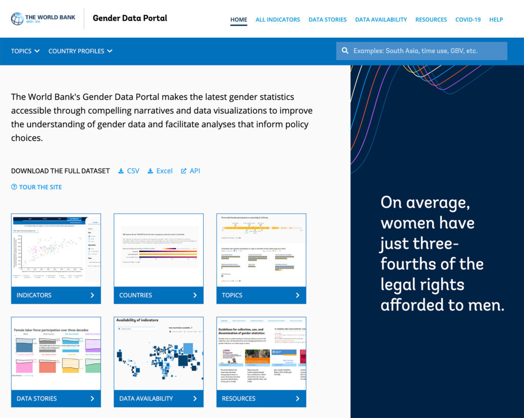
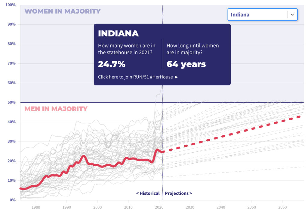
Visualize an Equal Playing Field
Data is key in revealing the reality of gender equality – or lack thereof – around the world. By allowing Graphicacy to make that data accessible, flexible, and even beautiful, activists and policymakers alike can effectively tell this critical story and make a case for change.
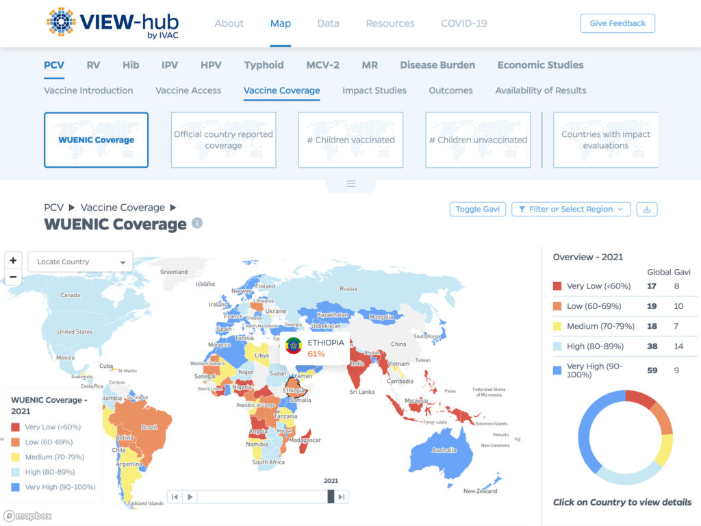
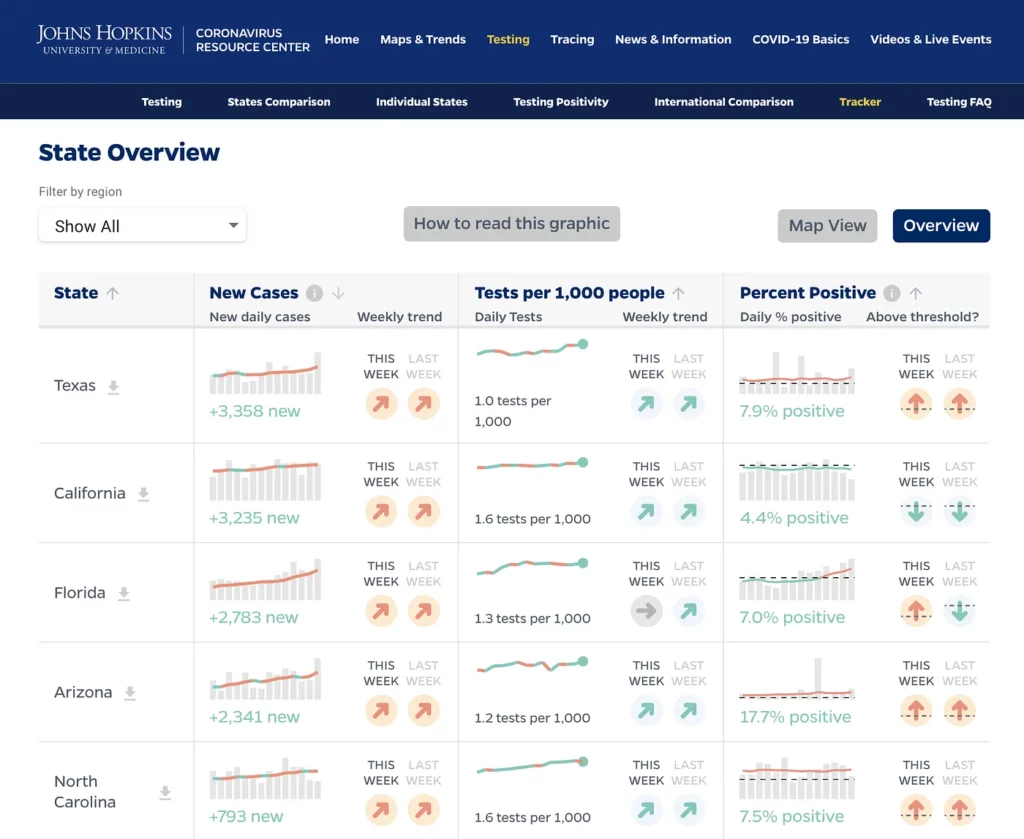
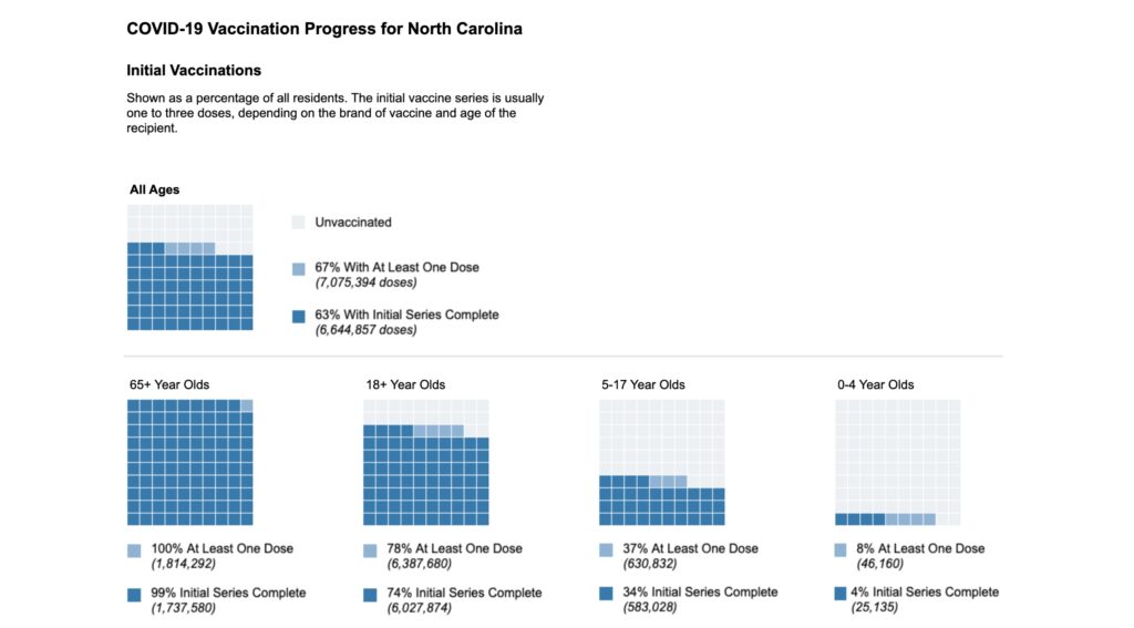
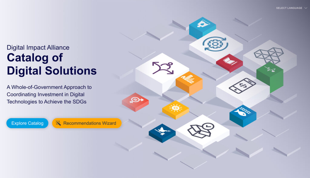
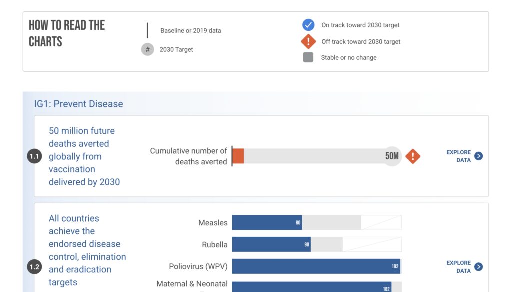
Visualize Accessible & Resilient Global and Public Health
Global and public health has never been a greater concern. That’s why organizations like Johns Hopkins, the Cystic Fibrosis Foundation and PATH came to Graphicacy to help them visualize the challenges – and their solutions. Explore our work and see how we helped visualize a healthier future.
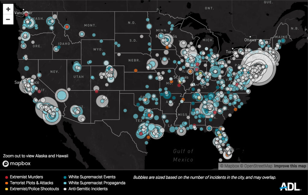
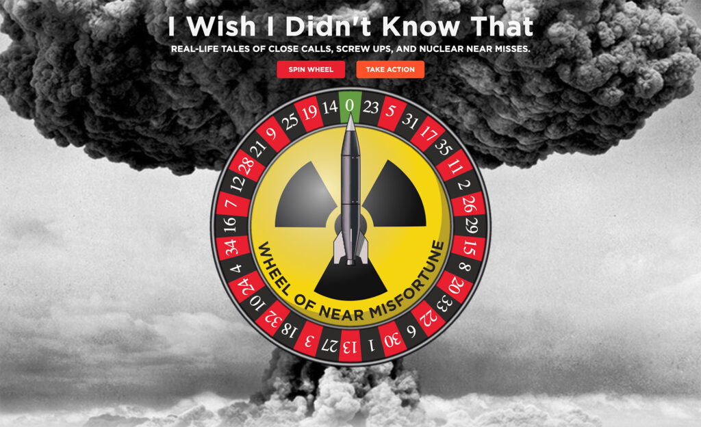
Visualize a Just World
Exposing human rights abuses is critical to ending them – and data is a powerful way to share the scale and impact of these abuses around the world. Explore Graphicacy’s work to help organizations protect human rights.
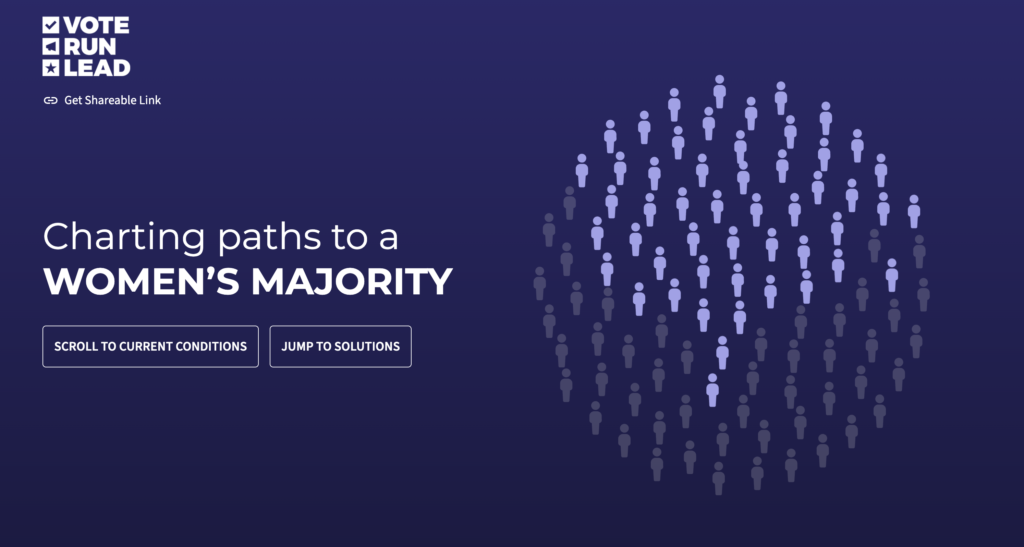
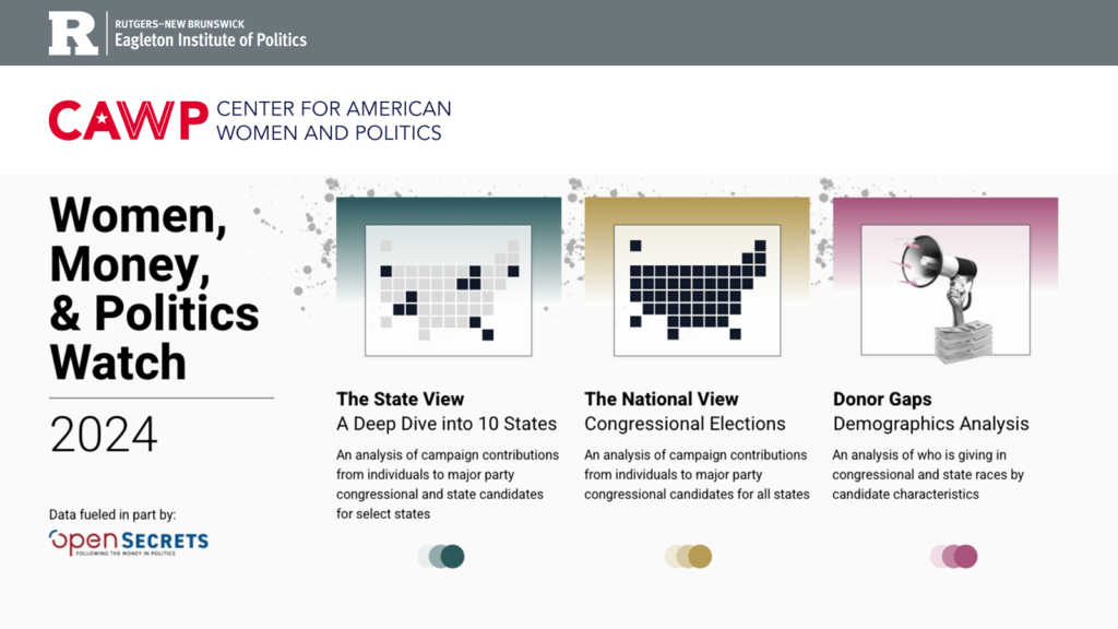
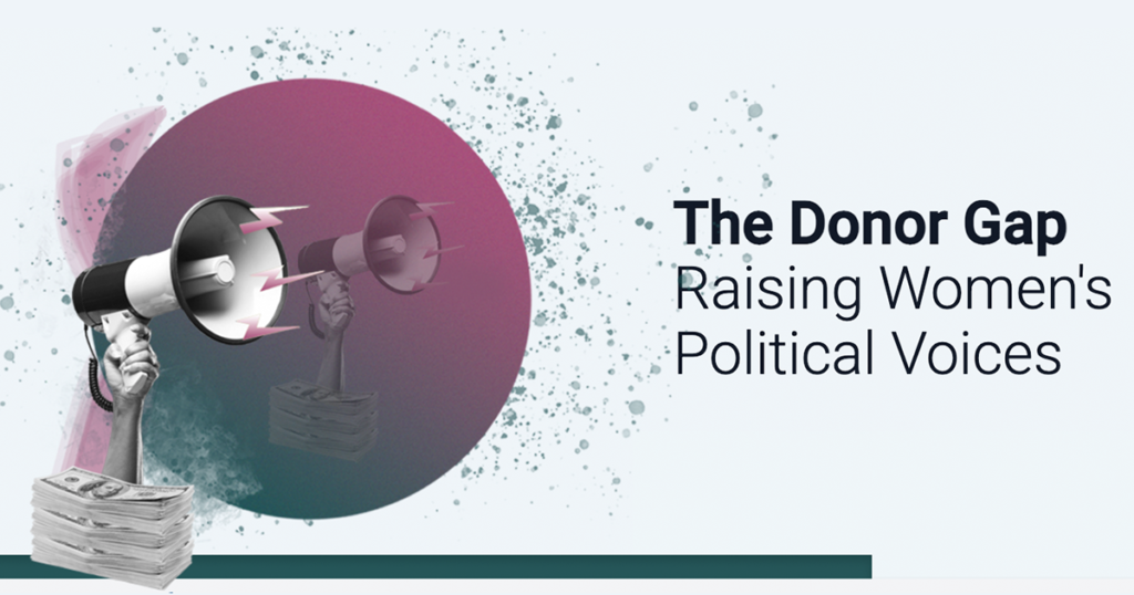
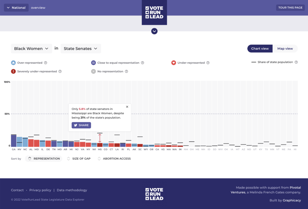
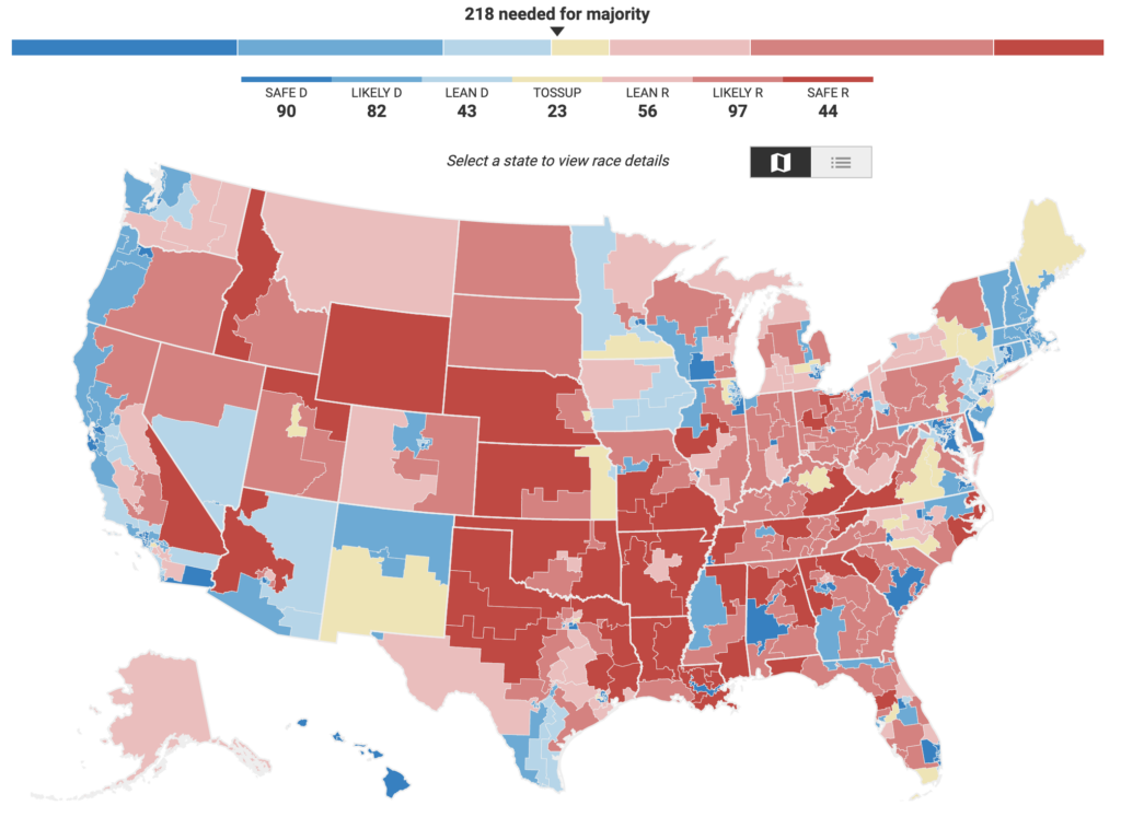
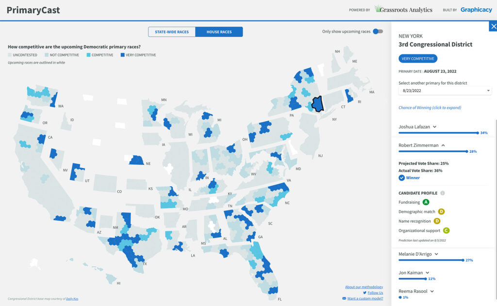
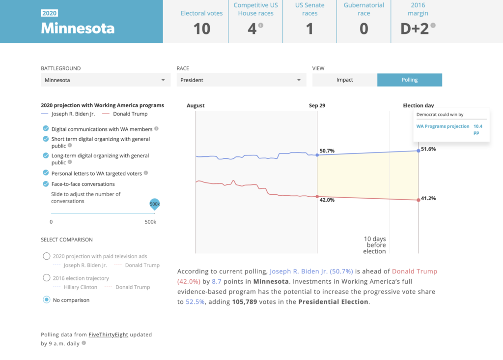
Visualize Democracy
Data is at the heart of politics and government. It shapes movements, drives campaigns, and informs policy. Graphicacy transforms wonky data into meaningful insights and cold facts into stories that warm the heart.
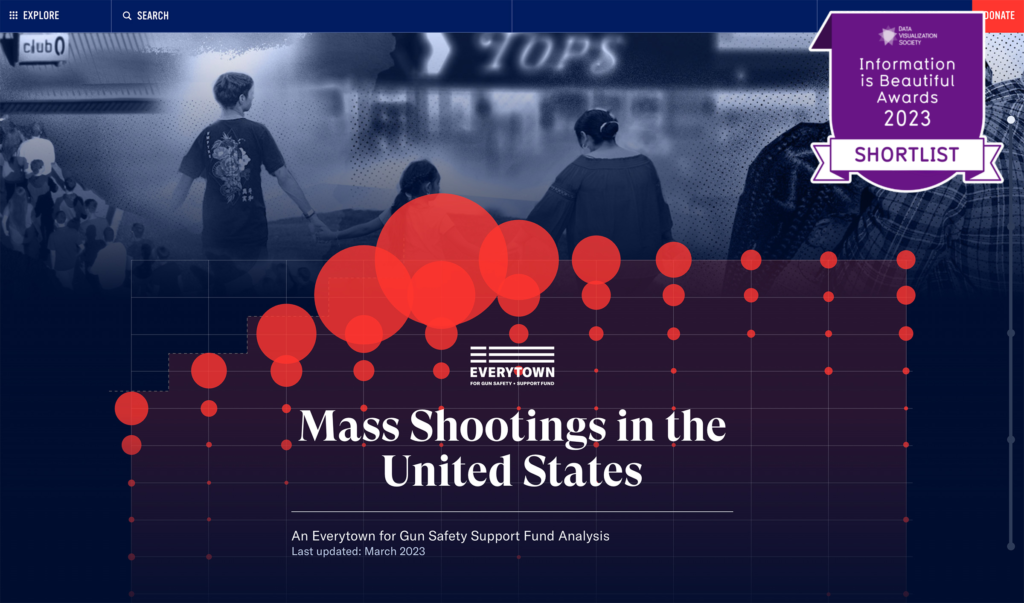
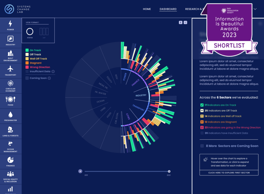
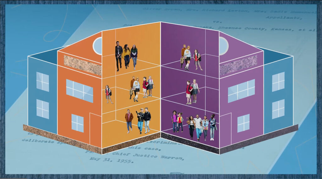
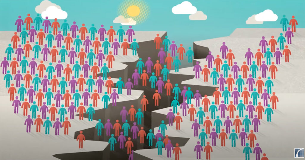
Visualize Racial Equity
Graphicacy is proud to help organizations fighting for racial justice convey the reality of this systemic problem and inspire action to make change through informative, inspiring, data-driven visuals. Telling stories can move hearts and minds – and we’re here to help.
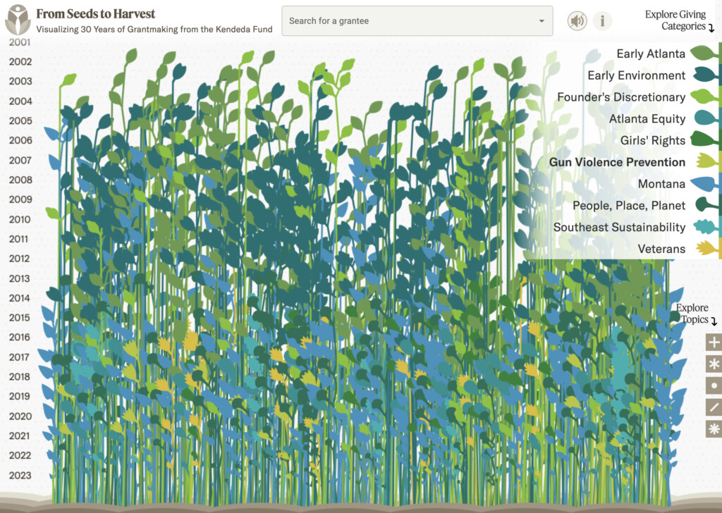
Visualize a Better World
Mission-driven organizations have trusted Graphicacy to help them visualize a better world for more than a decade. Explore our portfolio of work to see how we brought powerful data to life through beautiful design.
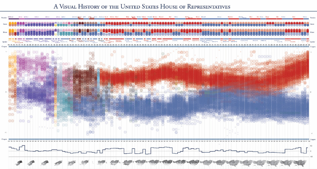
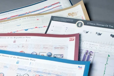
Timeplots: Data Fit for Framing
Timeplots are carefully crafted, large format posters that provide a clear, comprehensive perspective of subjects, like the American Presidency, the US Supreme Court, Congress, and both major political parties. Every time you look at one of our Timeplots posters, you’ll see a new pattern and learn new information. Explore them now!
Let's Work Together
Let’s chat about your data and the story it can tell.