While a useful tool for evaluating schools’ return on educational investment, the EVE has even greater potential to point high-level decision makers at federal, state, and institutional levels to where they can close gaps and improve postsecondary outcomes for all student populations.
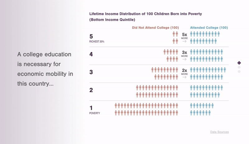
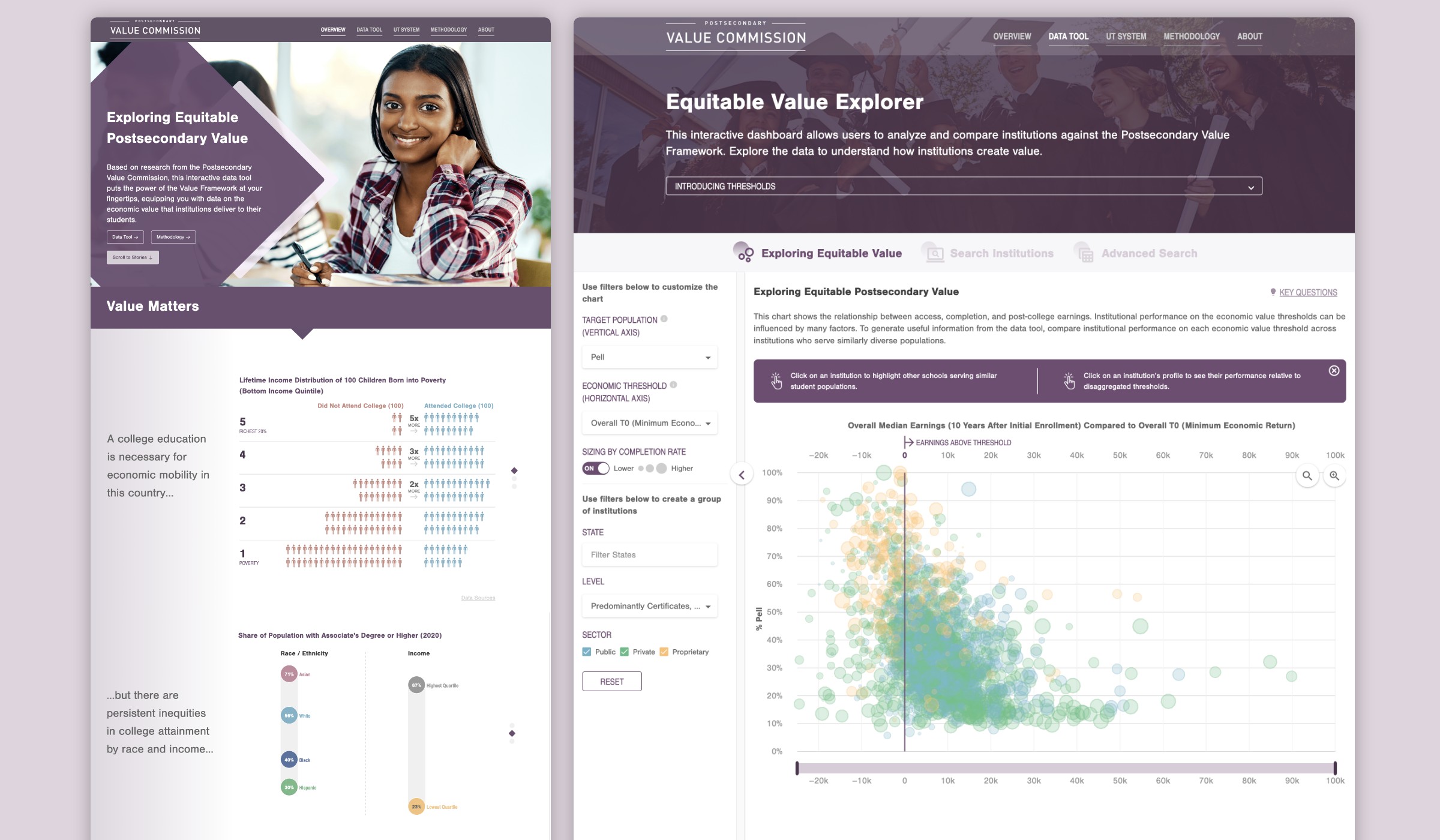
Scrollytelling: While not part of the project’s original scope, Graphicacy advocated to include a single snapshot that set the stage for the Explorer’s large amount of data. The snapshot came to life as a “scrollytelling” overview page that weaves the explorer’s data into a single, easy-to-follow story designed by Graphicacy and built by Graphicacy’s partner, 3 is a pattern. The intuitive platform allows everyone from everyday users to policymakers to make sense of the narrative behind the numbers.
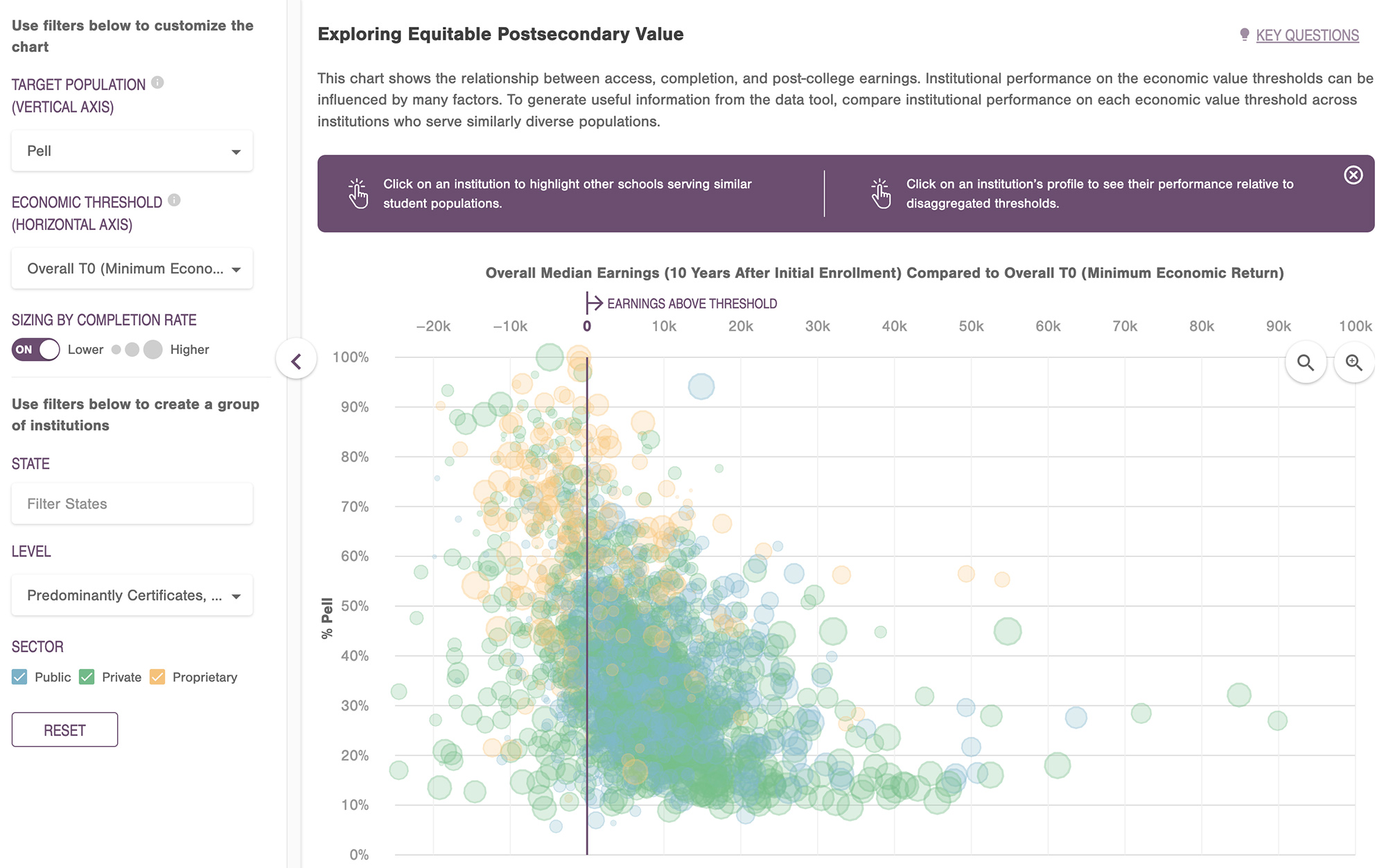
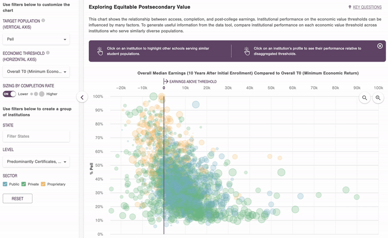
Data Explorer: The Explorer itself features multiple components that, together, create a multidimensional picture of American higher education:
- An interactive bubble chart allows users to glean information about a range of institutions by simply hovering their cursor over a scatterplot. Users can also zoom in to view the information in more detail.
- Filters allow users to customize their findings by target population (income, gender, and race/ethnicity) and economic threshold. Additional filters group data by state, level of education, and sector.
- Individual institution pages provide an overview of each university, offering data related to performance on the value thresholds, enrollment, admission rates, completion rates, cumulative net price and, most significantly, the overall median earnings of students 10 years after initial enrollment.
While the EVE provides numerous avenues for how to effect change, the Explorer’s best use — and the one IHEP intended — is to assist research and drive improvement towards equity in higher education. Most importantly, the EVE serves as a powerful model for how organizations can transform publicly available data into a tool for change.