Catalog of Digital Solutions

Digital Impact Alliance - UN Foundation / 2021 / Politics & Government

Hero image for the DIAL Digital Catalog of Solutions, designed by Graphicacy as part of an overall site redesign process

Overview

Graphicacy worked with the United Nations Foundation’s Digital Impact Alliance (DIAL), to do a top-to-bottom visual refresh of their Catalog of Digital Solutions. DIAL is a global leader in improving access to digital resources in the global development space, and the Catalog is central to that mission. We helped rethink and reimagine the design and functionality of the catalog, improving the experience for DIAL’s users.

Background & Challenge

The DIAL Catalog of Digital Solutions is a collaborative platform that aids users in the discovery and evaluation of digital technologies. The core of the Catalog is a card-based exploratory interface, where the user can search and browse examples of digital solutions. Previously, the Catalog had no landing page, and dropped the user directly into the card sort view. We designed a new landing page, including new hero artwork, which served as a short introduction for first-time visitors.

Once users are in the catalog itself, a set of tabs runs across the top of the cards, separating out solutions into broad categories (Projects, Products, etc.). The old interface also had a sidebar with a set of filtering options, also split out by those same categories. This created a confusing navigation structure for the users, as it was unclear if they should interact with the tabs across the top, or the sidebar, to switch between categories. Furthermore, the filters in the sidebar were visible at all times, regardless of which category was currently being displayed, which could result in confusing moments, where the user is applying filters, and seeing no change in which cards are being shown.

Opportunity & Solution

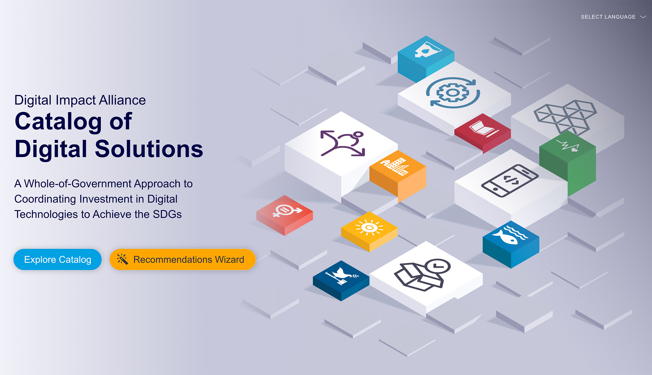
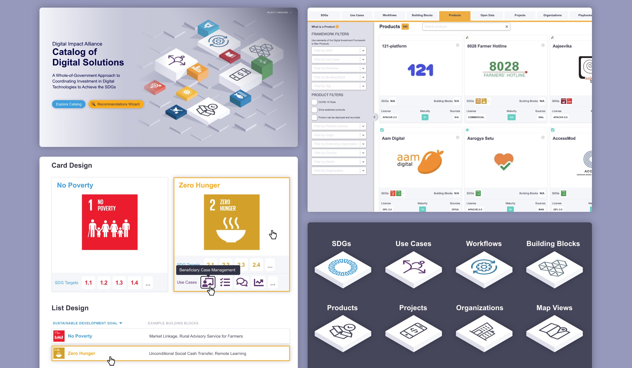
As part of our redesign, we created a new hero image, which introduces the new design language, colors, and icon system we created for the Catalog. It also includes icons from the Sustainable Development Goals, conceptually tying the solutions presented within the catalog to the SDGs. From there, the user can either dive right into the catalog, or use a new Recommendations Wizard to get a curated set of results.

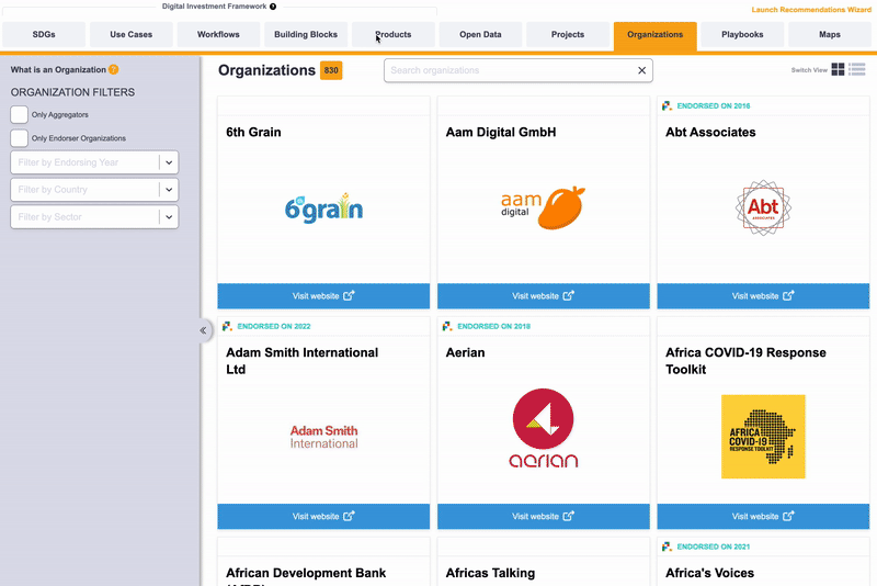
Within the Catalog,we recommended simplifying and collapsing the navigation and filtering into one area. We proposed removing the sidebar entirely, and collapsing filters into a drawer underneath the top navigation. When opened, the filters were now contextual, so the user sees only those filters that are immediately relevant. We also proposed a new list view, as an alternate display to the main card view. This would allow return visitors to move through the catalog more quickly, and find a specific solution.

The cards themselves contain a wealth of information. They provide an overview of the Solution, include cross-links to other solutions, and display badges for endorsed or highlighted solutions. We came up with a new system for the various card designs, cleaning up and streamlining their look, making the Solution titles easier to read, and the cards more inviting to click on. We implemented a number of other small design improvements throughout, helping to streamline the entire experience for the end user, making the catalog easy to explore.

A montage of views for the UX refresh done by Graphicacy for DIAL

Interested in working on a project like this?