2018 Political Atlas

Ipsos / 2018 / Politics & Government

Congressional District map showing potential winners in the 2018 primary election cycle, designed by Graphicacy for IPSOS

Overview

Graphicacy partnered with Ipsos, a multinational market research and consulting firm, to design an interactive dashboard in advance of the 2018 U.S. midterm elections. The site combines polling data, the University of Virginia’s Sabato’s Crystal Ball ratings, and cutting edge social media data to give users a holistic view of every House, Senate, and gubernatorial race.

Background and Challenge

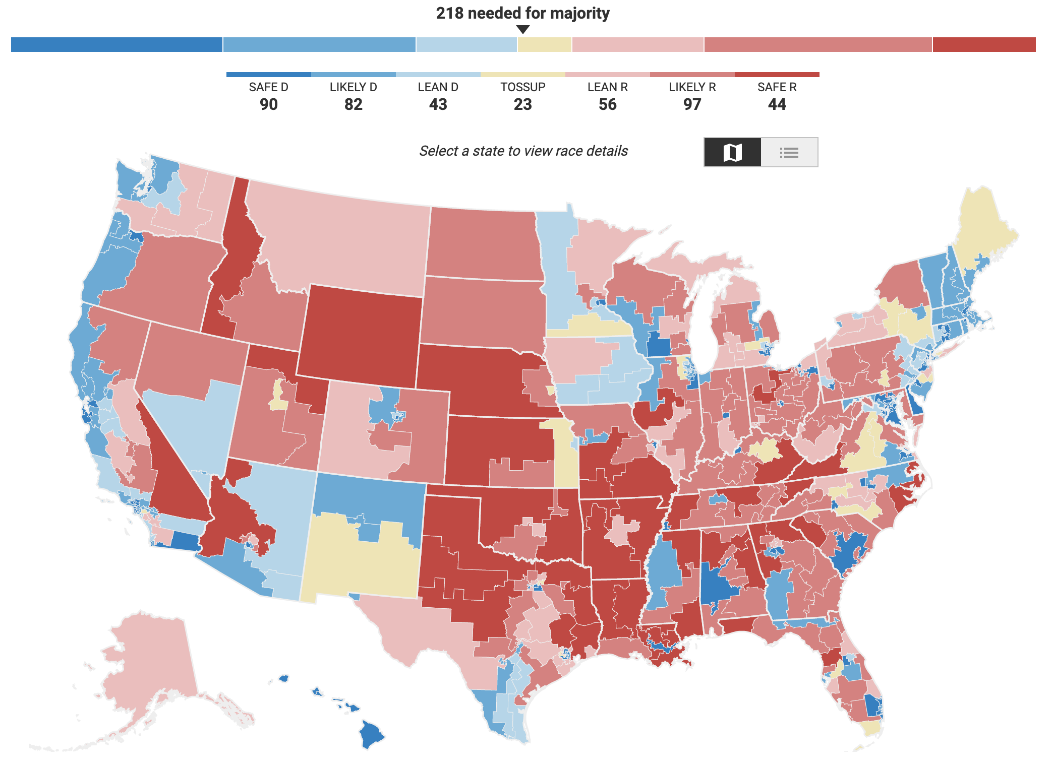
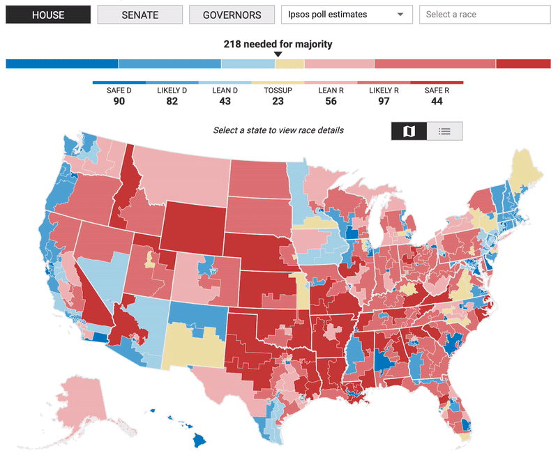
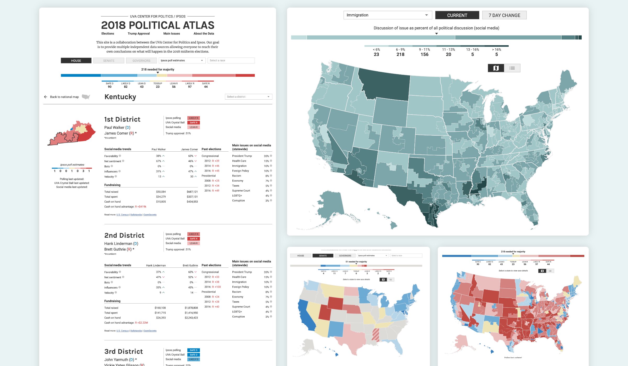
The 2018 Political Atlas Project interactive tool brought to life the combined resources of the University of Virginia’s (UVA) Center for Politics Crystal Ball and Ipsos polling and social media data.

Sabato’s Crystal Ball is a comprehensive, nonpartisan political analysis and handicapping newsletter run by the UVA Center for Politics. The Crystal Ball keeps tabs on presidential elections, along with every race for the U.S. Senate, House of Representatives, and state governor. Besides forecasting the winners, the Crystal Ball provides analysis of trends in American politics and elections based on a number of factors, including electoral history, polling, candidate quality, modeling, and reporting.

Through its detailed and varied polling and market research strategies, Ipsos positions itself as more than a data supplier, but also a partner for clients who can produce accurate and relevant information and turn it into actionable truth.

To begin with, accurate forecasting and predictions related to anything as complex as a democratic election is tricky business. Data-rich from quality sources, the 2018 Political Atlas needed to be easy to scan for top level takeaways –and– designed with an intuitive interface that also allowed for deeper dive, multi-variable exploration by power users.

A montage of visualizations made for IPSOS by Graphicacy, for their 2018 Political Atlas

Opportunity, Solution and Impact

There was an opportunity to create a simple yet powerful tool with multiple independent data sources allowing everyone to reach their own conclusions on what would happen in the 2018 midterm elections.

After some in-depth discovery work with the Ipsos team to clearly identify the most useful data and lines of exploration, Graphicacy designed a map-focused tool with some of the following features.

A homepage, centered on a national map, provided an Elections overview of which party was likely to win a majority, and allowed the user to toggle between data from polling, experts, and social media for either the House, Senate, or gubernatorial elections. Two alternative lenses to explore the upcoming election were also provided in the main navigation – Trump Approval and a variety of Main Issues. Users also had the option to toggle between a map view that helped frame things by geography, and a table view that showed state level “up” or “down” trends on different important topics.

State pages allow the user to view all the races in a particular state, with additional context such as candidate favorability, past election results, and the most talked about issues on social media.

The site has been shared by major media outlets and visited by tens of thousands of users, with an average session duration of four minutes.


Interested in working on a project like this?