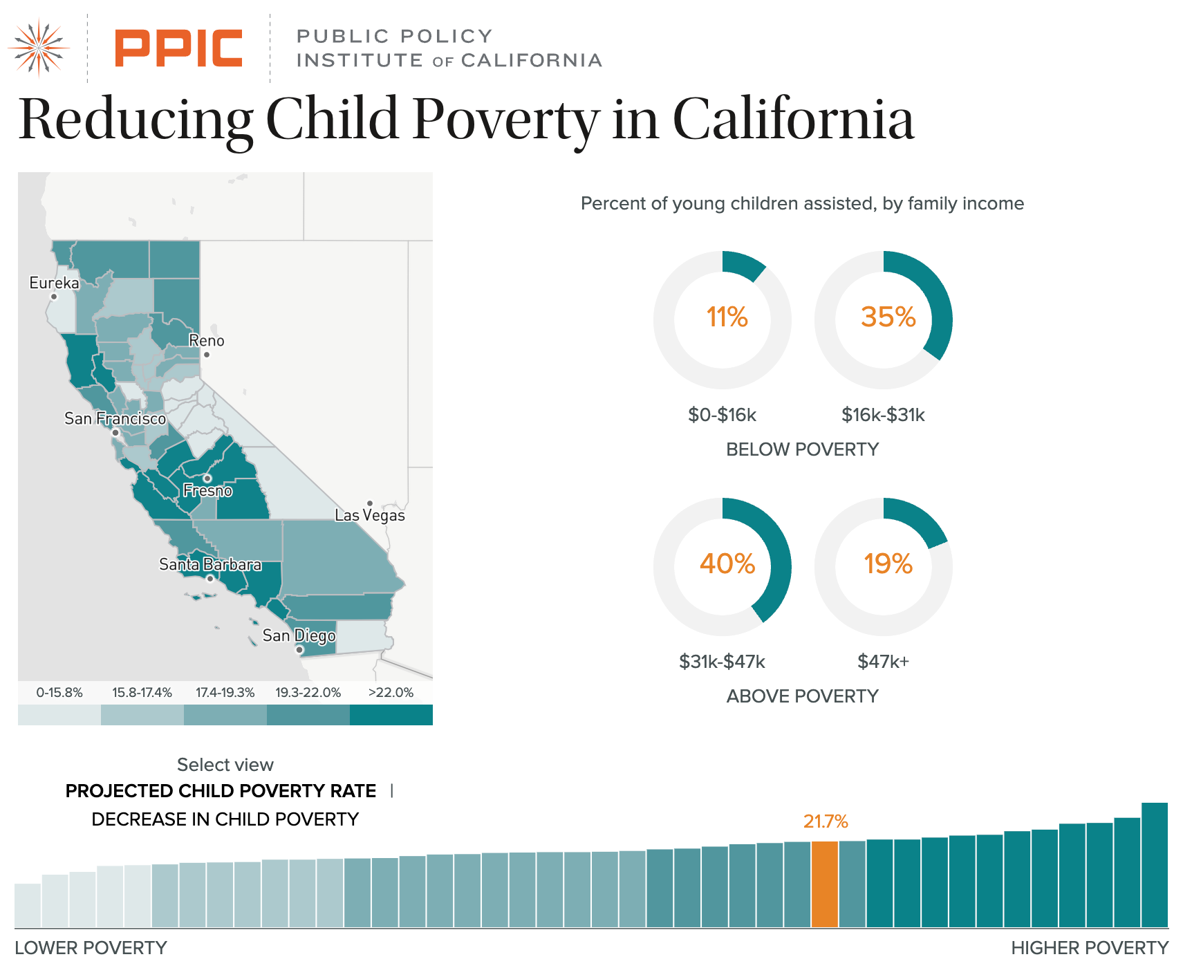
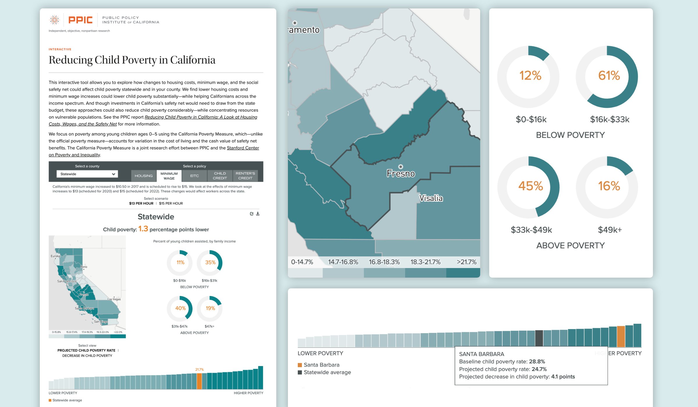
Taking a restricted, short-term view of likely policy outcomes, PPIC had found that lower housing costs and minimum wage increases could lower child poverty substantially while helping Californians across the income spectrum. The creation of this tool provided an interactive experience accessible to academics, researchers, journalists, and policymakers as well as general users.
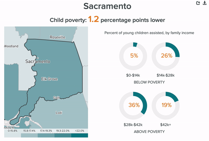
One early design decision was to present a map and a ranking bar chart together, displaying the same information. Choropleth maps are good at showing geographic patterns, but bar charts and line charts are better at communicating the actual data values and the distribution of a dataset. We included a bar chart below the map to allow the user to easily see the distribution of the data and where a selected county ranks relative to other counties.
Another consideration was how to set the scales to ensure that the large differences between different policy scenarios would be apparent. For the map, there was a decision not to use quartiles or quintiles to ensure that the variation among counties was apparent in the colors on the map. For the bar chart, the y-axis remains the same as the user toggles between policy scenarios, so it’s readily apparent which policies have the largest impact on poverty.
Overall, five policy options to choose from, two toggle options for both income and poverty rate scenarios, and four different types of charting (map, donut charts, ranking bar chart, and table), provided users with a simple but highly flexible way to explore this dataset.