CAP’s report on immigration was rich in detailed data and framed the compelling overall story of immigration in American history. The launch of this report also coincided with some key policy decisions being made on Capitol Hill and was intended to be a part of those negotiations.
Working closely with the CAP team, Graphicacy chose four distinctive interactive chart types stitched together with descriptive text blocks in a scrolling narrative to provide unique “windows” on the report data set.
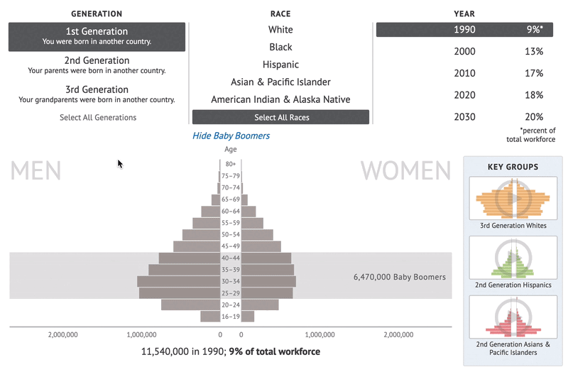
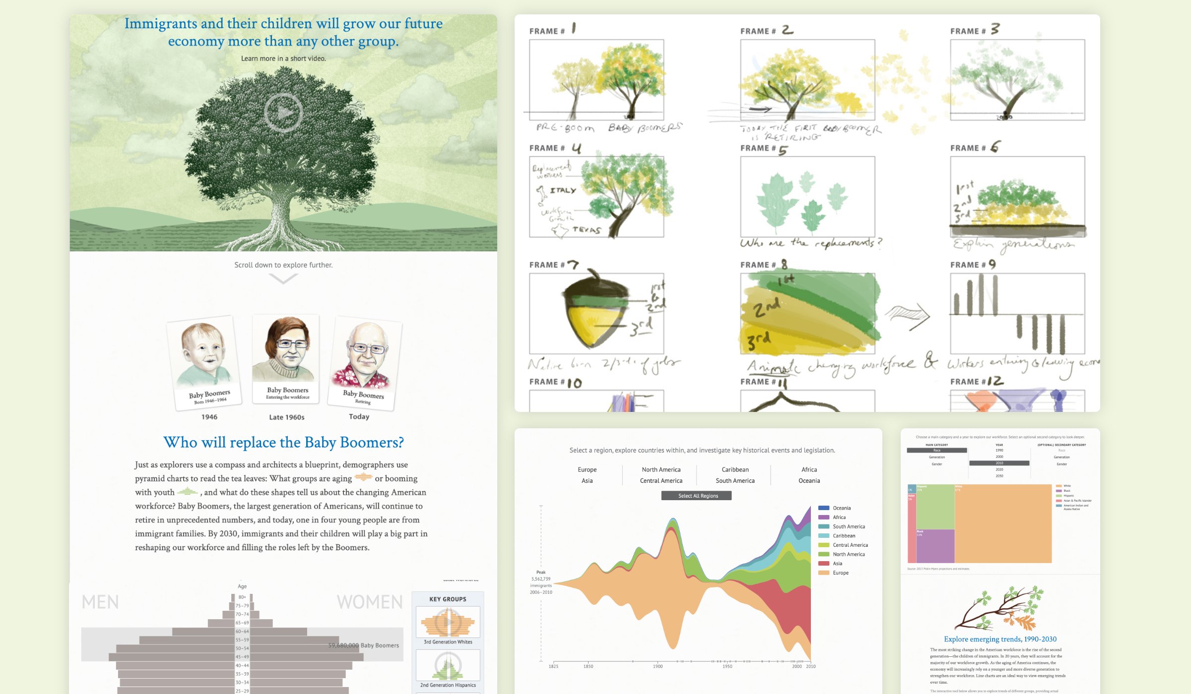
- Understanding Workforce Groups – We used a pyramid chart to allow users to see the “shape” of different workforce groups based on three variables (generation, race and year.) Pre-set key views were provided to make sure people didn’t miss the mid and upper chart bulging of aging Baby Boomers, and the bottom heavy profile of younger 2nd generation Hispanics, Asians & Pacific Islanders in their exploration.
- Comparing the Workforce Side by Side – While pyramid charts illustrate the shape of different groups, tree maps provide the ability to compare and contrast different groups alongside one another. As our workforce is changing, so too is the diversity in the racial and ethnic makeup of the country, with important implications for our future. This chart type helped highlight that, as the Baby Boomers reach retirement age, our future economy will depend on the contributions of many more Hispanics and Asians than in the past.
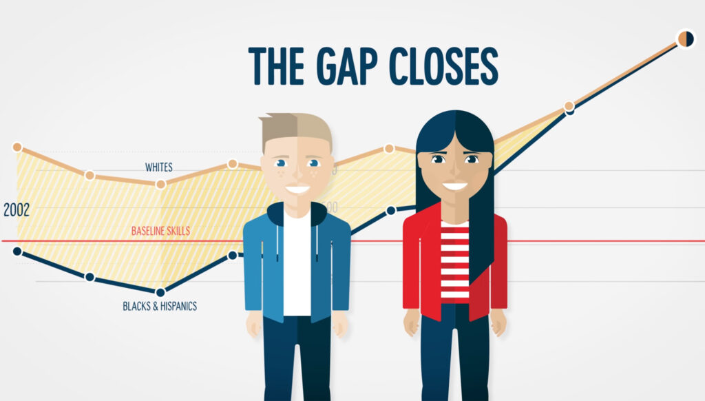
- Understanding the Workforce Over Time – The most striking change in the American workforce is the rise of the second generation—the children of immigrants. In less than 20 years, they will account for the majority of our workforce growth. As the aging of America continues, the economy will increasingly rely on a younger and more diverse generation to strengthen our workforce. Line charts are an ideal way to view emerging trends over time. While only allowing users to highlight one line at a time (shaped by generation, race, age and gender variables) we left all of the possible variations visible as selectable light gray lines to remind users of the richness in the dataset.
- Seeing the Impact of Immigrants – The stream graph we developed helped to show that throughout our history, a steady stream of hardworking and talented people from all over the world has enriched the United States. These generations of Americans have helped make our country the engine of the global economy. With each new decade, newcomers come to our shores to strengthen our economy, build our communities, spur innovation, and continually reinforce our history as a nation of immigrants. Mousing over the chart revealed key historical events and policy decisions that help to make sense of the variations in the region-based flow of immigrants.
Graphicacy also created a motion graphic video to provide an accessible, easily shareable, “data light” version of the story with an expanded use of metaphor, simple graphics, and a case study of a successful immigrant-owned business to underline the real world value of supporting successful immigration.
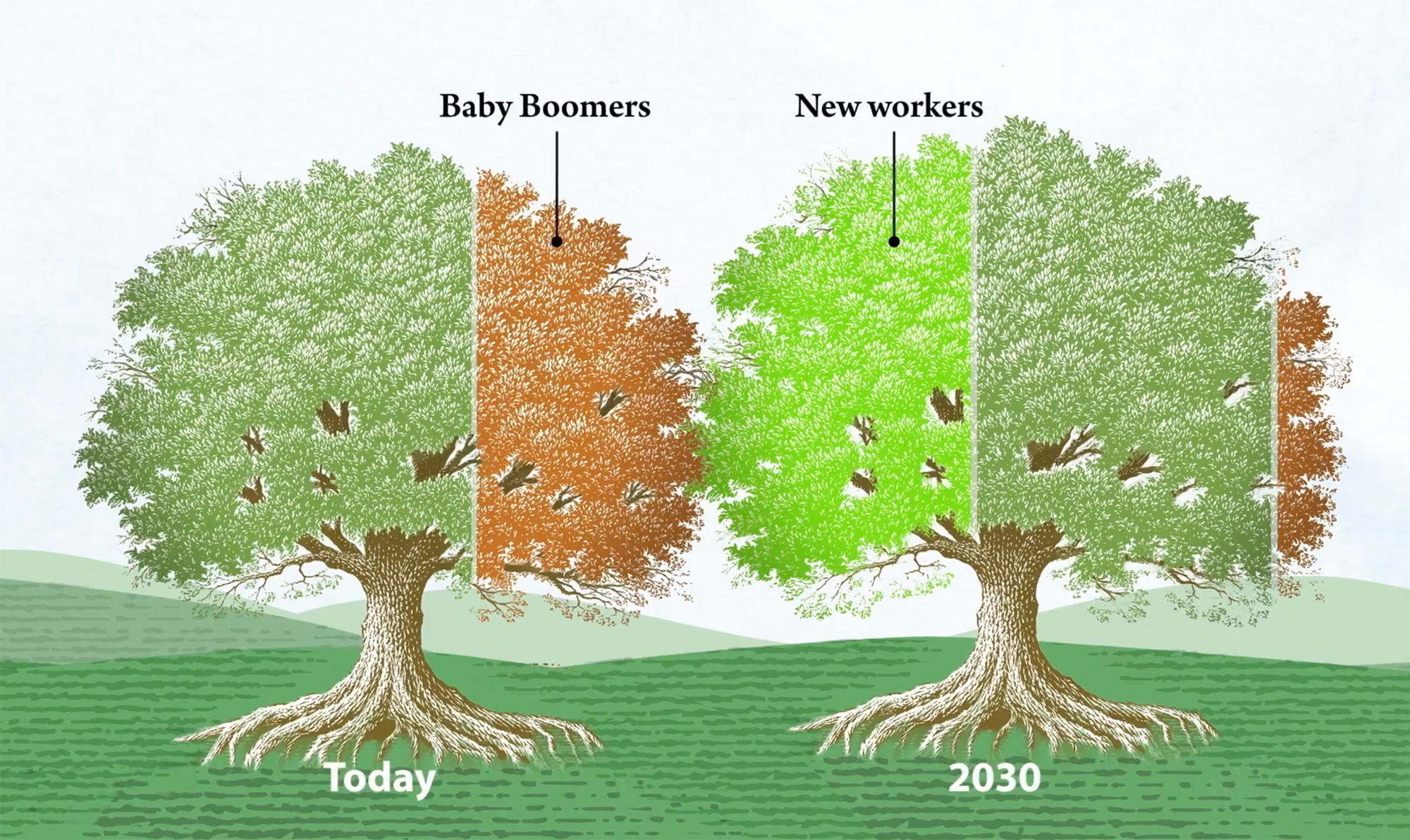
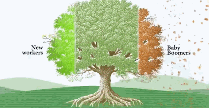
In both the video and the data visualization we used a strong metaphor, the American economy as a “mighty oak tree” to tie everything together, humanize the storytelling, and underscore the vibrant, everchanging, “living” nature of immigration in our nation’s history.