Killer Heat Interactive Tool

Union of Concerned Scientists / 2019 / Environment & Climate Change

Extreme Heat Calculator tool designed by Graphicacy for Union of Concerned Scientists

Overview

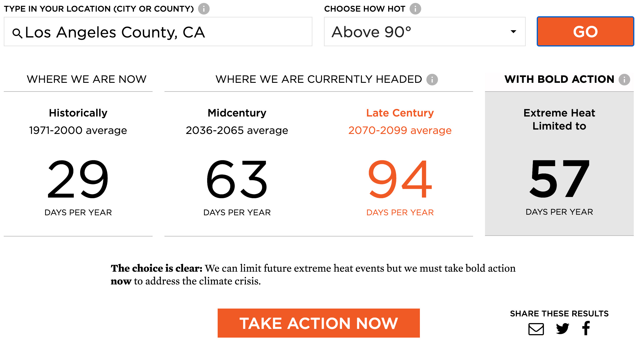
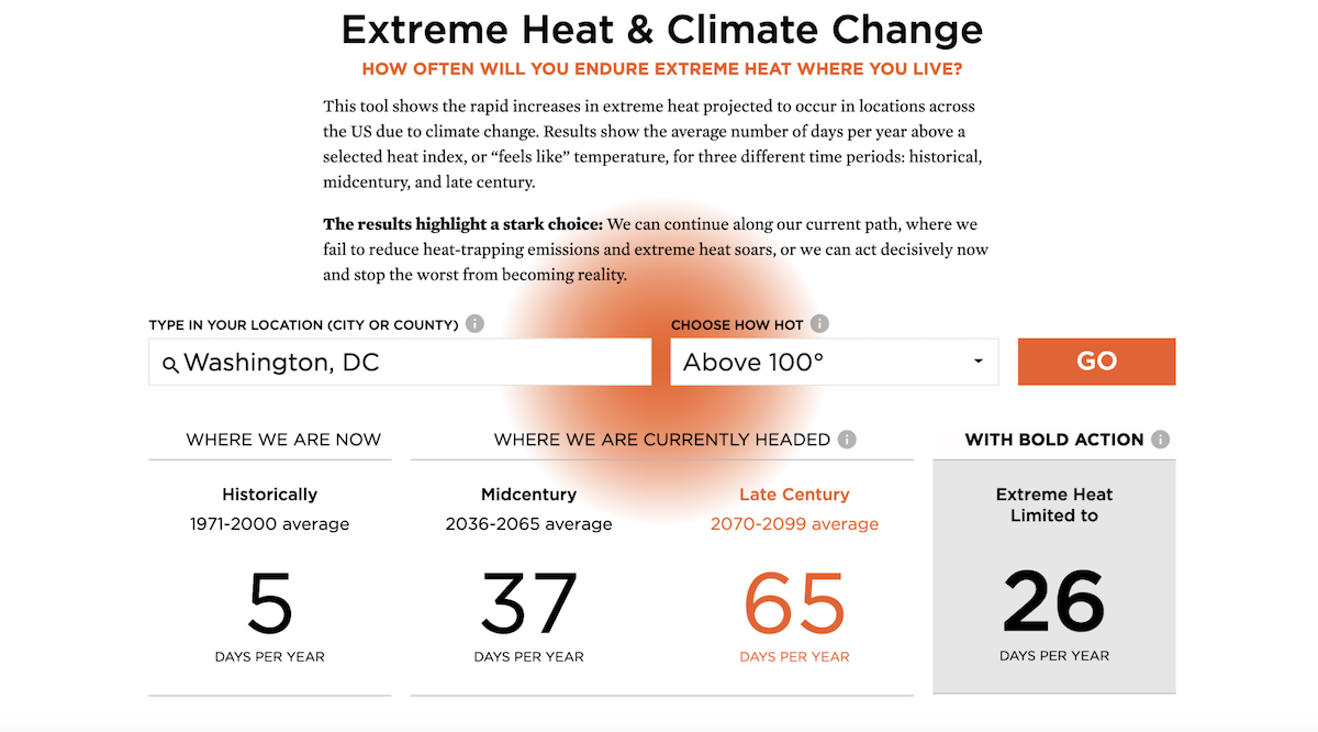
Graphicacy partnered with the Union of Concerned Scientists (UCS) to create an interactive companion tool for a report, “Killer Heat in the United States: Climate Choices and the Future of Dangerously Hot Days,” which shows the rapid increases in extreme heat projected to occur in locations across the US due to climate change. Results show the average number of days per year above a selected heat index, or “feels like” temperature, for three different time periods: historical, midcentury, and late century.

Background and Challenge

The Union of Concerned Scientists (UCS) is a leading national nonprofit organization that uses rigorous, independent science to solve our planet’s most pressing problems including climate impacts.

A team of communications staff, researchers, and subject matter experts from UCS came to Graphicacy for help in clearly communicating a critical matter: without global action to reduce heat-trapping emissions, the average number of days per year nationwide with a heat index above 105°F will more than quadruple (to 24) by mid-century and increase eight-fold (to 40) by late century. And, they wanted to quantitatively demonstrate that the number of dangerously hot days per year can be dramatically lowered in the future–if we take bold action now.

Opportunity and Solution

This was a chance to share well-sourced data from a respected organization with a sense of urgency, helping to educate and activate voters on this important issue. They wanted to show (not just tell) that in regards to climate change and extreme heat, here’s where we’ve been, and here’s what the immediate and not-too-distant future will likely look like for you – wherever you are – if we don’t do something about it now.

Working with the Center’s team, Graphicacy created an interactive tool on a modest budget that would be easy to use, easy to understand, and easy to respond to with action. The techniques we used included:
A bold highlight color and big type. These were paired with simple interactive options to allow users to dial into what seemed important to them and quickly see results and time-based comparisons.
Impossible to miss options to take action and share results so users could get involved right away.

Interested in working on a project like this?