City Monitor: A Tale of Many Cities Told Through Data Visualization

Centre for Cities / 2020 / Economics

The central circular diagram designed by Graphicacy for Centre for Cities. Each circle shows one city, each spoke a different metric of data

Overview

Graphicacy partnered with the Centre for Cities to create an engaging data visualization platform of economic data for their United Kingdom City Monitor program.

Background and Challenge

Centre for Cities, a leading British nonprofit think tank, is dedicated to improving the economies of the United Kingdom’s largest cities and towns. Each year, the organization publishes its flagship City Monitor to depict the economic performance of – and disparities among – the country’s 63 largest urban areas.

The data available in this critical report has always been useful, but hasn’t had the desired impact – one that could change policies … and change lives. One reason is the static presentation of dynamic and rich data, which had historically been published in print and PDF. The Centre needed their powerful solution to be a simple one as well – one they could easily update and operate themselves. They also needed their data to go live within three months.

Opportunity and Solution

Graphicacy accepted the challenge and delivered a do-it-yourself data visualization powered entirely by a familiar database system: Google Sheets, as described in our team’s Medium post.

Solution:
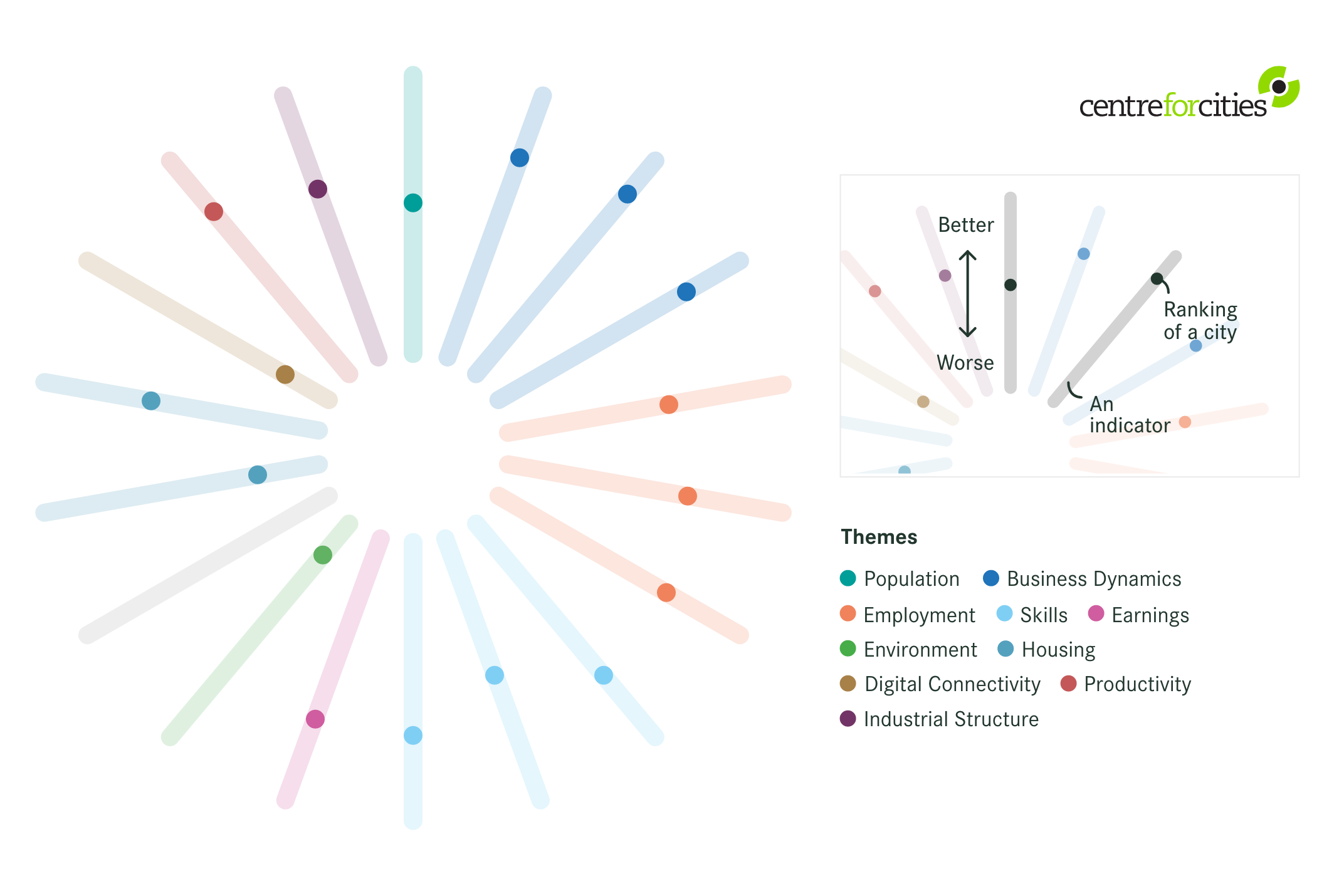
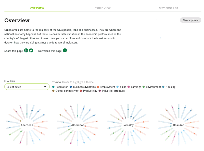
Graphicacy developed the City Monitor’s data explorer using information design best practices along with open-source data storage and front-end engineering solutions. This allowed users to easily explore and compare the latest economic data on the UK’s 63 largest cities and towns.

  • Open Source Solutions: Graphicacy recognized an opportunity to apply an open-sourced frontend engineering method: custom visualization that links to a database built on Google Sheets. This setup operates much like Content Management System and enables practically anyone in the organization to update the data – and thus the visualization – with little technical competency required.
  • Design Solutions Worthy of the Data’s Mission: After presenting a few creative directions, the team chose a spider-style design that showed each city’s performance across 18 economic indicators, including population, employment, earning, environment, housing, digital connectivity, and COVID-19 impact.
  • Built for Simplicity: Graphicacy’s visualization tool gives the Centre access to a cloud database so staff can focus on telling impactful stories with their data – rather than the tasks of storing and managing it – through integration with Google Sheets.

Adding to the advantages of a more intuitive database, Graphicacy’s design changed the way the Centre and its audience viewed the data. According to the Centre’s team, the new design inspired much more engagement than previous iterations.

A montage of visualizations designed for Centre for Cities, for their City Monitor program.

“We really enjoyed working with their team. They quickly understood who we are and what we needed for our internal team and our main audiences. The speed at which they moved from the initial ask to the final delivery — even amid holidays, a presidential election, and a pandemic — speaks volumes.”


Lauren Orso, Centre for Cities’ digital and audience manager

Interested in working on a project like this?