Covid Dashboard

North Carolina Department of Health and Human Services / 2022 / Global & Public Health

Vaccination Summary dashboard showing waffle charts disaggregated by age for Initial vaccinations. chart portion of a tool designed by Graphicacy for North Carolina Department of Health and Human Services, COVID-19 response.

Overview

With the North Carolina Department of Health and Human Services’ (NCDHHS) Data Office, Graphicacy (in partnership with Neimand Collaborative) facilitated a redesign of the NCDHHS COVID 19 dashboards. The aim was to make the dashboards more accessible, streamlined, and geared for the ever-changing climate of the COVID-19 data and outcomes. Graphicacy worked with Tableau developers, data analysts, public health experts, Data Office leadership, and communications partners to update their front-end Cases and Deaths Vaccinations dashboards, and develop a dashboard best practices leave-behind document to share lessons learned with data and health practitioners in communities of practice.

Background & Challenge

Throughout the COVID-19 pandemic, North Carolina’s Department of Health and Human Services (NCDHHS) shared more data with the public than they ever had before. Using the state’s thorough data dashboards, government and local leaders, health workers, and residents could make critical decisions to work toward health equity, protect everyone’s health, and save lives.

The sheer number of cases, deaths, hospitalizations, and lives affected by COVID-19 makes visualizing the figures tough to put into human terms in a sensible and relatable manner. Also, Graphicacy needed to approach this project with a service-based mindset toward capacity building and passing off designs and best practices geared toward maintenance and sustainability of the overall data visualizations, and dashboard users, NCDHHS developers and staff.

Opportunity & Solution

To give the data a more humanizing feel, the experts at Graphicacy worked with the North Carolina team to redesign the dashboard visualizations from the ground up. Graphicacy went beyond creating robust and insightful dashboards, however. Since pandemic data continued to evolve, Graphicacy also helped the NC team prepare to accommodate data changes—and gave them a roadmap for how to provide the best visualizations in the future.

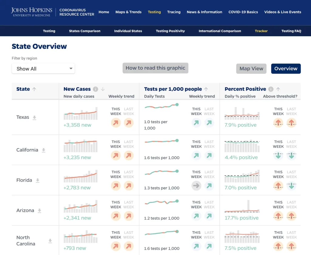
North Carolina has set the example for other states by creating COVID dashboards that help guide their pandemic response, using timely data sets and a combination of key metrics. The dashboards cover areas such as:

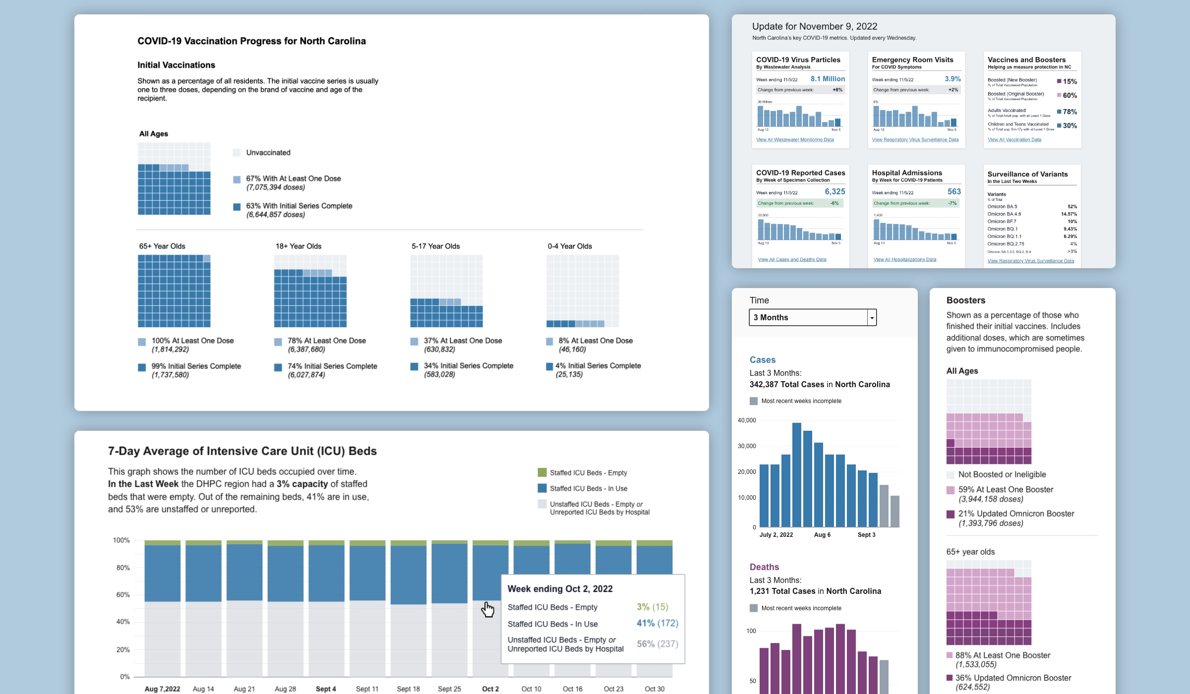
Graphicacy’s visualization team created a cleaner interface, with an easy-to-use, hierarchical view that includes a filter panel and charts below. We also focused our redesign on humanizing data that is somber in nature, so that each data point represents a person.

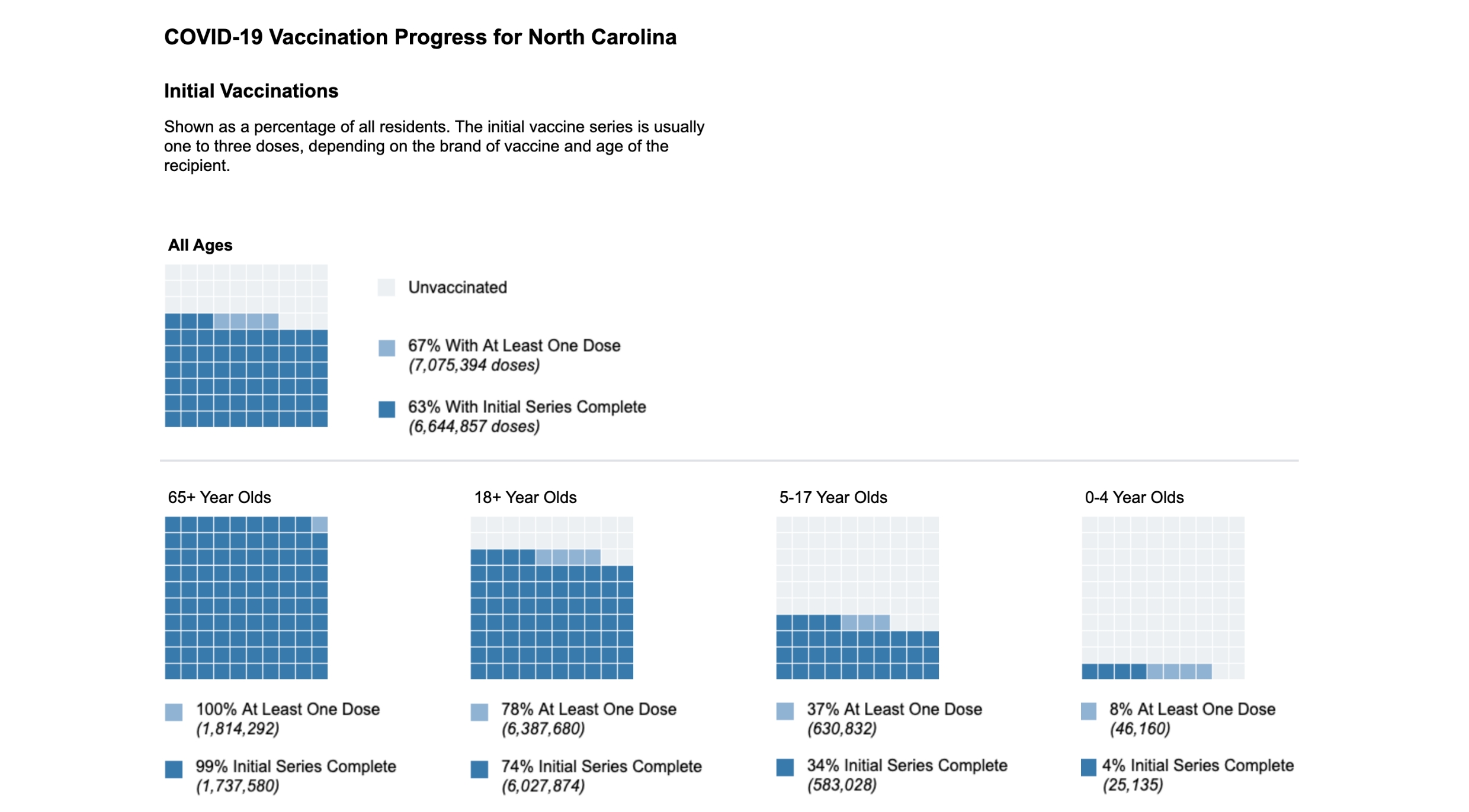
We thought through how to best ‘disaggregate’—asking :how can we best separate out particular summary statistics?” The original NC dashboard used bar charts. Graphicacy proposed waffle charts to give more perspective to the parts of a whole, with each square representing a number of people within the population. The new focus helps to illustrate progress made to vaccinate North Carolinians against COVID-19.

For vaccines, it’s important to draw on insights that can be viewed in a variety of analytical slices and disaggregations: an integral part of making sense of vaccination rates is seeing it broken out by age groups. Graphicacy’s dashboard view gives enhanced breakdowns and age buckets that align with when age groups become eligible for vaccines.

The effect is a more direct feel, which can be helpful in promoting equity. We switched from a wide color palate to a narrower one, so that users focus more on the data and don’t try to remember colors for a certain group.

A montage of visualizations created for North Carolina Department of Health and Human Services, COVID-19 response, designed by Graphicacy.

Designing for new users—and Tableau developers

As the pandemic evolves and use cases change, the NCDHHS team aimed to make their data more engaging for a general audience and for broader public health response efforts. Here the Graphicacy team tackled another challenge: How to redesign the NC dashboards so they’d be easy for others to operate as well as maintain?

To understand different users, the NC team and Graphicacy held in-depth discovery sessions and workshops. These included North Carolina residents, public health experts, professionals and data journalists who would come in search of data to repurpose for their own reporting.

Looking ahead also meant designing for a variety of back-end developers and data teams maintaining the dashboards in the future. For this, the Graphicacy designers opted to build the dashboards in the Tableau format. This ensured that when data changes, the NC team using Tableau could adapt in a seamless way using more accessible designs.

“We wanted the NC team to feel empowered to build on what we created and to leverage the convenient self-service analytics that Tableau offers them.”

Collaboration and teamwork for a path forward

Graphicacy built the new NC dashboards as part of a true partnership, with lots of back-and-forth communication and fine-tuning.

The NC developers worked in “sprint cycles”—every three weeks they finished clear deliverables , then started on the next round. The Graphicacy team aligned their workflow to the developers’, finishing the dashboard redesign in the first sprint, for example.

They handed designs over to developers every sprint and partnered on weekly check-ins, always making sure designs were useable in the NCDHHS Tableau environment.

“This project speaks to more than redesign. It was about how we can best serve the NC team within DHHS  so they can inspire others to do better. We pride ourselves on collaboration and working with the technology that works best for our client partners.”

Part of Graphicacy’s service was in providing a comprehensive dashboard style guide in PDF form that gives the NC team a clear overview of design best practice applied in the COVID-19 dashboards. “We aimed to give them more of a design template. We worked with their team to identify and describe  best practices, how to approach them—and how to apply them.”

The NC team can share the style guide and its messages with others as opposed to having to explain second-hand. And the guide serves as a technology agnostic tool, providing a path for a variety of future technical and data teams as the pandemic and the data continue to change.

An animated sequence showing a the Chart design section of a dashboard guide designed by Graphicacy for NCDHHS COVID-19 response project

Interested in working on a project like this?