Visualizing COVID-19: The Coronavirus Resource Center

Johns Hopkins University & Medicine / 2020 / Global & Public Health

An interactive table showing COVID cases, tests, and positivity rates, designed by Graphicacy for the Covid Resource Center

Overview

Graphicacy worked with our partners at Johns Hopkins University to design and engineer COVID visualizations that are easy for users to quickly understand as part of their renowned Coronavirus Resource Center. The Coronavirus Resource Center was selected by TIME magazine as one of the Best Inventions of 2020 and 2020’s Go-To Data Source.

Background and Challenge

Johns Hopkins came to Graphicacy to assist in making these particular COVID visualizations easy for the general public to understand: trends in how COVID is increasing or decreasing in any particular state in relation to key indicators set by the White House as benchmarks for reopening.

One of the persistent challenges of designing COVID data visualizations is that a single metric only tells part of the story. To gain a better understanding on whether an outbreak is improving or worsening in a given state, the number of new cases should be looked at alongside how robust that state’s testing program is (tests performed per 1,000 people), and what percentage of those tests are positive. Due to the variability in states’ self-reported data, weekly trends and moving averages help to further clarify the current condition of an outbreak.

Opportunity and Solution

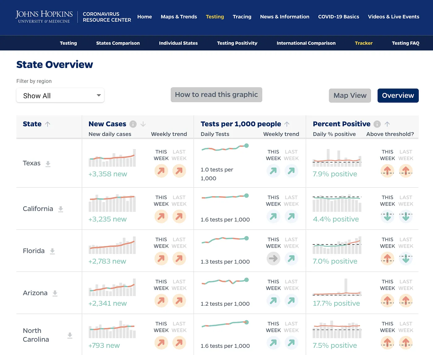
To aid in that type of easily digestible overview that users were looking for, Graphicacy designed a sortable, filterable table that displays all three metrics alongside each other, using small multiple charts displaying the most recent 14 days of data, as well as weekly trend icons that allow for a quicker, at-a-glance read.

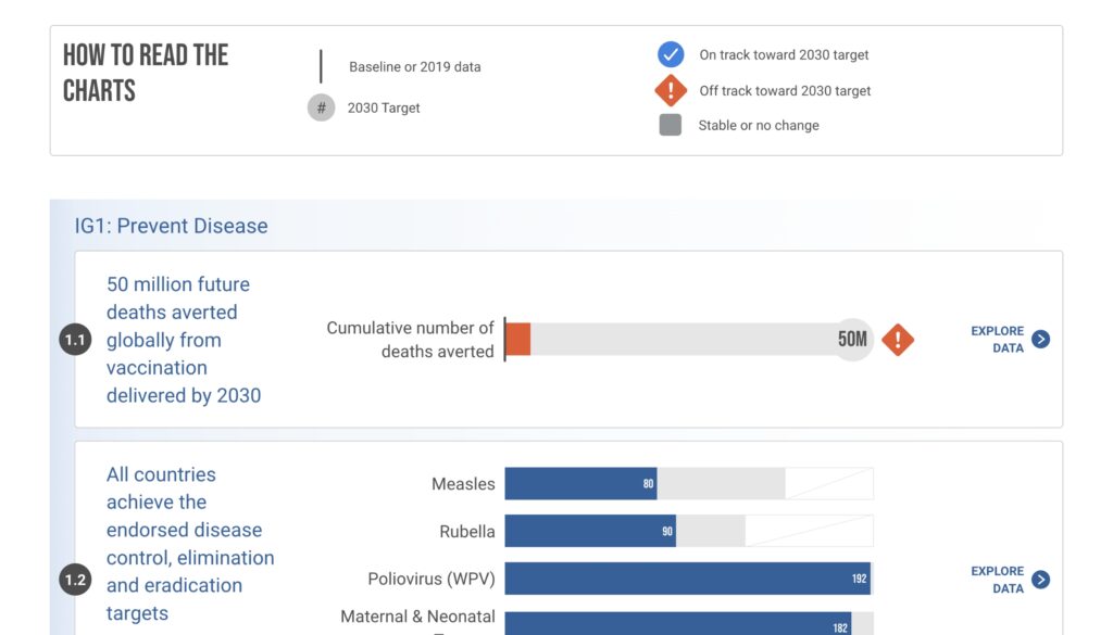
The overview table is data-rich and invites careful exploration. To help users understand each of the chart components, we designed an explainer graphic that gives instructions on how to read each chart, and explains any calculations being made under the hood.

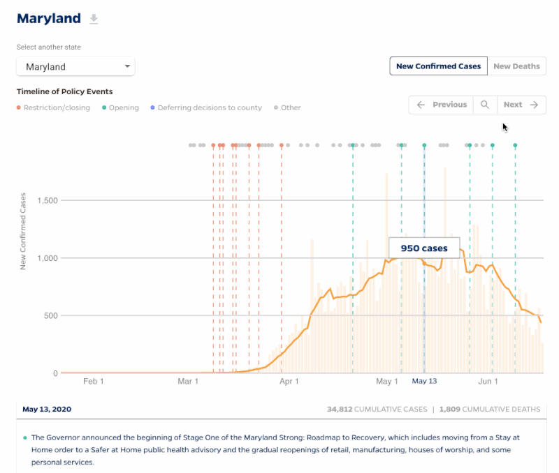
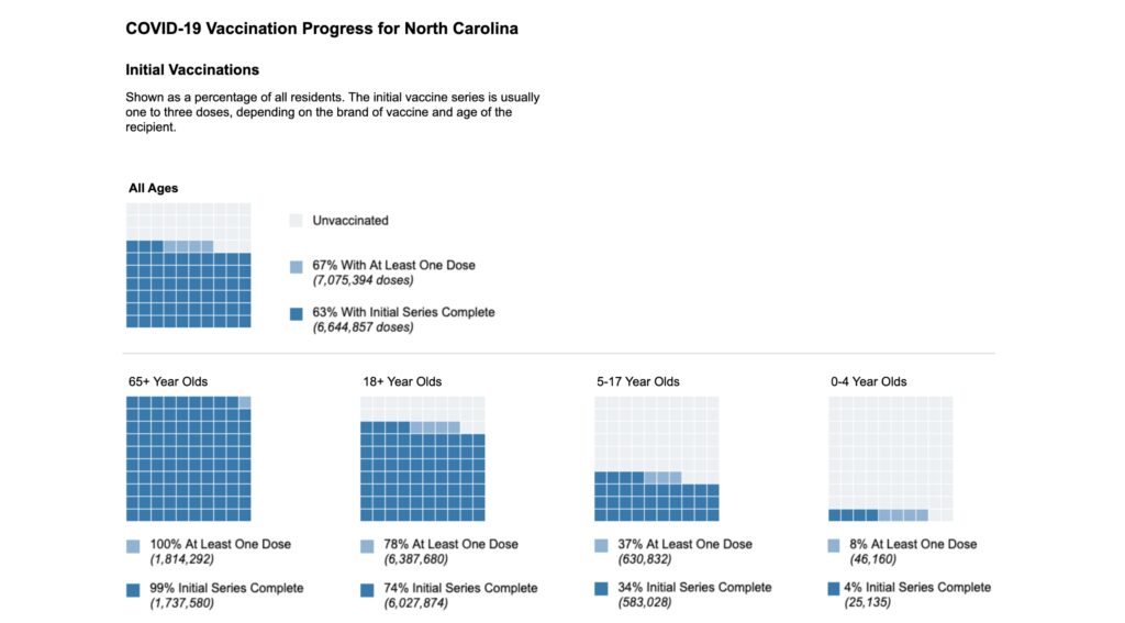
With a website as popular as Johns Hopkins’ Coronavirus Resource Center, many times users wanted to take high-quality images of their state’s testing data for embedding in a presentation or elsewhere. To meet this need, Graphicacy created a custom export view that optimized the display and provided all the necessary context for the data.

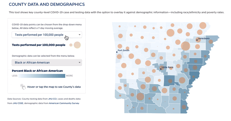
We also designed a tile map view that displays any of the metrics from the overview table, to identify regional trends.

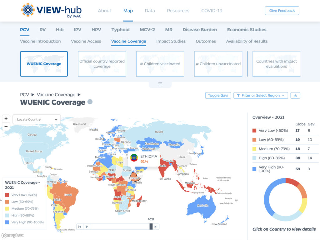
As part of an ongoing relationship with Johns Hopkins School of Public Health and the International Vaccine Access Center at the Johns Hopkins Bloomberg School of Public Health, this project allowed the Graphicacy team to engage in what we do best: dig in with our client partners to examine complex data and then create data visualizations and visual narratives that are topical, relevant, and effective.

Interested in working on a project like this?