Transforming Political Tech: Designing an Intuitive and User-Centered Interface

A Leading Political Tech Company / 2024 /

Overview

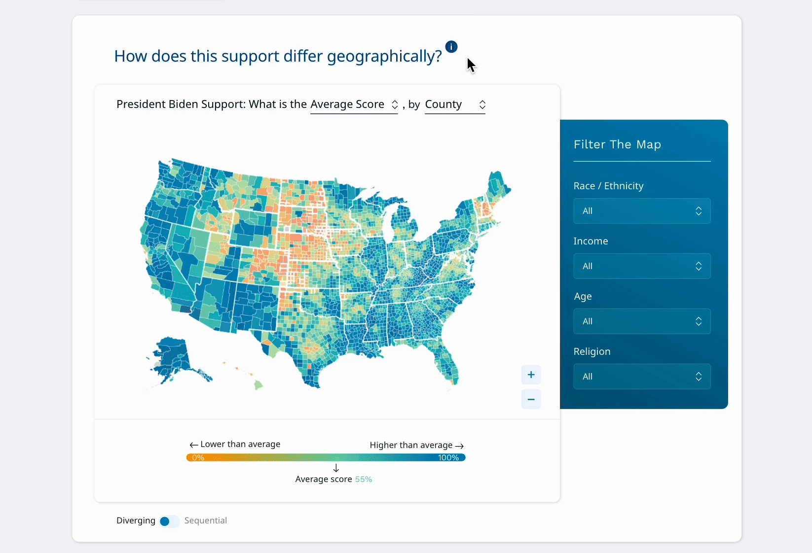
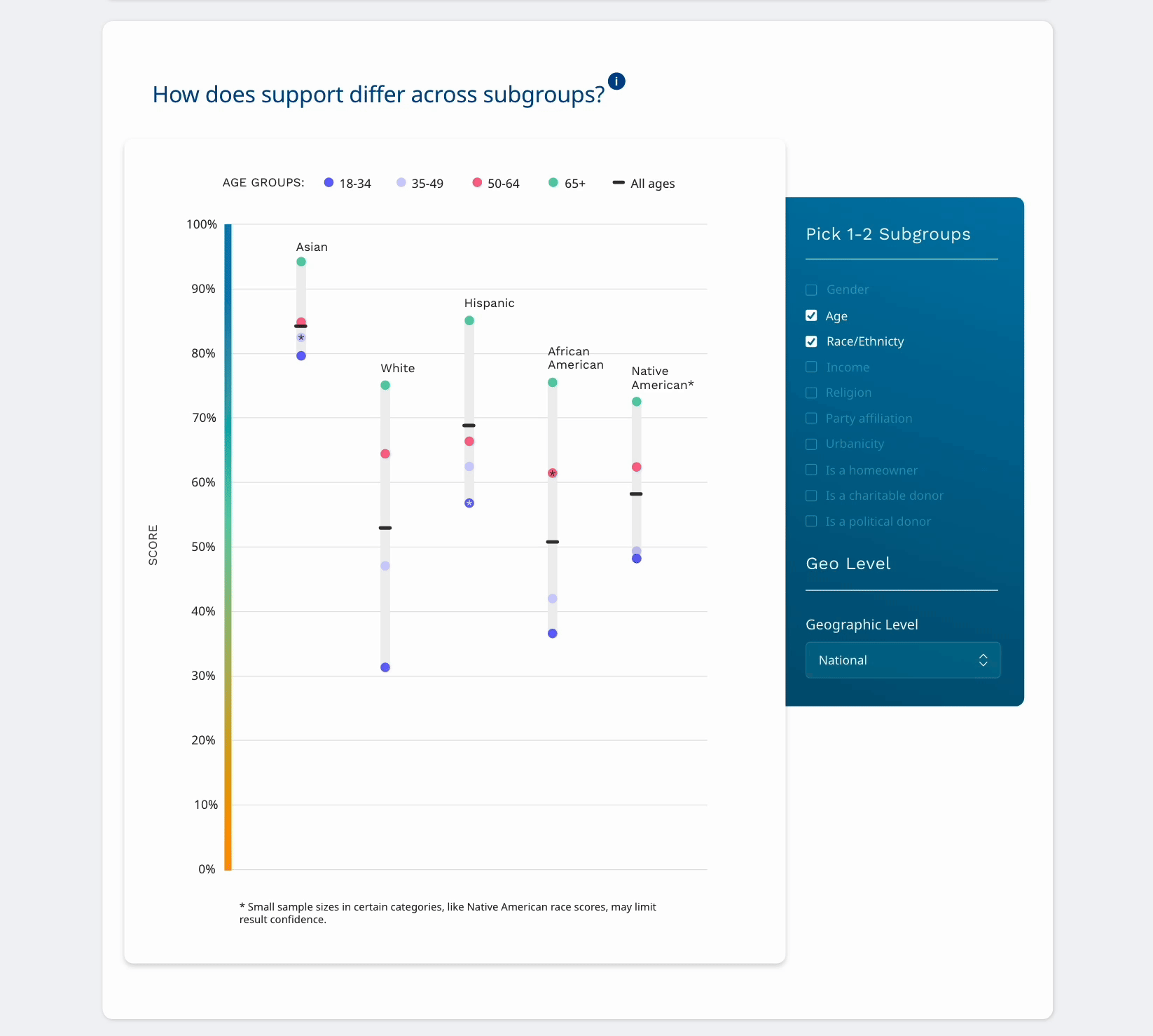
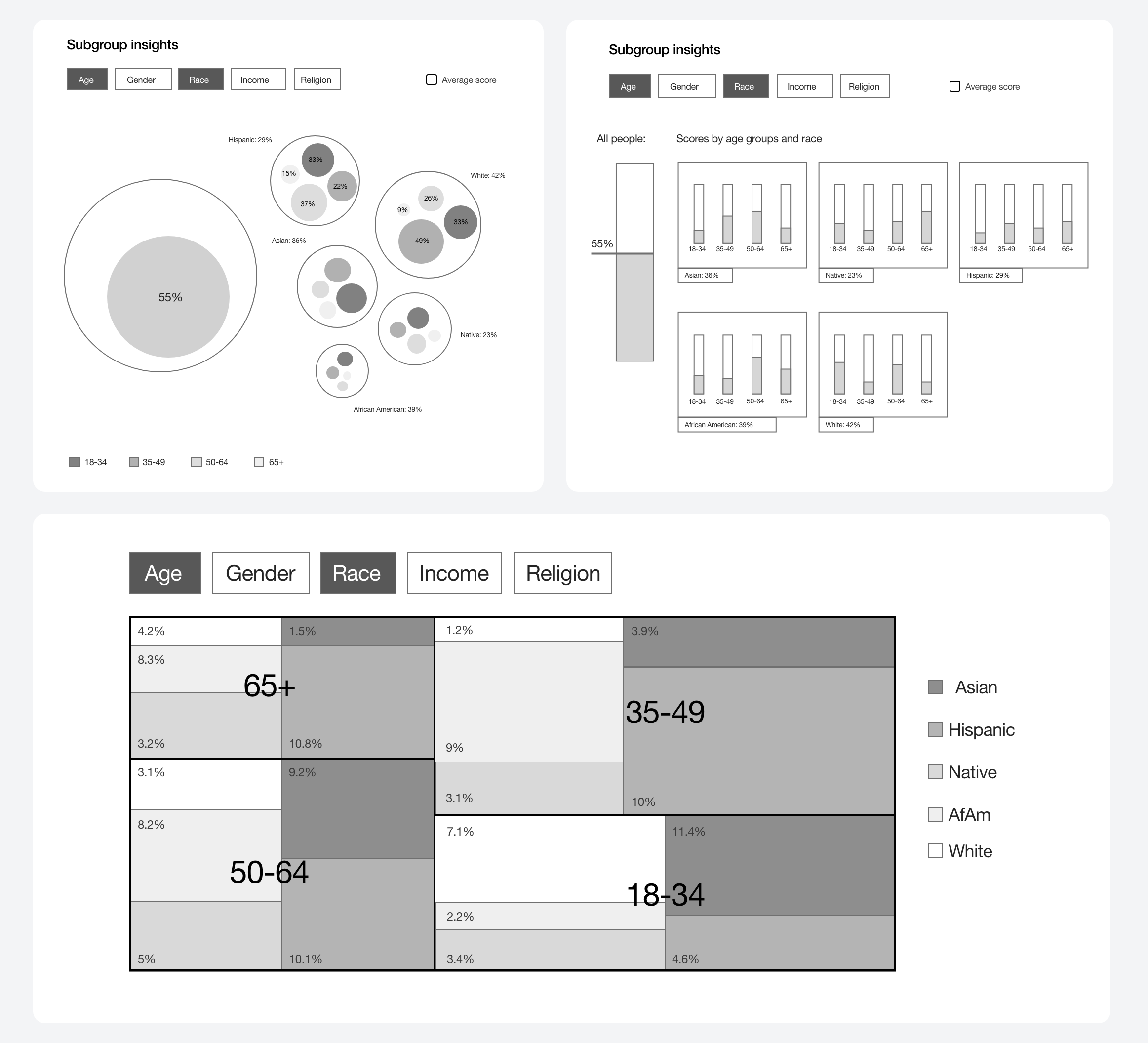
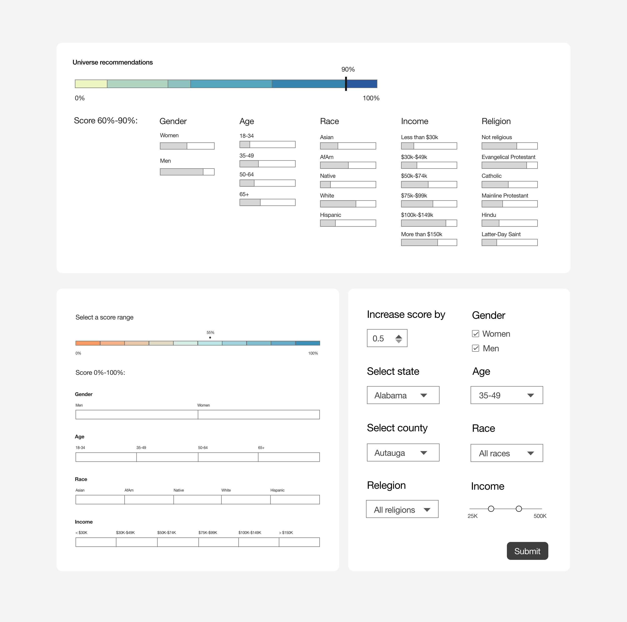
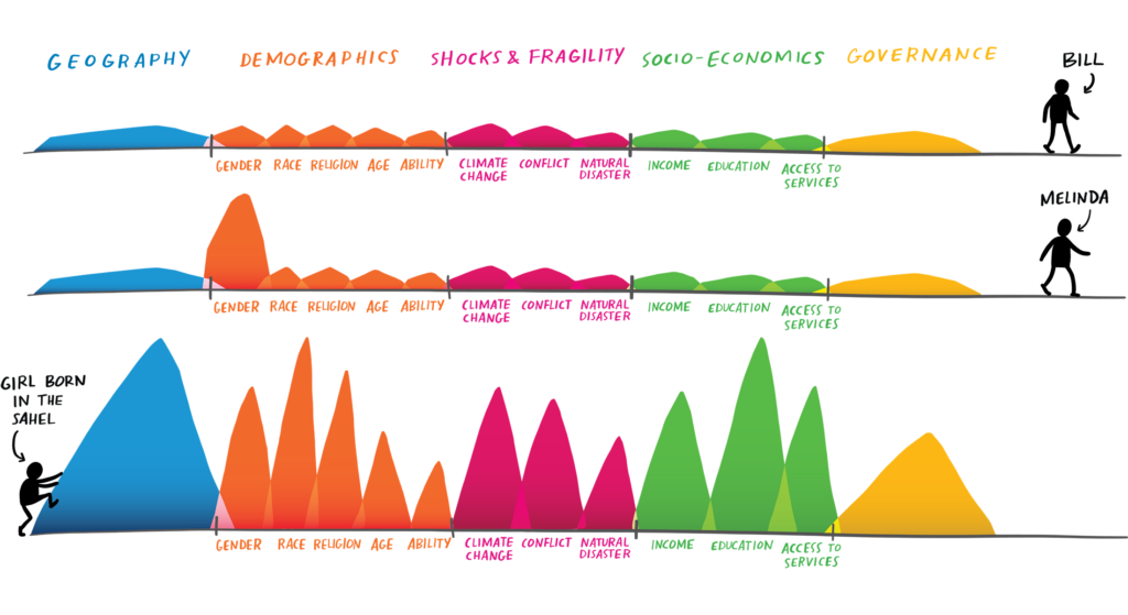
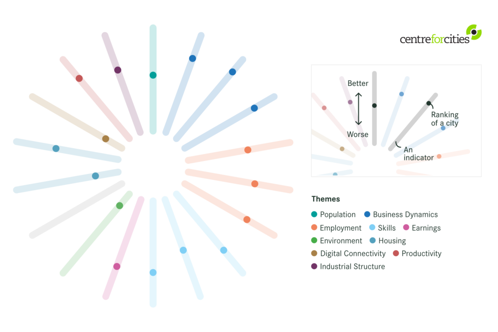
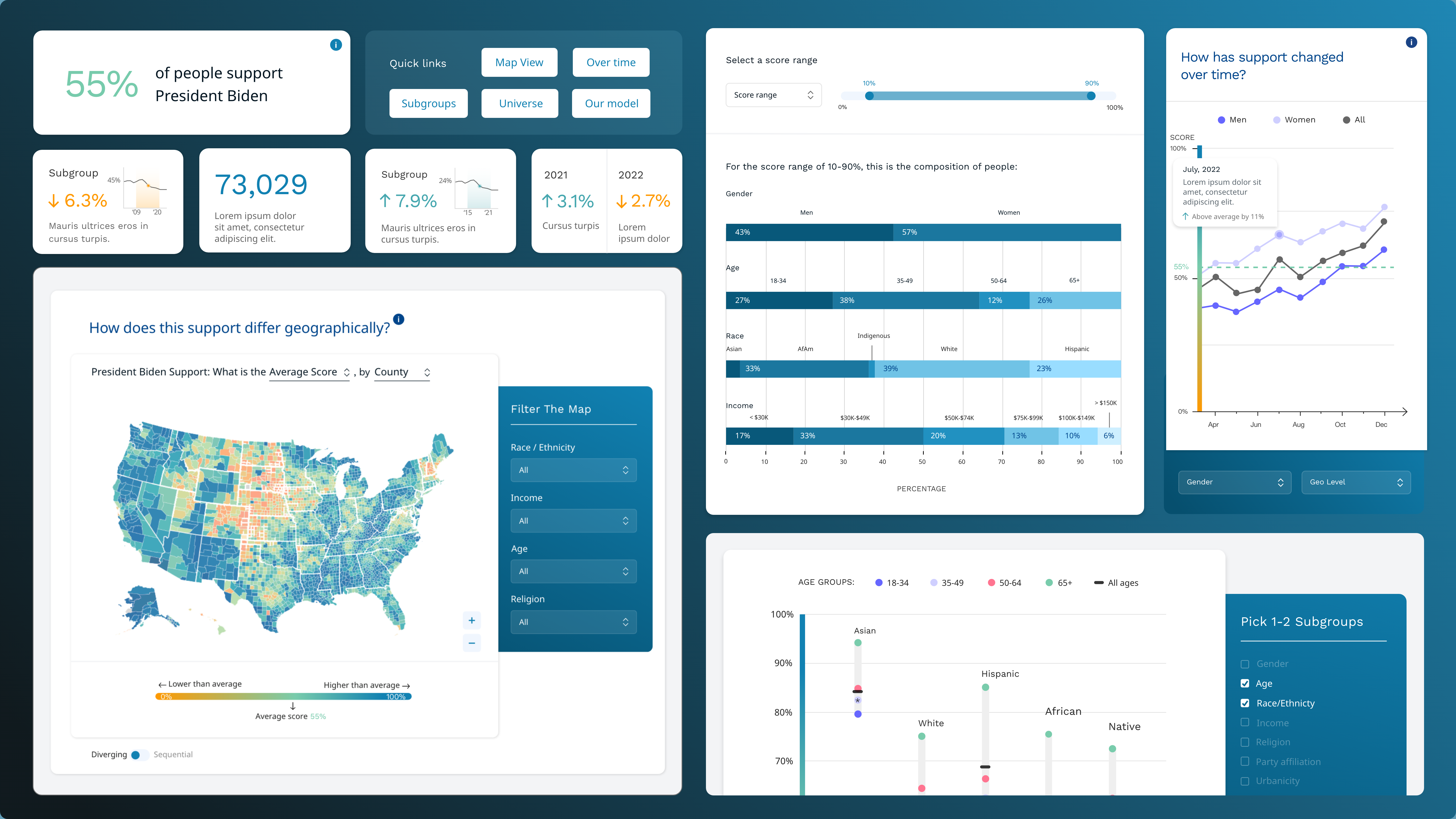
A leading political technology company partnered with Graphicacy to develop a simple, intuitive, and user-friendly interface for their product that transforms complex audience analytics into clear, actionable insights.

The goal was to streamline the product’s user interface (UI), making it easy for non-technical users to navigate, filter, and compare audience data across geographic, demographic, and behavioral dimensions.

By applying best-in-class user experience (UX) and UI principles, modular design systems, and interactive visualization techniques, Graphicacy designed a solution that ensures seamless navigation and an engaging user experience.

Background and Challenge:

The client for this engagement, a leading political tech company, needed a modern, easy-to-use software interface that allowed teams—from strategists to campaign managers—to quickly access and interpret audience insights without needing deep technical expertise.

The existing UI of the tool was cumbersome, difficult to navigate, and lacked clear visual hierarchy, making it hard for users to compare audience models, track trends, or generate meaningful insights. The challenge was to design an intuitive interface that eliminated friction, reduced cognitive load, and helped users get to the information they needed—fast.

Opportunity:

This project was an opportunity to reimagine how the product’s interface by:

  • Simplifying navigation to help users easily explore data without feeling overwhelmed.
  • Designing clear visual hierarchies so users immediately understand key takeaways.
  • Eliminating unnecessary complexity to create a seamless experience, regardless of a user’s technical background.
  • Streamlining workflows by reducing manual reporting and automating data comparisons.

To inspire continued action, the dashboard directs people to guides and other tools designed to help them better understand their community’s data and determine their next steps. Users have the option to download the dashboard’s charts for use in presentations or generate links to share with colleagues and others interested in toppling barriers to upward mobility.

Solution:

Graphicacy applied a user-first design approach, prioritizing clarity, efficiency, and ease of use in the design of the interactive software application.

Key components of our interface and product design solution included:

  • Minimalist, Clean UI Design – Crafted a modern and simple interface that eliminates clutter, guiding users toward key insights effortlessly.
  • Seamless Navigation & Data Exploration – Designed intuitive filtering and search functionality so users can quickly find and analyze audience data.
  • Clear Data Visualizations & Comparisons – Built an interactive dashboard that simplifies trend tracking and audience comparisons, making complex data easily digestible.
  • Modular UI Components for Scalability – Developed reusable, consistent UI elements that integrate with React, ensuring scalability across multiple projects.
  • Automated Reporting & Data Sharing – Enabled users to generate custom PDFs and PNG reports, making data insights easily shareable.

By using interface design best practices, Graphicacy created a seamless, intuitive experience that empowers the product’s user to navigate the complex datasets with ease.

“We literally could not build this product without Graphicacy.”


Founder, Leading Political Tech Company

Interested in working on a project like this?