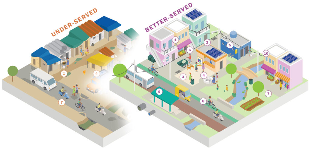
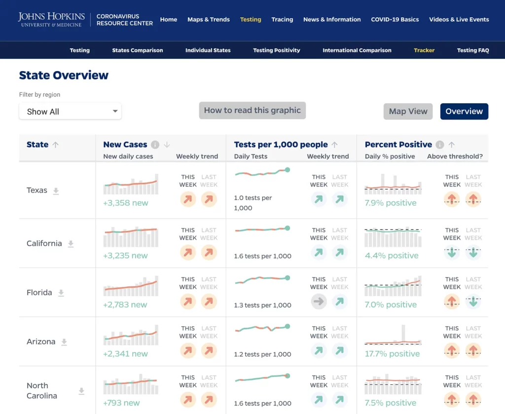
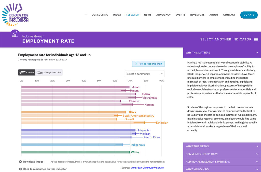
This was a chance for Graphicacy to play a key role in communicating global progress for the biggest issues societies face in tandem with one of the largest, and most respected, charitable foundations in the world. As data visualization experts, we had the opportunity to create assets for efforts designed to be evaluated by their measurable impact – evidence that things were getting better, or not, due to the BMGF’s efforts.
Working closely with the BMGF’s internal teams and their agency-of-record, the Graphicacy team and our partner, Catherine Madden, approached this project through a very in-depth, multi-day discovery process, followed by iterative rounds of data review and sketching, wireframing, visual design and final production and development.
Discovery sessions for this project involved robust discussion and a number of whiteboarding exercises that were intended to yield clear intent, appropriate tone, a compelling narrative, the most effective presentation of the related data, but also a very thorough and iterative look at how all of the assets (text, photos, illustration, and data visualizations) would all work powerfully together.
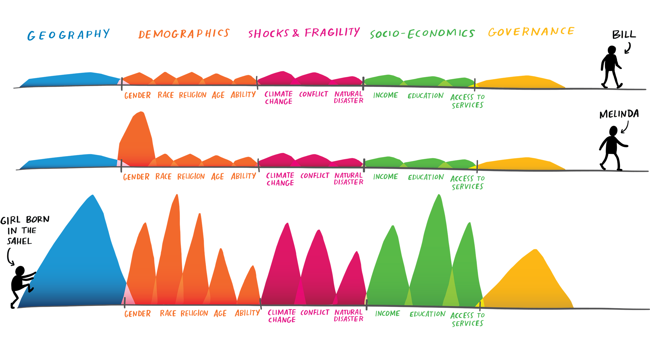
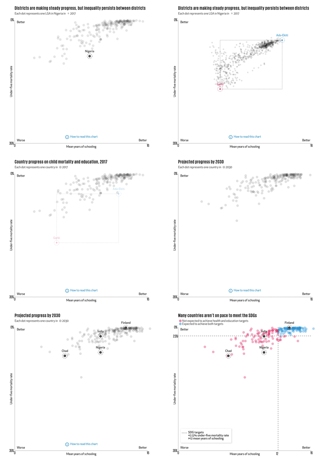
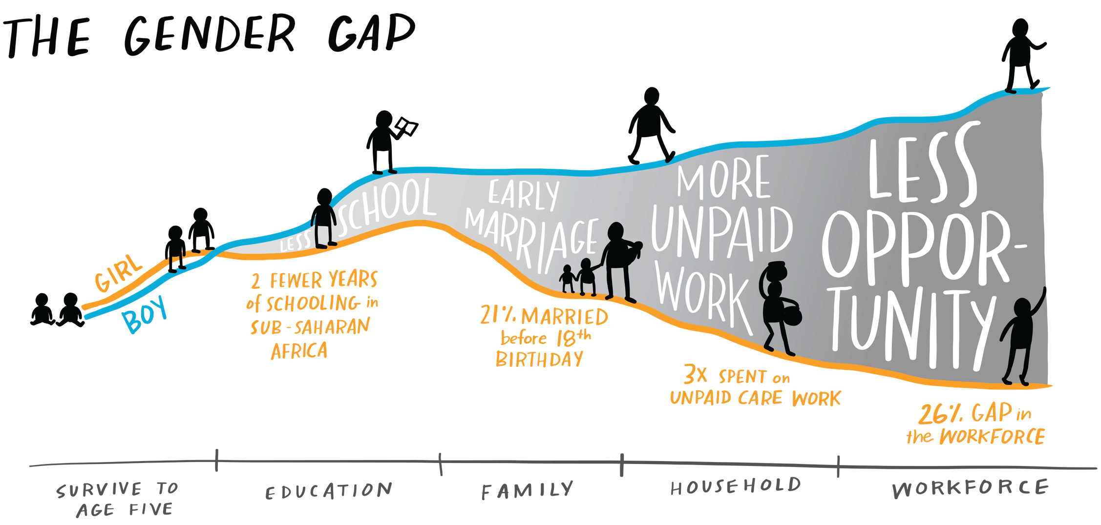
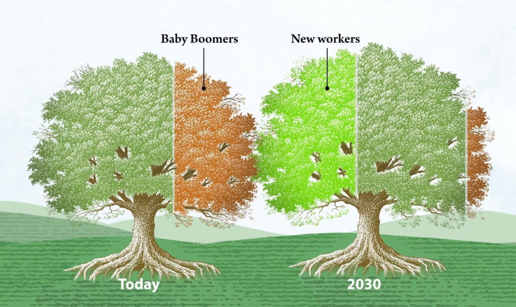
The report website was designed as a single, scrolling page with a crisp, magazine-style layout. There was a lot of information to convey, so the story was chunked into “chapters,” some of which contained mini data-driven narratives. As users scroll through these narratives, text on the left side of the page corresponds to adjoining visualizations and infographics on the right, amplifying and enhancing what is being described. The result is a multi-faceted interactive experience that is easy to navigate, vibrant, and informative.

