Disease Tracker Visualizes Vital Health Data for the U.S.

Johns Hopkins University / 2026 / Global & Public Health

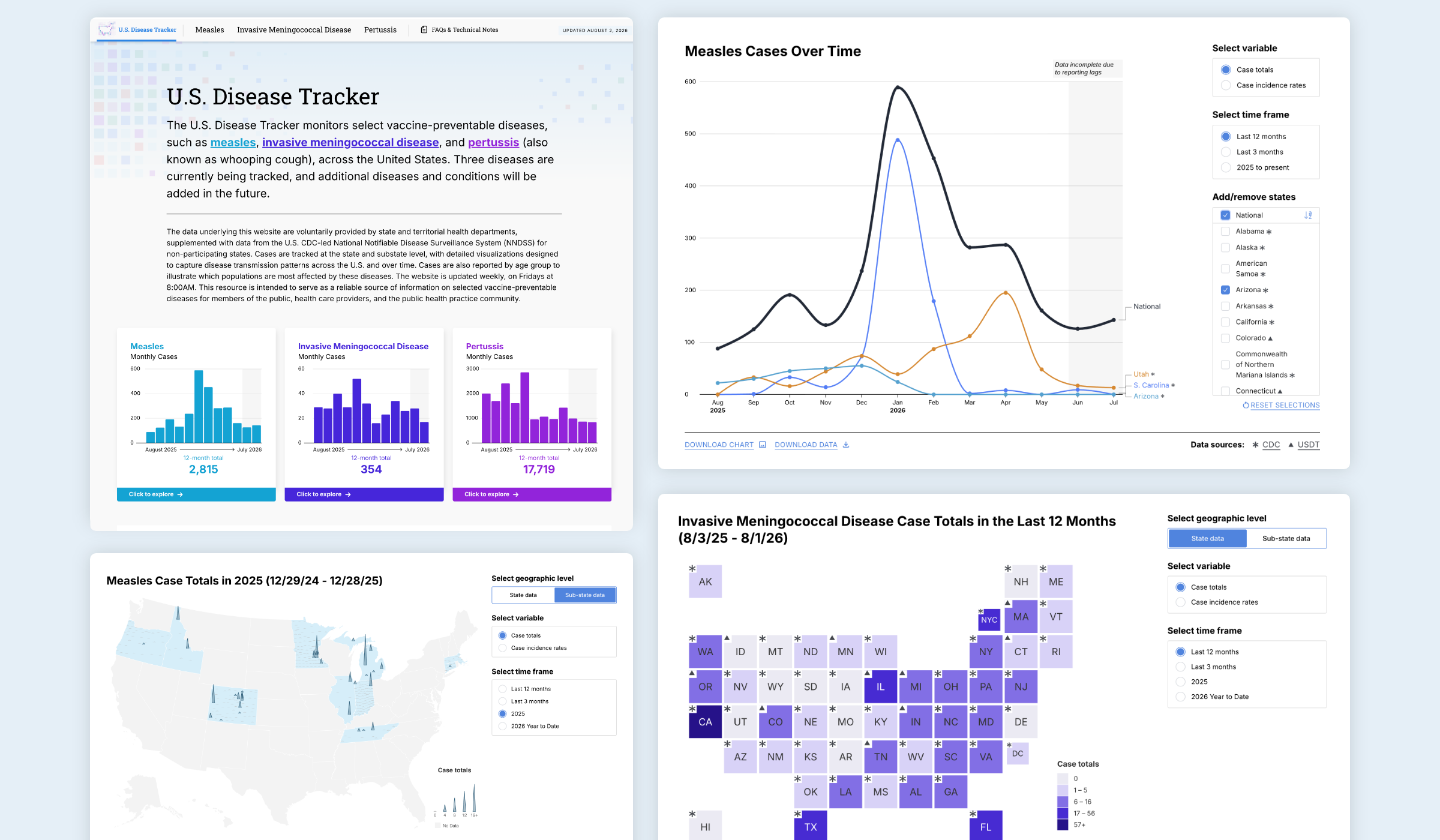
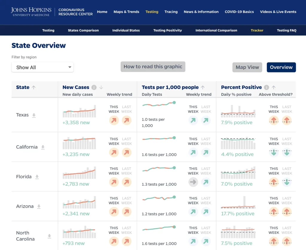
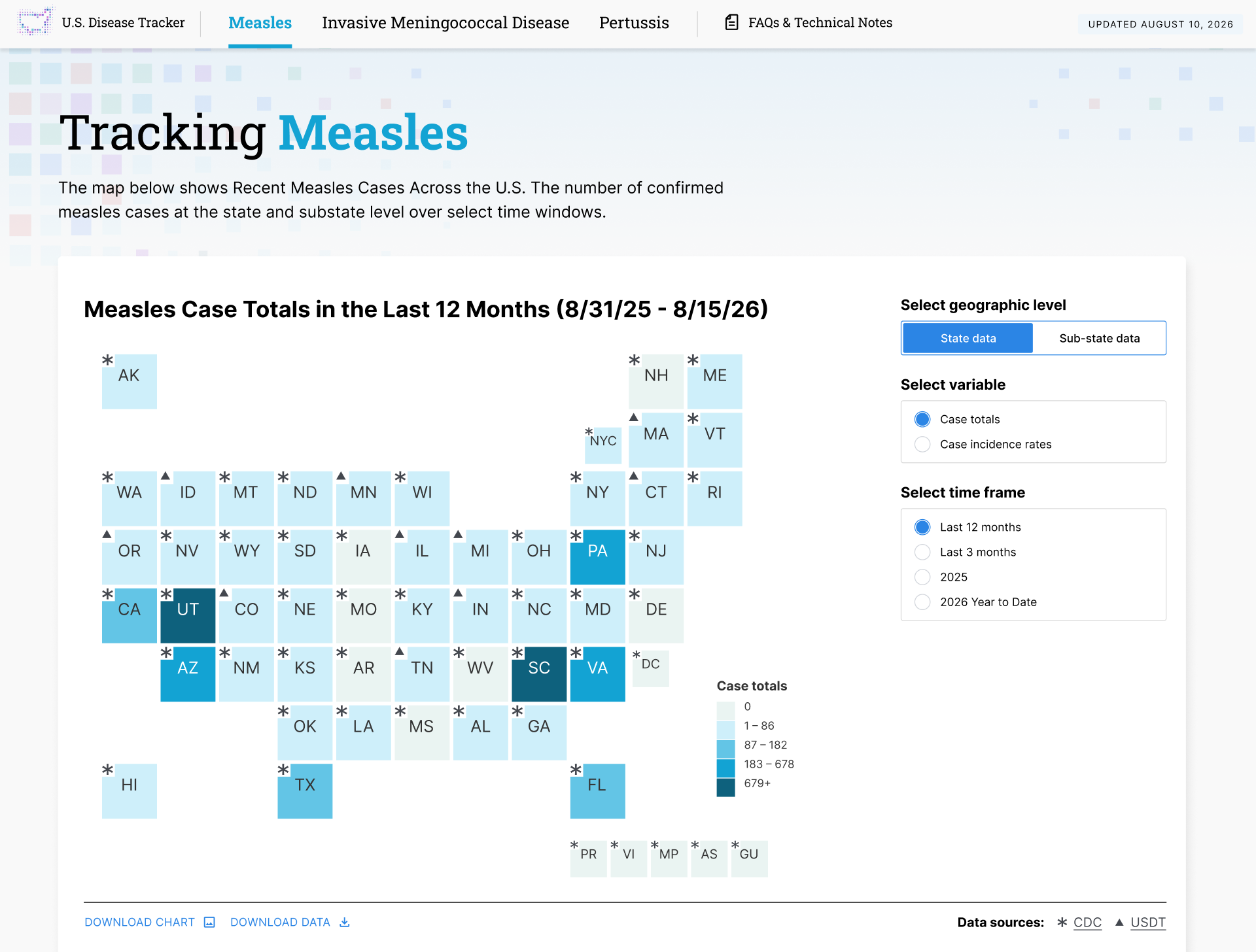
Hero image of U.S. Disease Tracker tool designed and built by Graphicacy for Johns Hopkins University.

Overview

In 2025, Johns Hopkins University, the Association of State and Territorial Health Officials and the Council of State and Territorial Epidemiologists set out to establish a reliable source of real-time information about vaccine-preventable diseases across the U.S. They engaged Graphicacy to realize their vision for a critical new tracker.

Background and Challenge:

Johns Hopkins University (JHU) aimed to augment the efforts of the CDC by providing standardized data on multiple diseases in digestible, clear formats for the general public, health care providers and public health practitioners.

They sought Graphicacy’s expertise to transform a prototype for a proposed U.S. Disease Tracker (USDT) into an interactive visualization tool that was easy to use, maintain and expand.

The USDT would be powered by a steadily increasing repository of information: data submitted weekly from a growing number of participating state and territorial health departments, supplemented with data gathered from the CDC-led National Notifiable Disease Surveillance System for non-participating states.

Opportunity and Solution:

JHU needed Graphicacy to quickly develop a preliminary version of the USDT at the end of 2025 to secure leadership’s buy-in at a January meeting. JHU and its partners also wanted to give participating states a preview of the finished product.

Instead of waiting for real data to come in, Graphicacy used placeholders to start building clear, accessible visualizations so the tracker was ready to populate.

Upon arriving on the USDT main page, users find a brief description of the overall project followed by data dashboards showing monthly case numbers for the diseases tracked. Each dashboard serves as a portal allowing users to delve deeper into a given disease.

Within the disease pages, a color-coded tile map reveals the total number of confirmed disease cases in the past 12 months. Users can filter data at the state and substate levels and for different time periods, by case totals or incidence rates. Hovering over a state brings up a callout box with specific data based on the filter’s parameters.

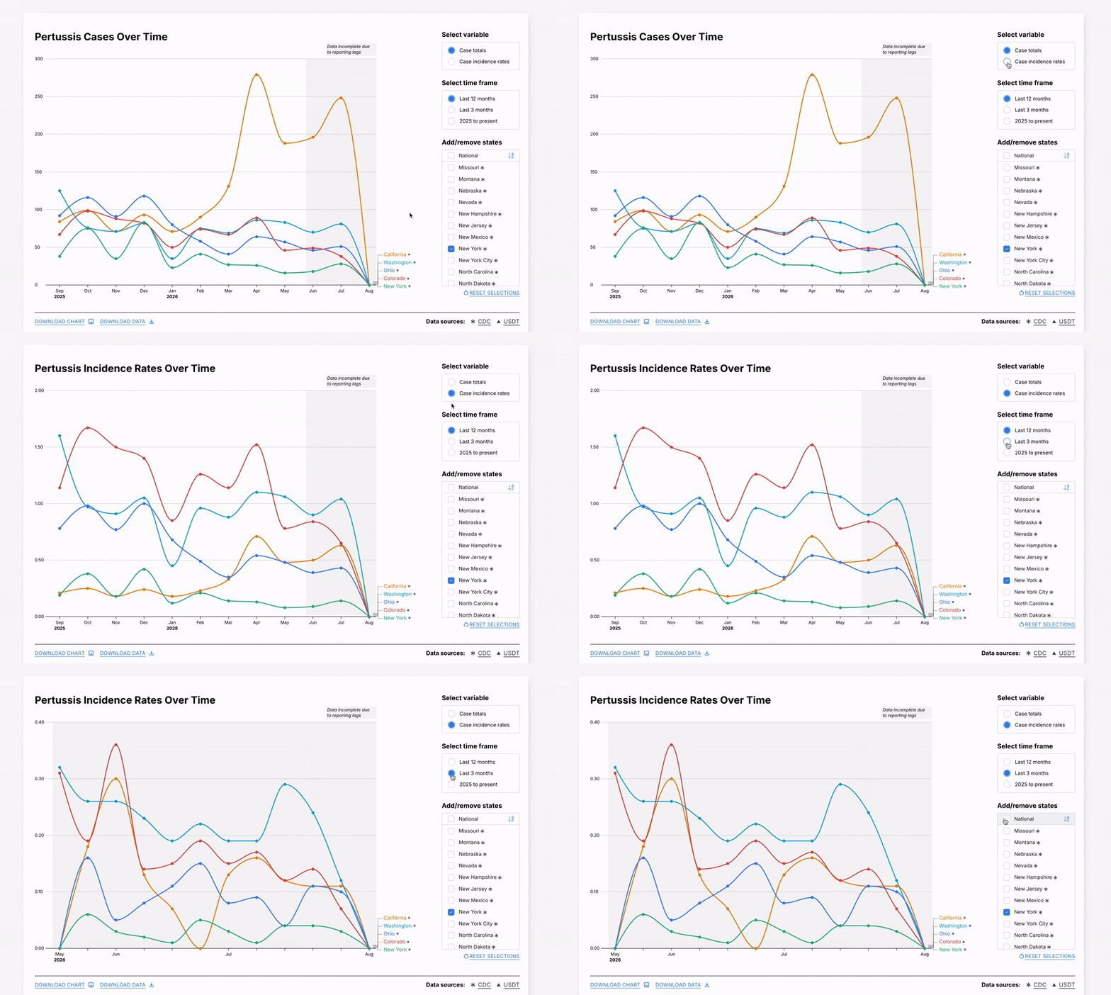
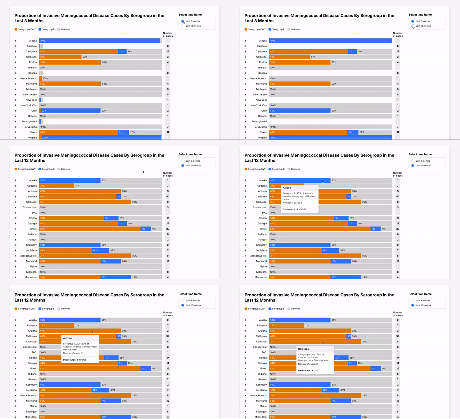
The next visualization, a line graph, illustrates changes in reported disease cases over time at both the national and state levels, with options for state comparisons. Finally, a bar chart highlights the proportion of disease cases by age groups over periods of either three or 12 months. Users can download all USDT charts and underlying data for their own materials.

The initial version of the tracker launched with three diseases and several states and jurisdictions actively sharing data. Graphicacy put the infrastructure in place to enable simple scaling, so JHU can easily add new states and diseases over time.
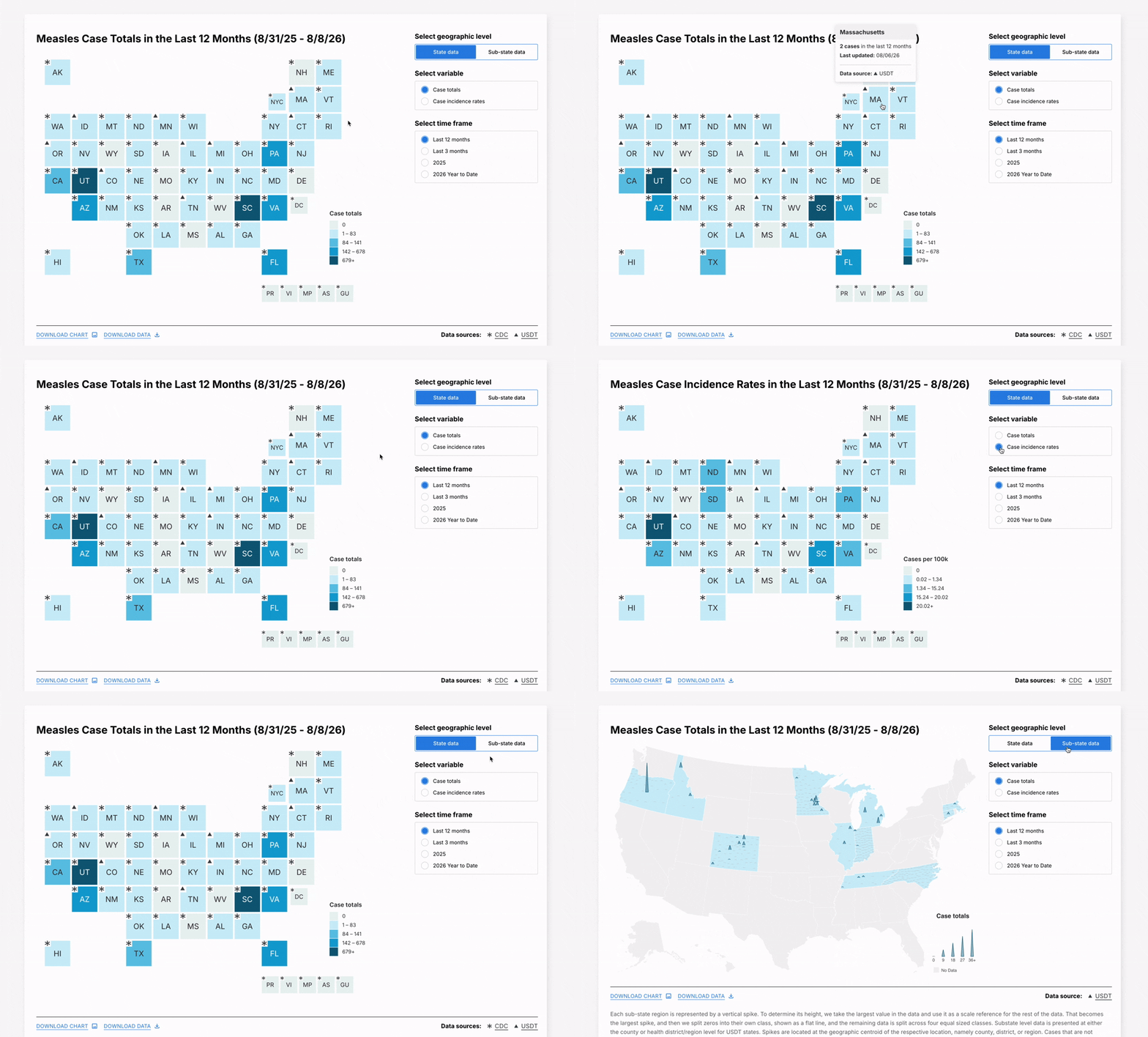
Montage image of U.S. Disease Tracker tool designed and built by Graphicacy for Johns Hopkins University.

"Graphicacy has been both efficient and thoughtful partners in this project, creating a high-quality end product that meets all our needs."


Lauren Gardner, Project Co-Lead and Director of Johns Hopkins' Center for Systems Science and Engineering

Interested in working on a project like this?