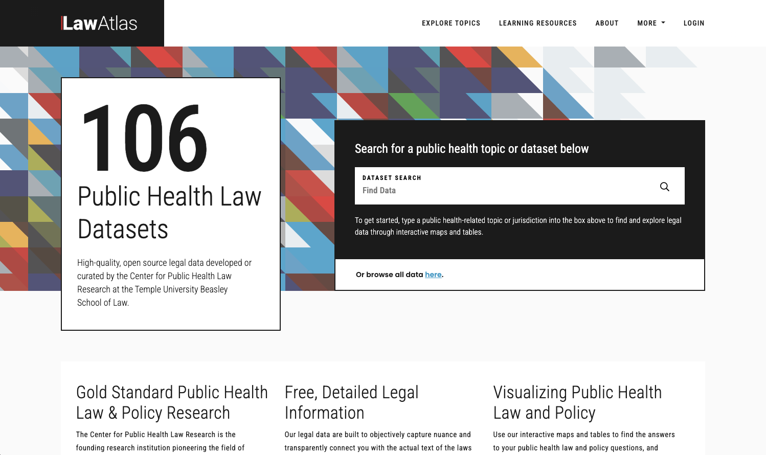
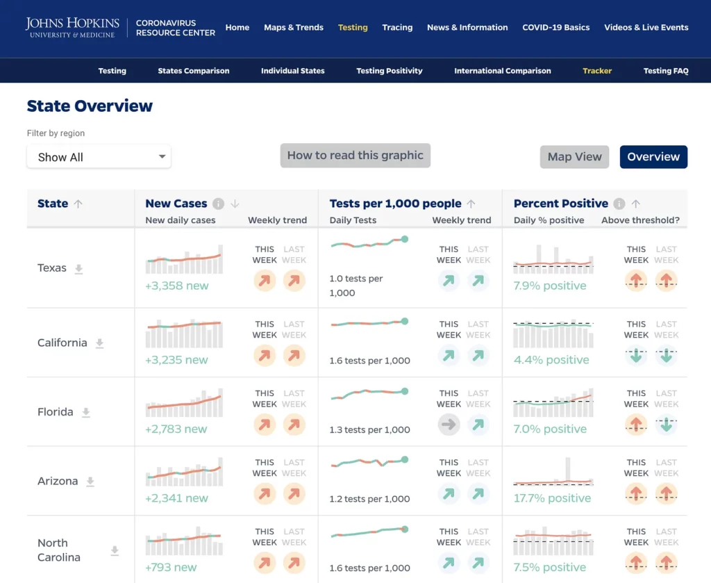
Graphicacy’s mandate was clear, but the challenge was steep: Organize volumes of complex legal data in an interface that was both useful to the legal community and intuitive for government and public health practitioners, advocates, journalists, and the general public.
Graphicacy, with design and engineering partner Eli Holder of 3 is a pattern, collaborated with the Center team to rethink the entire visual ecosystem—starting with a cleaner, interactive data visualization design to replace static tables and volumes of small type.
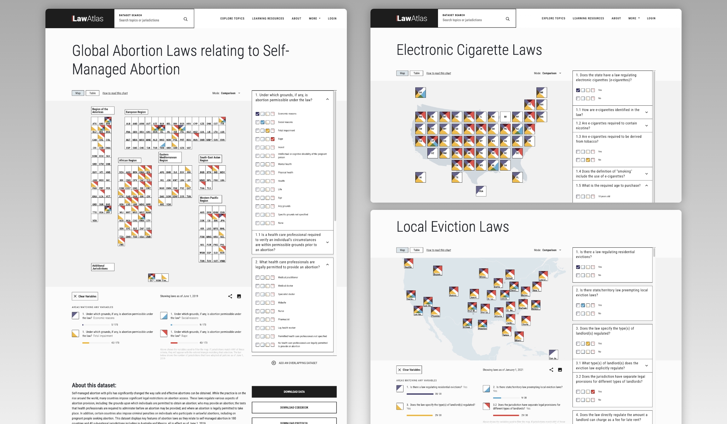
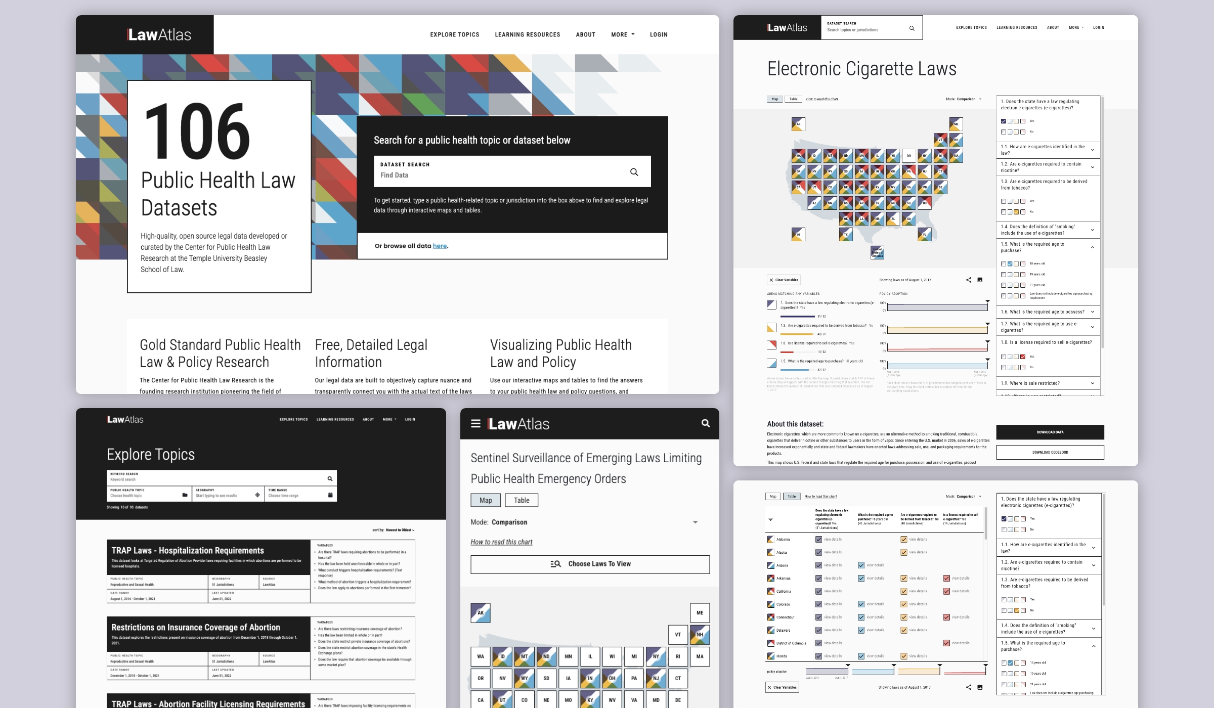
All told, the Center has more than 200 datasets users can explore, though only a handful of these were available at the time of design. Graphicacy worked with those most representative of the entire data spectrum to develop solutions encompassing all possible chart based and geospatial scenarios and displays, including a US tile map, fixed map, and global map.
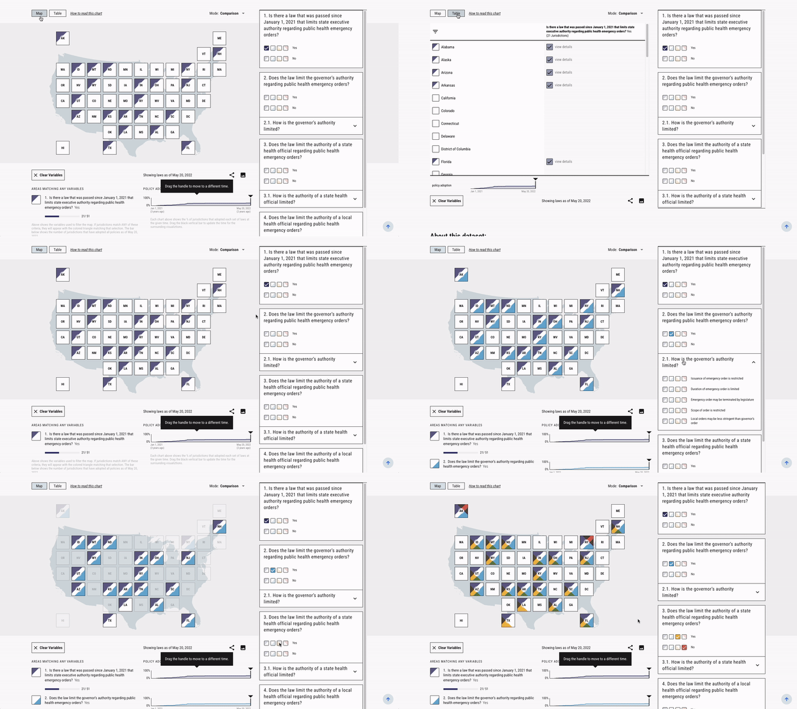
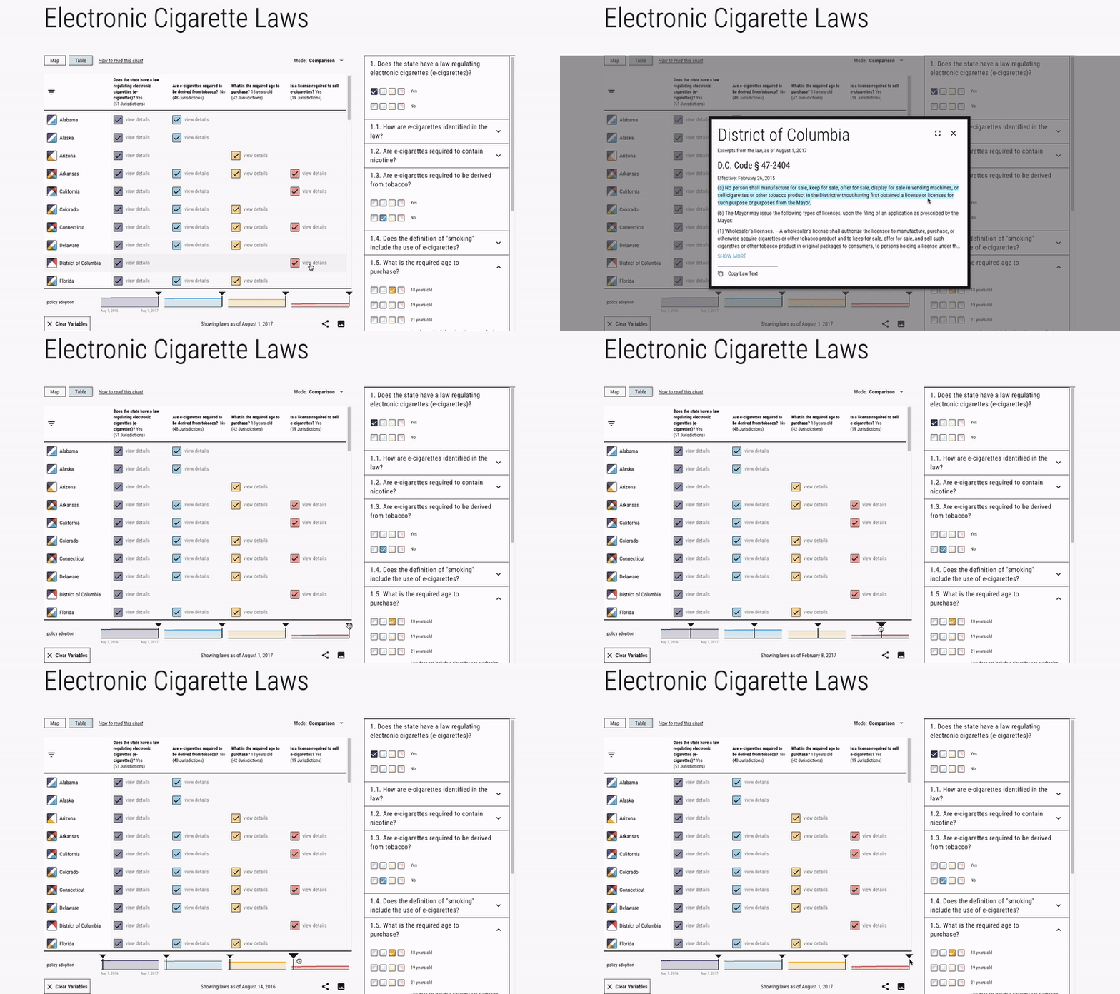
Within this new scheme, users have options to view data in tables or map formats, with simple black-and-white tiles representing states and local jurisdictions. They can read current laws and track their evolution into the past. Users can also filter using color-coded variables and create comparisons across maps based on a question-and-answer format.
Data overlap functionality enables users to see all data for a policy, such as abortion, in one visualization.

For global views, a conventional tile map would not be feasible due to a lack of horizontal scrolling space. Graphicacy considered the merits of geographical vs geopolitical displays and ultimately landed on a clean, grid-like global tile arrangement that matched the World Health Organization’s country groupings.
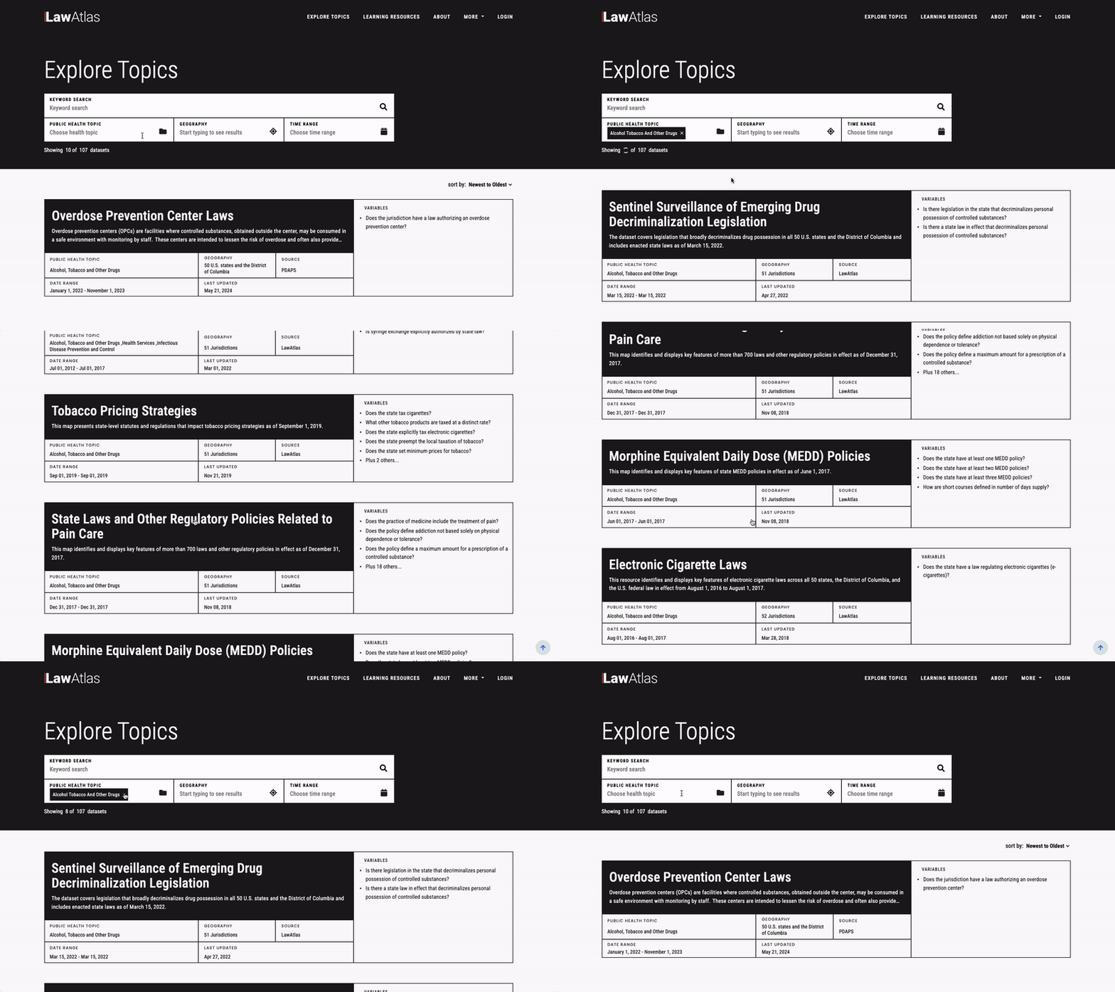
To enhance the tool’s searchability, Graphicacy indexed policy data by keyword, topic, and geography. The addition of new popup windows provide lay users with richer information as well as tips for making the most of LawAtlas and its data. Iterative testing with lawyers and other key audiences shaped the evolution of these features and other refinements.
