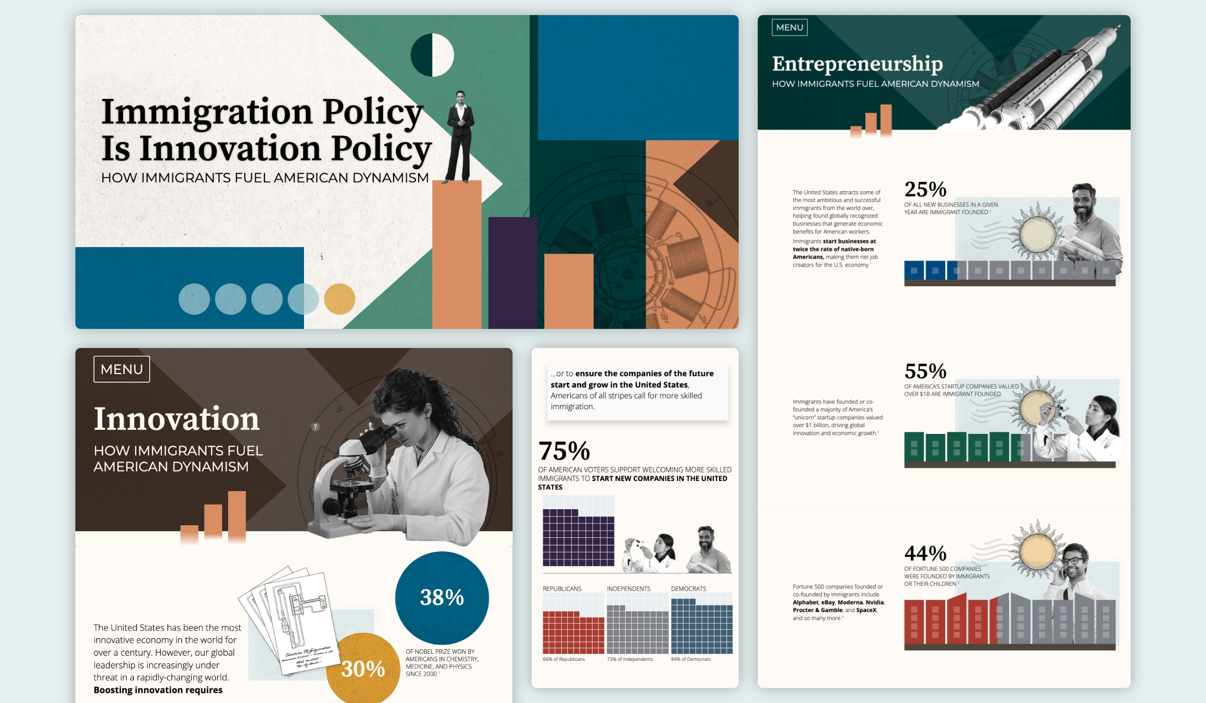
The Immigration Policy is Innovation Policy project makes the data-driven case for immigration in four sections: Entrepreneurship, Innovation, Revitalizing Communities, and A Bipartisan Way Forward. A full site menu, accessible at key junctures, allows users to jump to these topical chapters throughout the narrative thus facilitating a self-directed journey through the content.
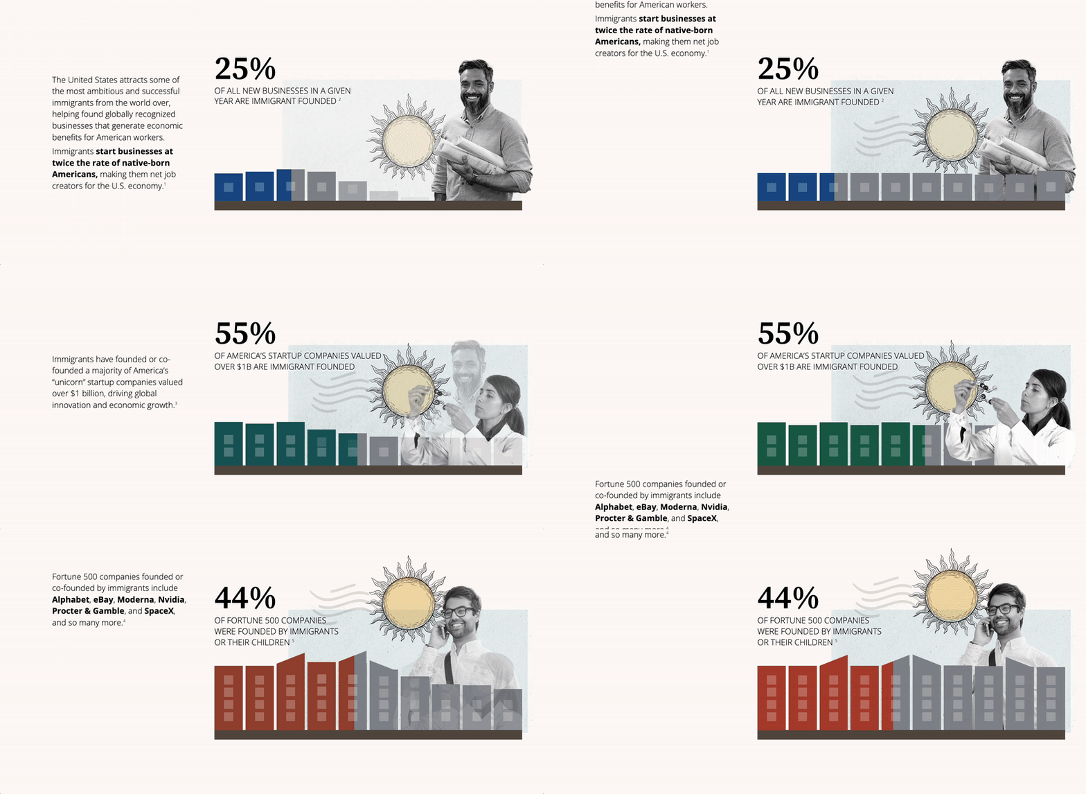
The Entrepreneurship section might surprise even those who believe in immigration as a positive force. For example, 55% of American startups valued over $1 billion were founded by immigrants.
For this and other sections, Graphicacy turned those numbers into dynamic, animated visuals. Visitors are presented key takeaways through a lively mix of scroll-triggered charts, maps, and interwoven photographs and illustrative elements that humanize, and bring historical context to, the scrollytelling experience.
The EIG story then tells how immigrants foster American commercial and scientific innovation. As one of a series of “chapter” openers, Graphicacy conceived a fade-in image of a woman scientist looking through a microscope, with expanding bubbles revealing key numbers: immigrants make up only 14% of the U.S. population but 30% of all American inventors and 38% of all American chemistry, medicine, and physics Nobel Prize winners since 2000.
To help make the point that America’s success has always included immigrants, Graphicacy incorporated clever contextual storytelling cues by, for example, animating a historical image of Tesla’s revolutionary patent.
In their research, EIG found that Americans of all ideological backgrounds support skilled immigration. The EIG team had struggled to convert the data into a clear and compelling visual, however. How could they both contrast the numbers for Democrats, Republicans, and Independents and show unity across all three groups?
Graphicacy’s designers developed a waffle chart showing an overwhelming 71% of all American voters backing skilled immigration. As the user scrolls, three separate dynamic waffle charts appear, each filling up to show each political affiliation’s support. With one quick scroll, Graphicacy turned a complex statistic into digestible data nuggets—and an easily understandable representation of consensus.
