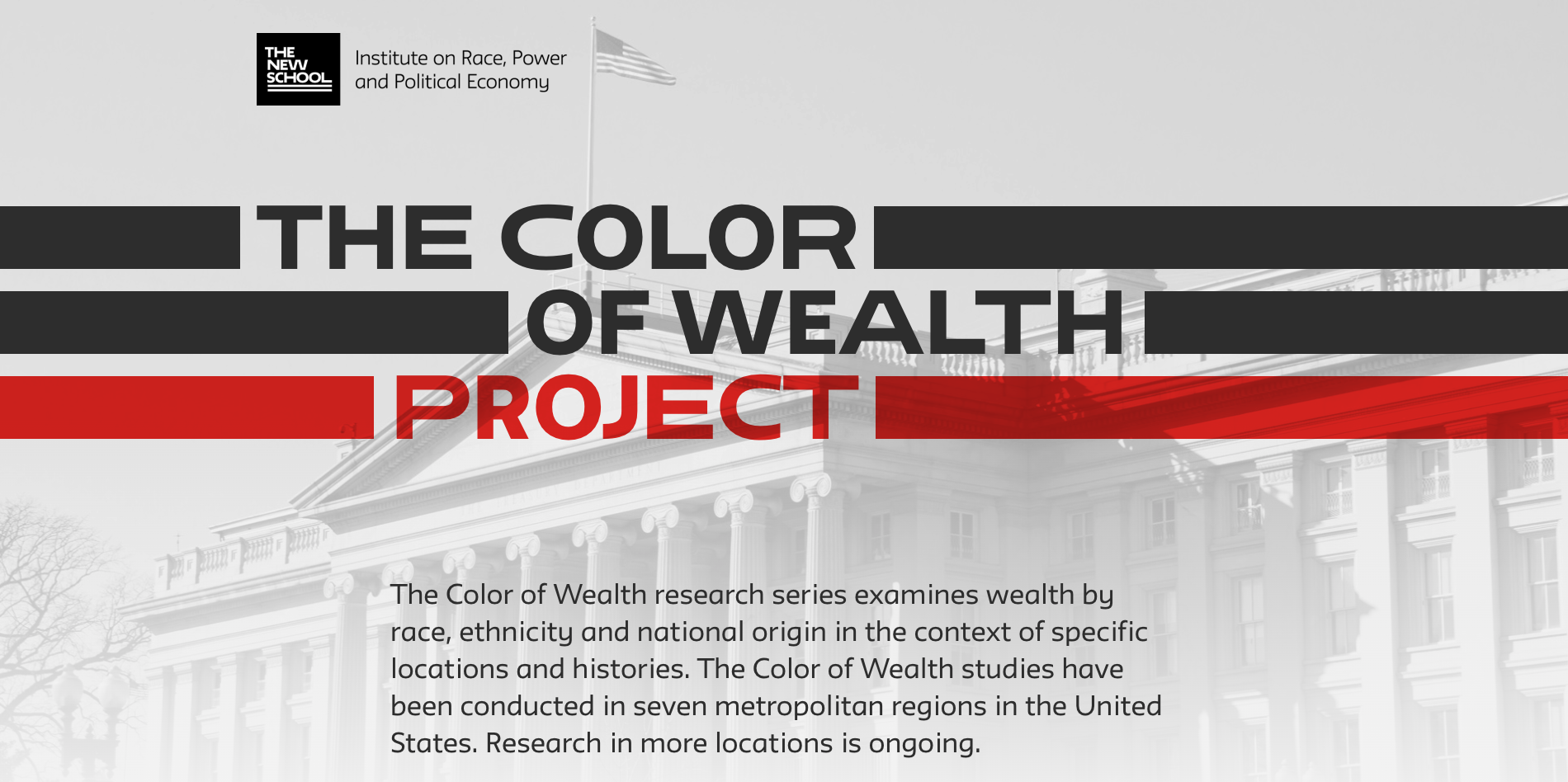
Unveiling Inequities: Visualizing Wealth Disparities in America, City by City

The New School: Institute on Race, Power, and Political Economy / 2024 / Economics, Politics & Government, Racial Equity

Hero image for The Color of Wealth Project, designed by Graphicacy for the Institute on Race, Power, and Political Economy.

Overview

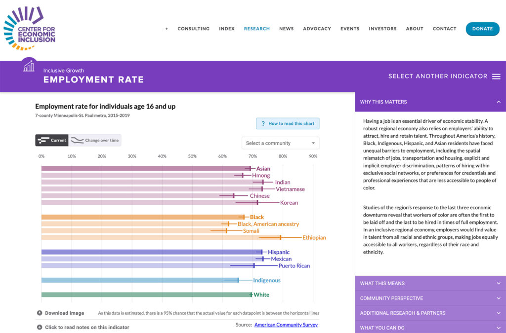
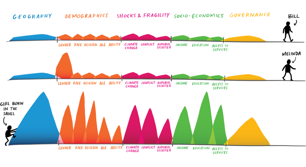
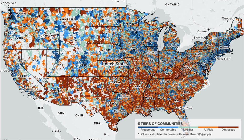
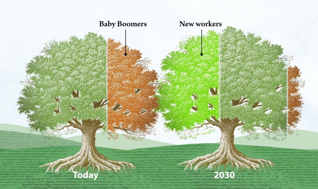
For The Color of Wealth, the Institute on Race, Power, and Political Economy at The New School partnered with Graphicacy to transform their extensive data on racial wealth disparities into compelling visual narratives. Through innovative scrollytelling, data visualization and motion graphic videos, Graphicacy worked to make this critical information accessible to a wider audience.

Background and Challenge:

Since 2014, Dr. Darrick Hamilton, the Henry Cohen Professor of Economics and Urban Policy at the Institute on Race, Power and Political Economy at The New School, has amassed a mountain of research and published numerous studies detailing the structural inequalities affecting this massive wealth gap, based on race and ethnicity.

Dr. Hamilton and the Institute had conducted their insightful research in several cities, but they wanted to make the roughly 50-page reports more accessible and digestible to a general audience.

They turned to Graphicacy to develop a visually engaging website, bringing more than 10 years of research to life and illuminating the differences in the wealth divide across select American cities through the Color of Wealth.

Opportunity and Solution:

Graphicacy created a dynamic visual home for the research at Colorofwealth.org.

Initially, Graphicacy created Color of Wealth visualizations for the Institute’s Chicago report, making it easy to navigate, read, and understand. To illustrate the structural and historical context for wealth disparities in Chicago, for example, Graphicacy used bar charts to keep the message clear and simple.

As the collaboration thrived, Dr. Hamilton asked Graphicacy to apply their digital storytelling expertise to six more cities’ reports:

  • Baltimore
  • Boston
  • Los Angeles
  • Miami
  • Tulsa
  • Washington, DC

Looking forward, the goal is to expand the Color of Wealth project and visualizations to cities nationwide.

Project montage image of Color of Wealth designed by Graphicacy for Institute on Race, Power, and Political Economy.

"Having the charts with animations and the takeaways right next to them matches our needs exactly. Graphicacy made this research not only accessible but highly engaging.”


Elaine Chang, Director of Technology & Innovation

Designing for Outreach and Promotion:

As the launch day for the Color of Wealth website approached, the Graphicacy team partnered with the Institute’s communications team to help get the word out and connect with a larger audience: a short collage-style, motion graphic video that recaps the Chicago story in under two minutes.

Working with their animation and editing partner, Margaret To, under a tight deadline, Graphicacy created a video that concisely explains the difference between wealth and income, adds in supporting data visualization and humanizing historical context, and ends on a hopeful note—all voiced by Dr. Hamilton himself.

“Graphicacy’s brief video smartly captures the essence of key points from our 55-plus page report. It not only transmits the information concisely, but its powerful visualizations help people understand — and hopefully inspires them to act.”


Suparna Bhaskaran, Director of Research Partnerships

Interested in working on a project like this?