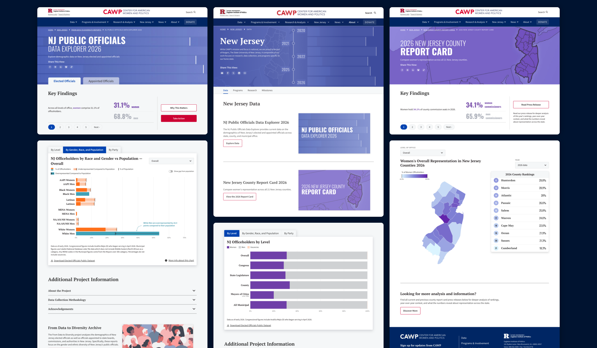
Transforming the From Data to Diversity Reports into a more engaging data explorer meant enabling users to see core information at a high level.
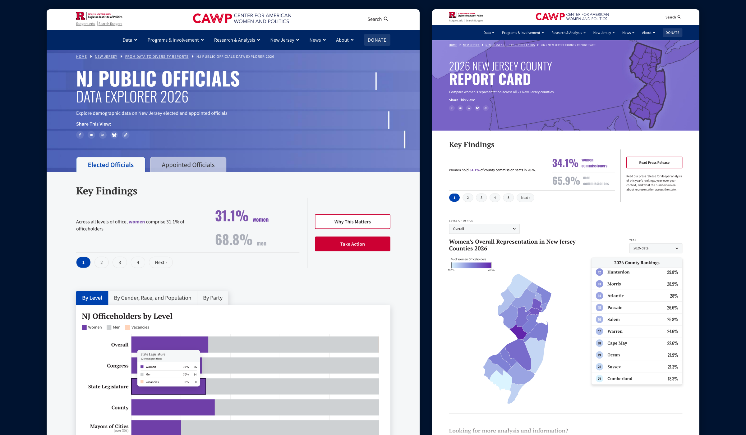
The explorer now features two primary tabs in the top navigation—Elected Officials and Appointed Officials. Beneath each tab appears a series of Key Findings with brief descriptions and related statistics called out. Users can sort Elected Officials by level of office, by gender, race and population, or by party. Options for Appointed Officials include gender as well as gender with race and population.
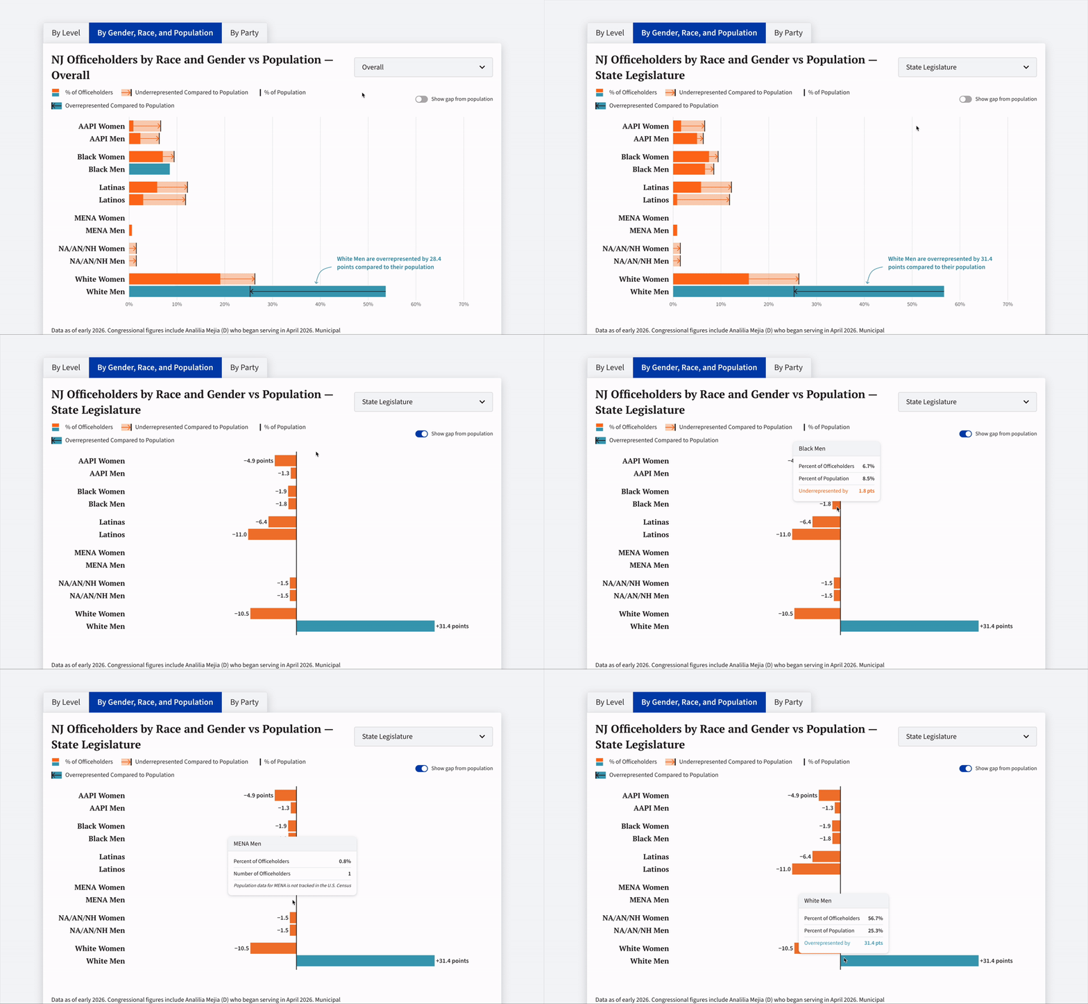
Graphicacy used distinct indicators to show under- and overrepresentation compared to the population. They also included a “Show gap from population” toggle that replots the chart on a central axis, turning each group’s representation into a diverging bar. Meanwhile, an animation component in the chart adds both clarity and a dynamic feel.
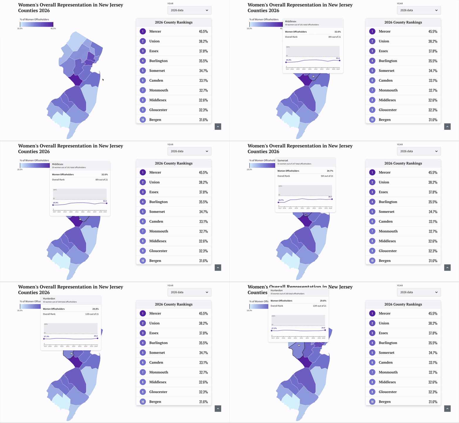
For the County Report Cards, Graphicacy again displayed a Key Findings section at the top of the page. An interactive New Jersey county map follows that allows users to filter by Level of Office and Year. Each county is shaded by the Percentage of Women Officeholders. The shaded color corresponds to the ranking table displayed alongside it.
Users can hover over a given county to see the percentage of women officeholders, where that county ranks compared to all others and how it has changed over time—a first for CAWP.
For both tools, Graphicacy integrated their work into CAWP’s Drupal content management system for simple updating, editing and expansion.