Women and U.S. Politics: Understanding the Story through Data

Center for American Women and Politics (CAWP) / 2026 / Gender Equality, Politics, Racial Equity

Screenshot of the redesigned CAWP (Center for American Women and Politics) homepage hero section, featuring a bold typographic headline reading 'Research + Education = Change' with 'Change' in red. A dotted circular pattern in light gray creates a diagonal visual element across the left side. The top includes the Rutgers Eagleton Institute of Politics branding and a navigation bar with dropdowns for Data, Programs & Involvement, Research & Analysis, New Jersey, News, About, and a Donate button.

Overview

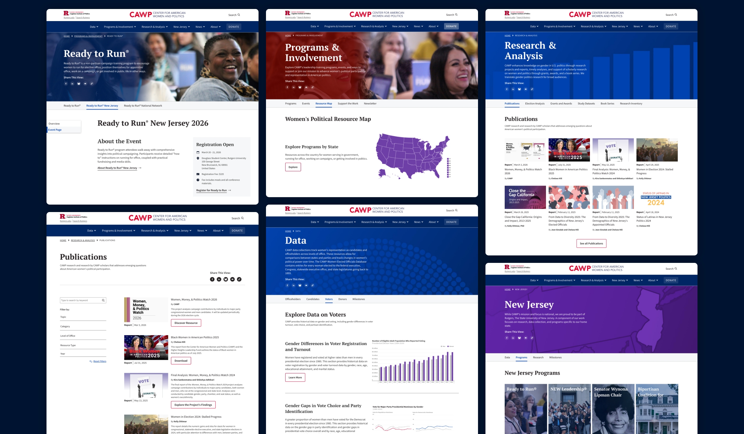
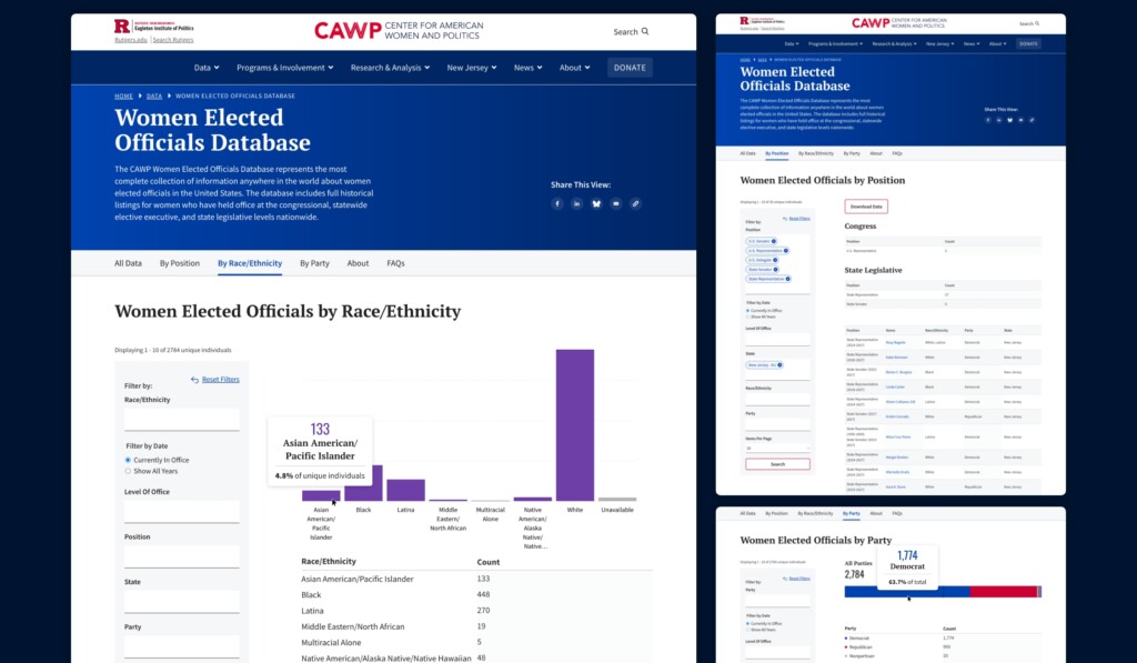
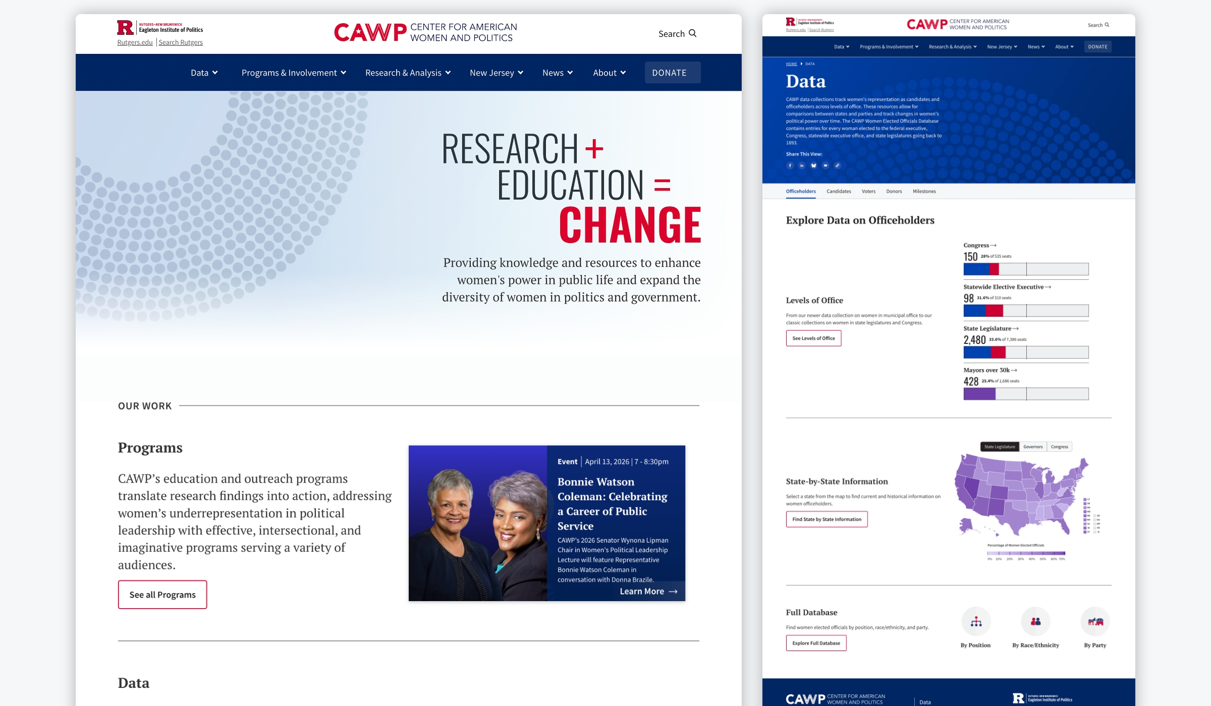
The Center for American Women and Politics (CAWP), a unit of the Eagleton Institute of Politics at Rutgers University, is the premier source of research, data and programming focused on women’s participation in governance across the U.S. In 2025, CAWP brought in Graphicacy to reengineer and redesign its digital properties to better serve its mission, visitors and staff.

Background and Challenge:

CAWP has spent nearly five decades acquiring and sharing information about the role of women in American politics, along with delivering programs that address gender discrepancies in civic leadership. During this time, its website evolved into a hub of essential content for journalists, academics, funders, practitioners and the general public. But as the site grew in size, it also grew in complexity. As a result, CAWP wanted to make their site simpler to navigate, so valuable information was easier to find.

CAWP gained firsthand familiarity with Graphicacy’s data visualization expertise through two previous projects focused on campaign contributions and the gender divide in campaign financing. This third engagement involved a three-part website overhaul: upgrading the site’s look and functionality, creating new data visualizations and adding even more data to the experience.

Opportunity and Solution:

Graphicacy and CAWP worked together to identify which elements of the existing site to keep or discard. These decisions guided the creation of six primary sections that streamlined the navigation.

The landing page for each section guides users to tabs that direct them to what they’re looking for without excessive scrolling. Local navigation features on the site’s interior pages allow users to move between related content within each section.

This cleaner user experience is reflected in the site’s enhanced look and feel. Visitors find consistent page structures within a style that incorporates photography along with design elements that echo the site’s many charts and graphs.

CAWP Website Montage

An Integrated Database:

For the data section, one of the most popular destinations within the CAWP site, Graphicacy transformed existing data and text into a variety of custom visualizations—including interactive bar charts, line graphs, tables, maps, milestone timelines and other components—that meet users’ needs for in-depth information at a glance.

Another aspect of the work involved a second sizable database. For years, CAWP maintained the Women Elected Officials Database, a separate site cataloging every woman elected to federal executive office, Congress, and state executive offices and legislatures going back to 1893. Graphicacy integrated the database with the main site to realize significant time and cost savings, as each site had used different versions of Drupal for its content management system (CMS).

Montage image of the Women Elected Officials Database Redesign

Graphicacy also upgraded the backend experience for the combined database. Because the world of elections and public leadership changes frequently, CAWP wanted to make their new site easy for their teams to add new data, update events and alter layouts, unassisted. An upgraded Drupal CMS met this goal, along with modular building tools that simplified the process for making changes.

Side-by-side mockup of the redesigned CAWP website. On the left, the homepage hero section features the headline 'Research + Education = Change' with a geometric dot pattern and navigation bar. On the right, the Data landing page shows a blue hero banner, followed by sections for Explore Data on Officeholders with stacked bar charts breaking down women's representation across Congress, Statewide Elective Executive, State Legislature, and Mayors over 50k. Below, a State-by-State Information section displays a choropleth map of the U.S. colored by percentage of women elected officials, and a Full Database section with icons for searching by Position, Race/Ethnicity, and Party.

“We really appreciated Graphicacy’s input and attention to detail at every phase,” said Hill. “Even beyond their design and engineering work, their project management processes kept us focused and ultimately delivered a useful site we can be proud of.”


Chelsea Hill, Director of Data

Interested in working on a project like this?