Graphicacy collaborated with Vera to build an intuitive, interactive entry point into the data. The goal was to create a landing page that was inviting, engaging and allowed for an immediate grasp of the connection between incarceration and economic outcomes.
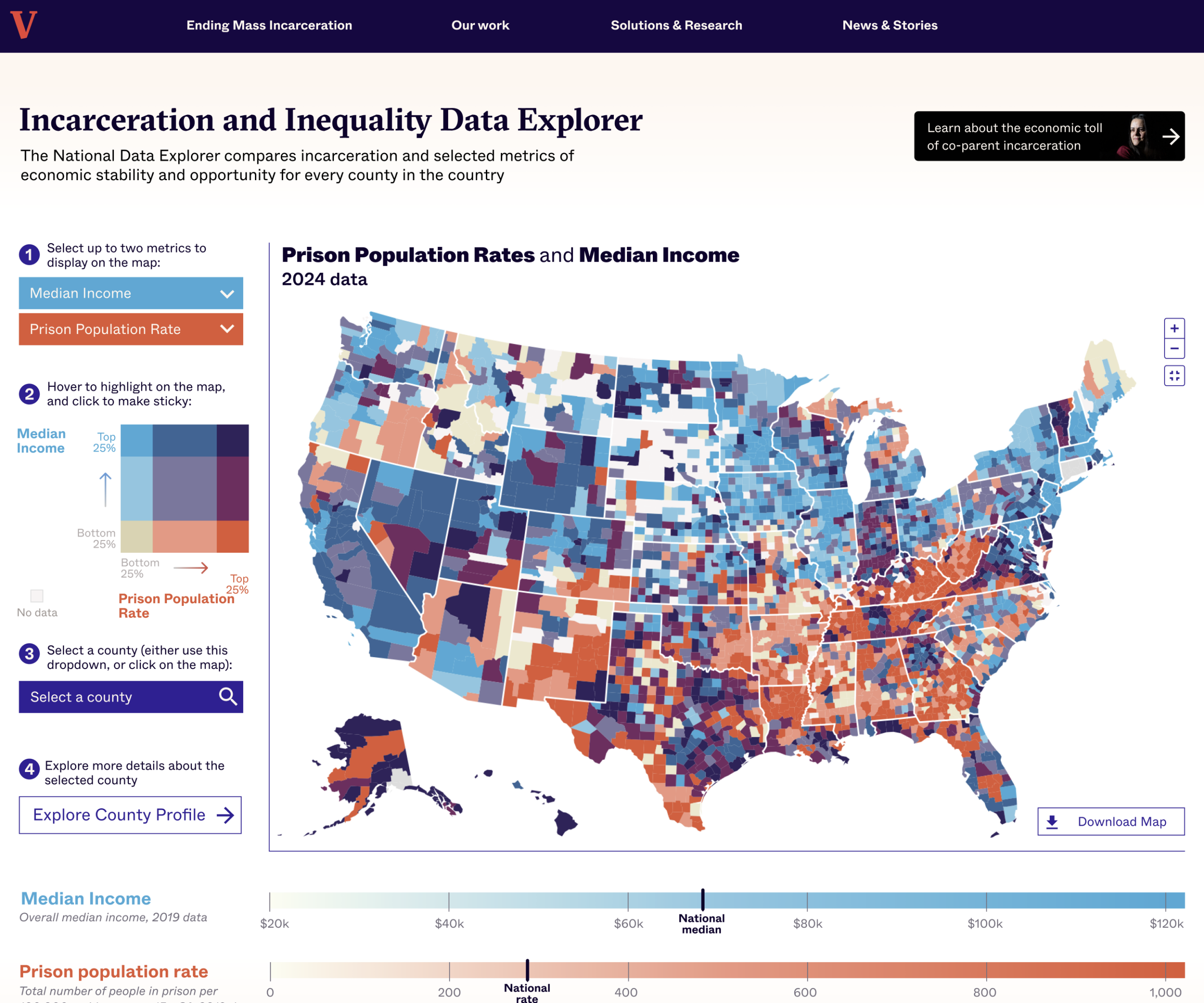
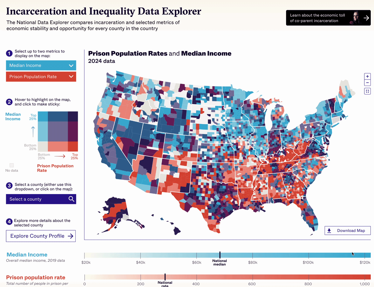
During an in-depth discovery process, the teams looked at ways to present the massive amounts of data to users. Their solution involved a bivariate county-level map of the U.S., on which users can superimpose two metrics over the same area. When two metrics are selected, the data is binned into nine groups, which are selectable by clicking on the legend. Users can isolate specific groupings, such as counties with High Incarceration Rates and Low income.
To help aid map navigation, Graphicacy designed an interactive layering approach. A user picks a single metric, sees that data on a continuous color scale, then layers on a second metric. Allowing the user to control the metric layering process invites deeper exploration and discovery.
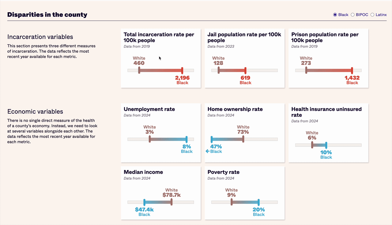
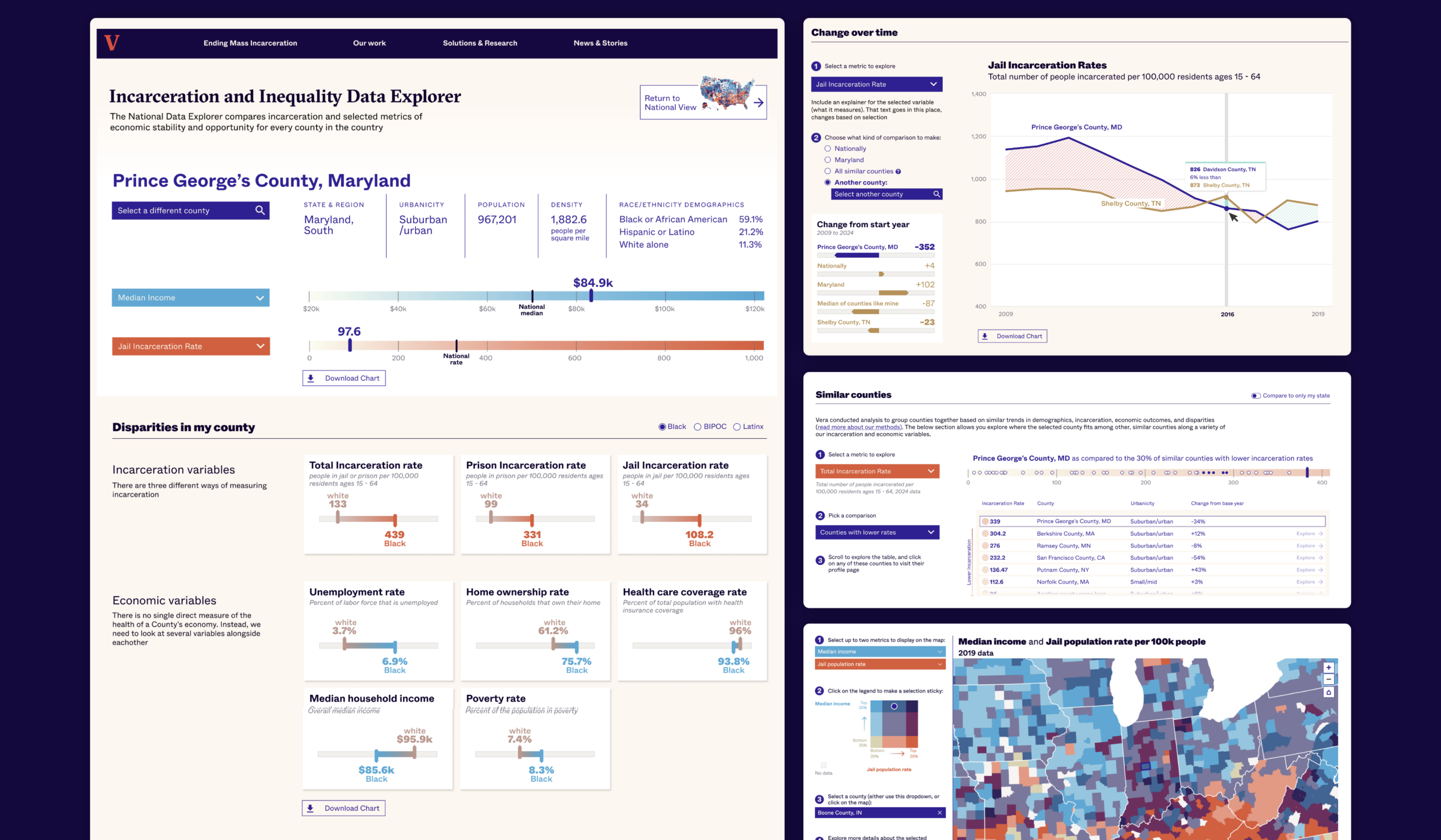
From the landing page, users can click through to a dedicated page for each county. These pages provide insights that can lead to actionable change. For instance, the first main section focuses on disparities across races/ethnicities, showing any gaps in incarceration rates, employment and more among white and either Black, BIPOC or Latinx residents of the given county.
In the second section, users can compare counties to identify places with similar economic, demographic and criminal justice profiles that have found ways to send fewer people to prison and jail.
The final section on the county page shows change over time, so users can see how incarceration or economic variables have improved or worsened. This data appears in comparison to a reference line, which users can switch out to pick whichever comparison is most meaningful for them. When it’s time to share their findings with policymakers and other decisionmakers, users can easily download the county charts for their own presentations and content.