Timeplots posters

Graphicacy / 2016 / Politics & Government
Overview

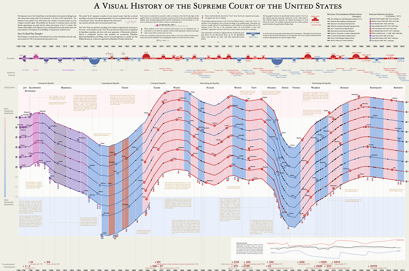
Timeplots are carefully crafted, large format posters that provide a clear, comprehensive perspective of a specific subject.  Every product is created to be lasting information art that reveals new patterns and details upon repeated viewings.  Our current roster includes Visual Histories of the American Presidency, the U.S. Supreme Court, the U.S. Senate and the U.S. House of Representatives, the Democratic Party and the Republican Party, U.S. State Boundaries –and– Death & Taxes, depicting recommendations for how the annual U.S. budget was to be spent.

Background & Challenge

Our first completed public project was a three-part series of large-scale prints visualizing the history of major U.S. political institutions: the American Presidency, the U.S. Supreme Court and the U.S. Senate. With this project, we had several primary goals: to capture the full sweep of the nation’s political history, to give each individual justice and president and senator a place within that history, and to locate landmark judicial decisions and major legislation in context. The overarching aim of Timeplots is to build a library of such ambitious visuals; some of which will be prints, and some that will be online and interactive.

We also offer a service for custom Timeplots—“Timeplots on Demand”—for institutions and individuals seeking to map their own history or that of a specific issue or subject. For a political software firm, for example, we created a giant Timeplot of notable events in the company’s history, including every new hire, acquisition of key clients, and photos of each employee.

The challenge of this particular project was to find the right balance between creating beautiful, at-a-glance information art, and our desire to craft “canonical” data-rich posters that were packed with so much information they invited study and repeated viewings.

Solution

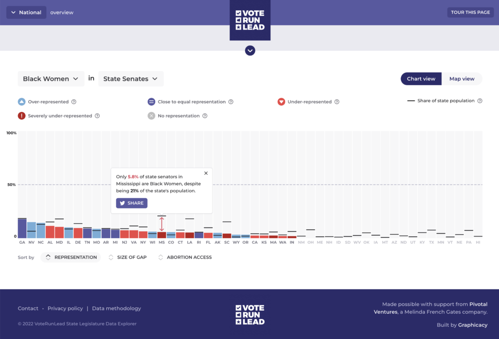
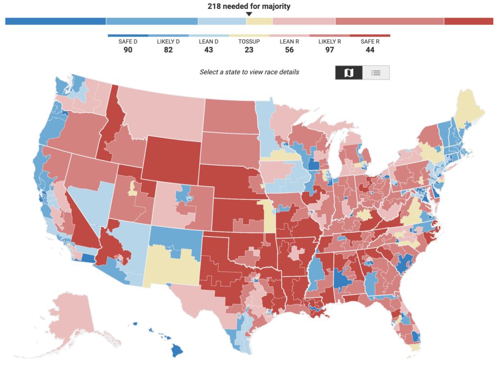
Given the density and complexity of information presented for each topic, the Graphicacy design worked to make sure that every poster had at least one dominant image to anchor the page. Interactive online companions for the print posters were often created to give viewers the chance to explore the information further in a less curated fashion.

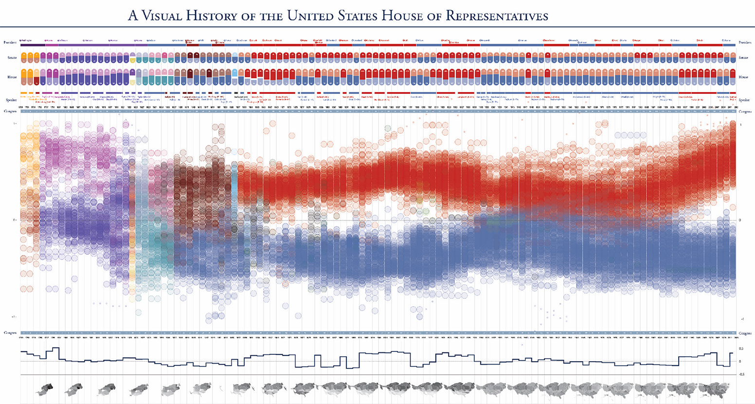
  • When Graphicacy made the Visual History of the House of Representatives Timeplots poster, we created a dot for each person who has ever served in Congress. Readers can sort parties and states to see the ideological patterns of a particular group over time. People are often surprised by the diversity of political parties in the 18th and 19th century, before they began to simplify into the two main groups we have now.
  • Our Death & Taxes poster visualizes the President’s budget proposal each year. We also built an interactive companion that shows our nation’s financial priorities. Readers can explore where the money goes, find the government agency they are interested in, and compare and contrast the current budget with a budget from previous years.
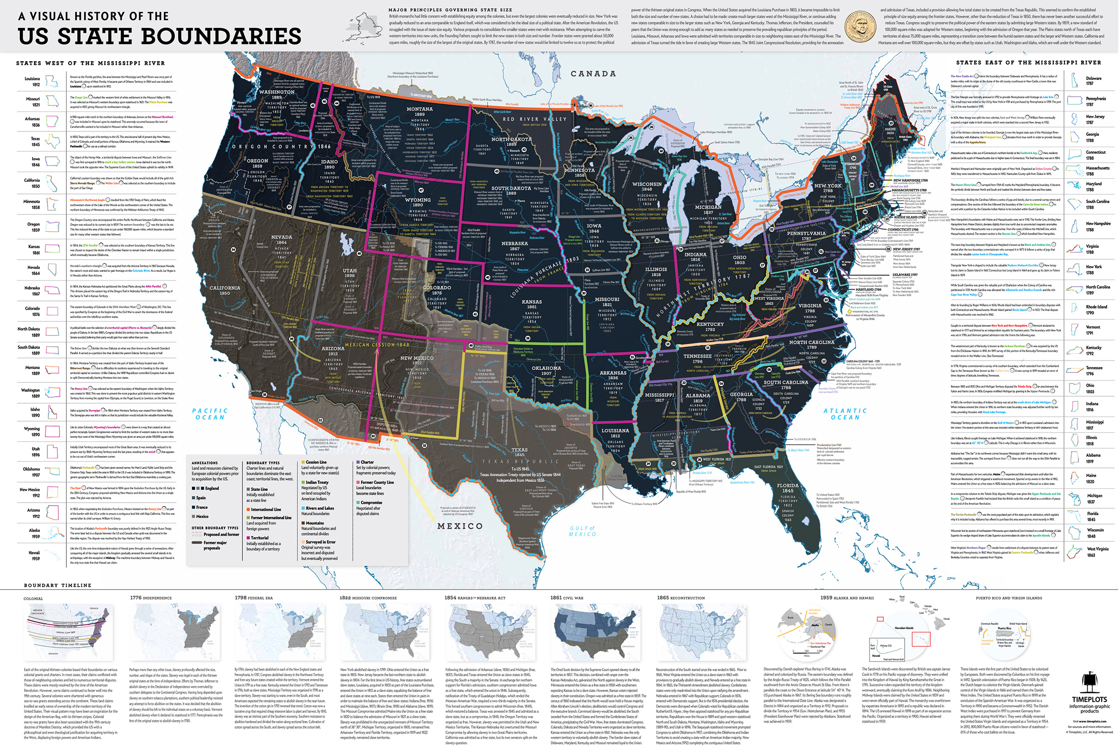
  • Why do we have oddities in our state boundaries? Consider the Delaware semi-circle, the Idaho stovepipe, and the Missouri bootheel. Some reasons are political, some geographic, and some purely accidental. The History of State Boundaries poster and interactive introduce the origins and evolution of state boundaries in a way that makes obscure stories more playfully accessible to the general reader.
A map showing the history of U.S. State borders, as part of the Timeplots series of posters

Interested in working on a project like this?