Revamping Pew’s Fiscal 50 with Dynamic Visualizations

Pew Charitable Trust / 2024 / Economics, Politics & Government

Collage of various examples of charts on the Fiscal 50 website. The top row includes a scatter plot with trend lines showing population change, a horizontal bar chart depicting unfunded pension liabilities, and a grouped bar chart with a line graph illustrating population change drivers. The bottom row contains a choropleth map showing states living within their means, a line chart with shaded areas representing gaps between revenue and expenses, another choropleth map for Medicaid spending, and a series of small multiples featuring bullet charts, line charts, and dot plots highlighting fiscal indicators such as revenue, expenditures, and population change. Each chart uses different graphical elements to illustrate the data.

Overview

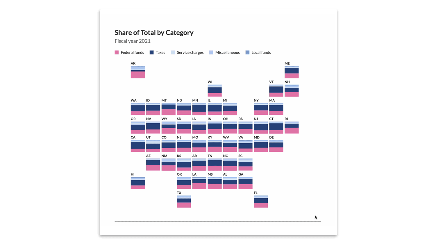
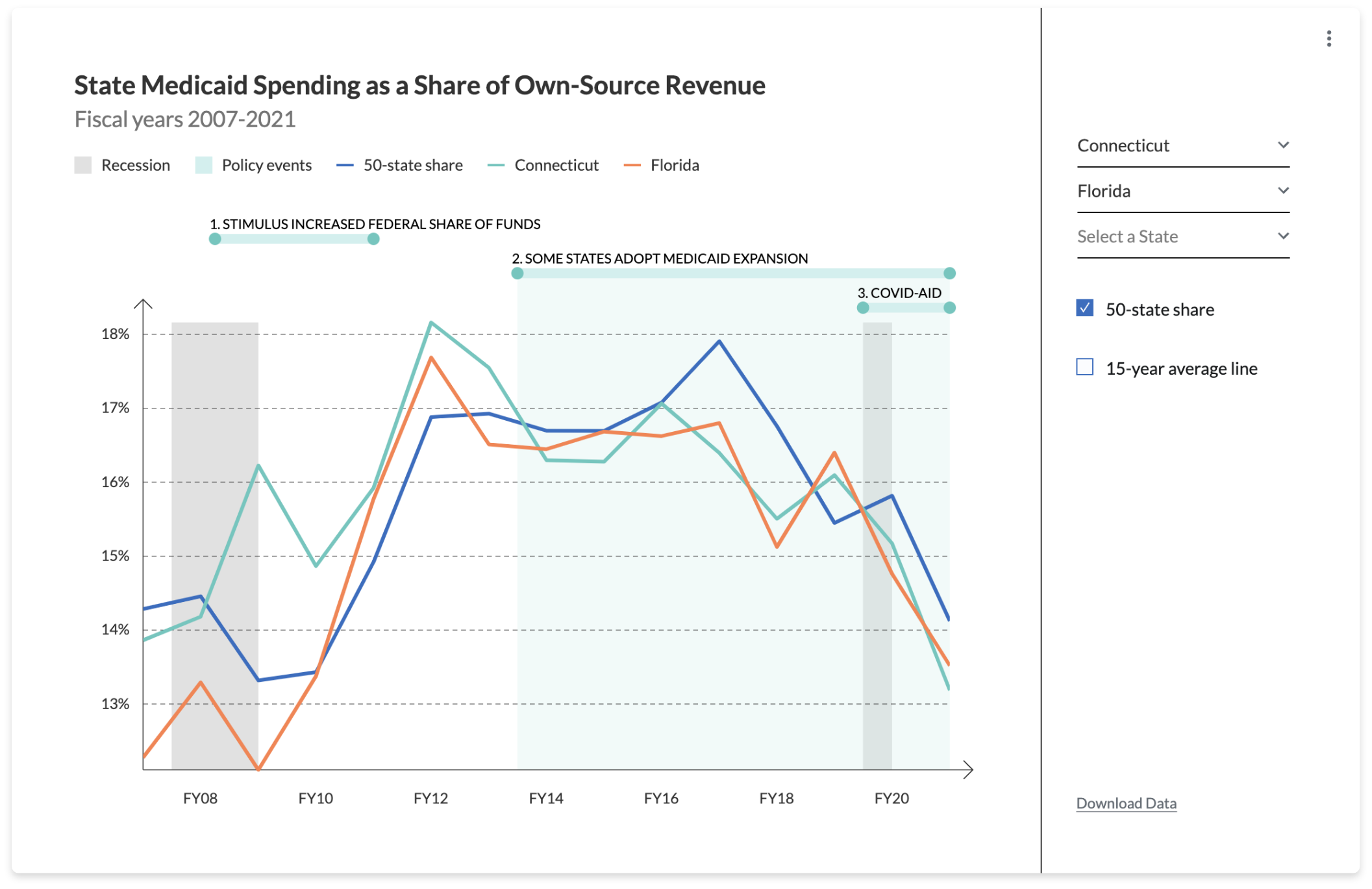
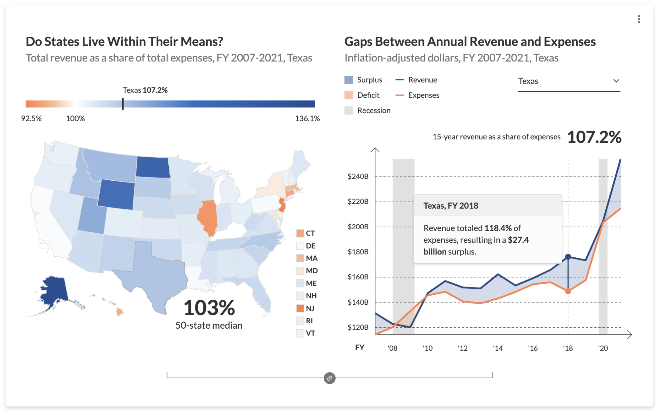
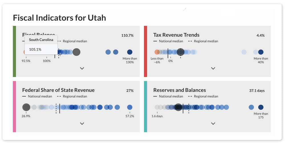
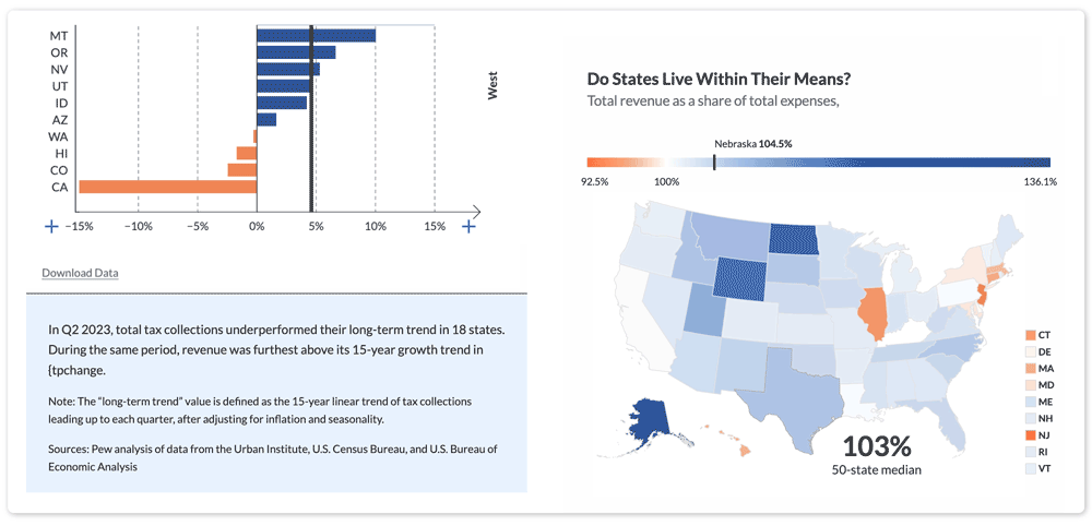
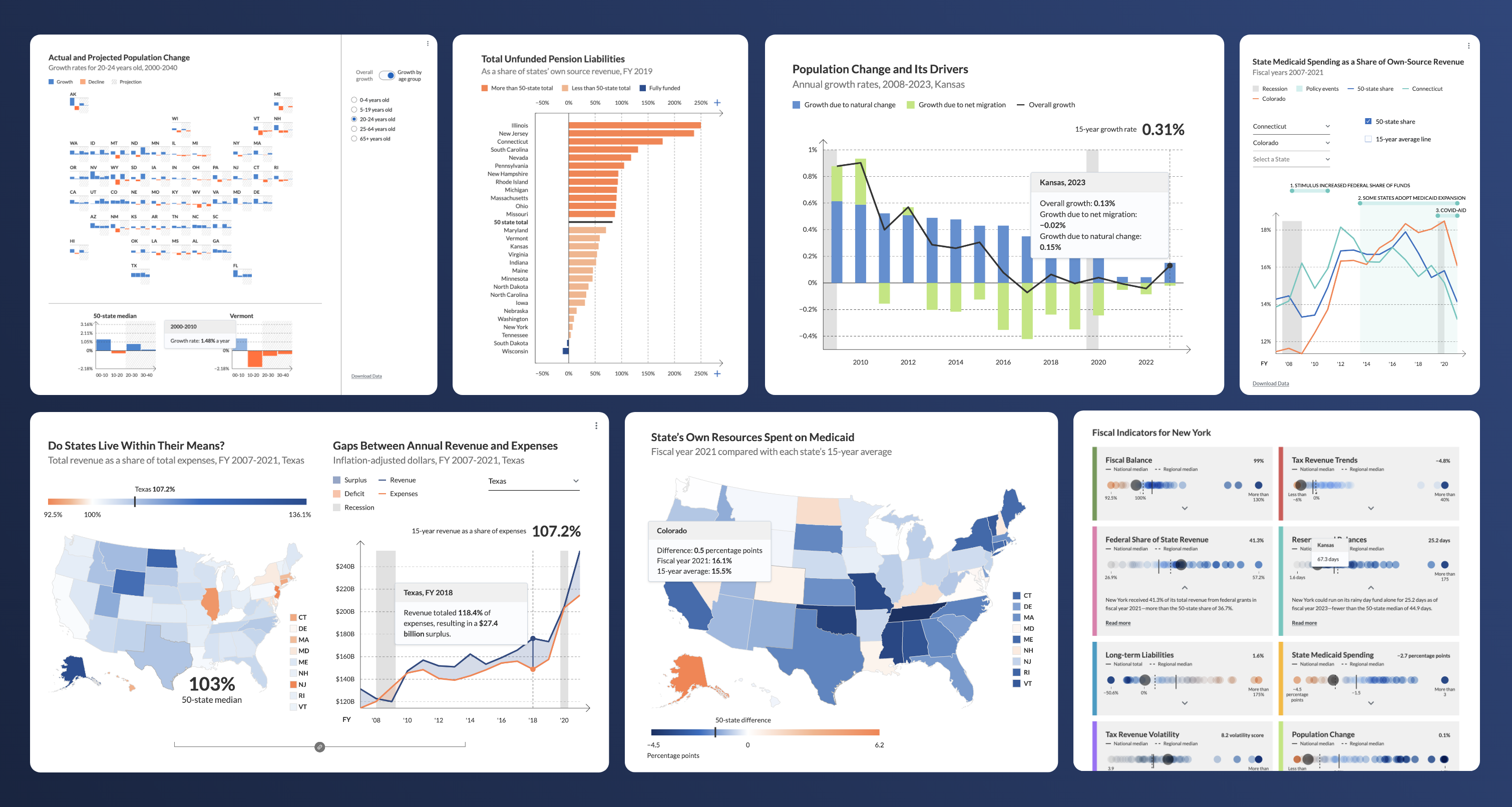
When their respected Fiscal 50 website needed refreshing, The Pew Charitable Trusts connected with Graphicacy to make it mobile-friendly and modern, complete with new state-specific pages.

Background and Challenge:

The Pew Charitable Trusts launched the Fiscal 50, which aimed to help policymakers at the state and national levels, the media, and the public understand what drove long-term budgetary trends, in 2013. The innovative site featured interactive graphics for fiscal and economic indicators that measure states’ long-term financial health, and 50 soon became a respected resource. But, as it celebrated its 10th birthday, the site was starting to show its age.  

It was time for Pew to reimagine things, to continue to meet users’ needs and expectations while shaking things up and experimenting with new approaches. 

Pew turned to Graphicacy to rebuild the Fiscal 50 site from top to bottom and to produce a platform that Pew could expand upon by adding more chart views over time and easily updating the data on their own. 

Opportunity and Solution:

Graphicacy welcomed the challenge to redesign and develop a responsive suite of charts with an enhanced state-level focus, bringing the Fiscal 50 into the modern era. Graphicacy also created an inventive process for Pew to update text and figures on their own as new data rolled in.

Graphicacy built dynamic state-specific profile pages that combine data and research insights from Pew’s fiscal teams. The pages display the performance of eight key indicators for each state, and every indicator has an interactive plot dot, which can be expanded to show more detailed information.

GIF image showing the 'Fiscal Indicators for Florida' page. The page features interactive dot plots and other visualizations. The top left section displays 'Fiscal Balance,' with a dot plot comparing Florida's revenue to its expenses from fiscal year 2007 to 2021. The top right section shows 'Tax Revenue Trends,' with a dot plot illustrating how Florida's tax collections in Q2 2023 compare to its 15-year trend. The bottom left section, 'Federal Share of State Revenue,' features a simple text and number indicator showing Florida at 38%. The bottom right section shows 'Reserves and Balances,' with Florida's days of operating costs available in reserves listed as 22.5 days. Each dot in the dot plots represents a different state, and clicking on a dot changes the state page to the selected one, demonstrating the interactive nature of the visualizations.

Another key feature Graphicacy created is data-driven text, which allows Pew to write narrative text with tokens that can be replaced by data values. These are updated on the fly to show the current data displayed in the charts.  

Ultimately, the data-driven, dynamic captions will lighten the load on Pew’s team while retaining the in-depth analysis the organization is known for.  

To allow for frequent site changes, Graphicacy produced a toolkit for the Fiscal 50 team. Ongoing collaboration with Graphicacy will allow Pew to leverage the toolkit and achieve maximum benefit from it. 

Two side-by-side visualizations demonstrating data-driven text features. The left chart is a horizontal bar chart showing the share of total tax collections by state in the Western U.S. compared to their long-term trend for Q2 2023. States with negative trends are shown in orange, and states with positive trends are shown in blue. Below the chart, there is a text box with a summary stating that total tax collections underperformed their long-term trend in 18 states, with revenue furthest above the trend in Alaska (1040.9%) and furthest below in California.

The right chart is a choropleth map titled 'Do States Live Within Their Means?' showing total revenue as a share of total expenses for FY 2007-2021 across U.S. states. The map uses shades of blue and orange to represent states that are above or below the 100% threshold, respectively. Texas is highlighted, with a tooltip indicating that Texas' revenue totaled 107.2% of its expenses. The map includes a color legend and a note indicating the 50-state median of 103%.

“The partnership between Graphicacy and Pew has leveraged everyone’s strengths. We felt heard by Graphicacy throughout and were impressed with their willingness to learn our language and embrace the secret sauce that has made Fiscal 50 work so well over time, all while pushing us to do more than we’d hoped.”


Melissa Maynard, Project Director of State Fiscal Health at The Pew Charitable Trusts

Interested in working on a project like this?