Over nine months, Graphicacy and Urban worked hand-in-hand to build the new Upward Mobility Data Dashboard on a foundation of data capturing Urban’s 24 indicators for every U.S. county, as well as 480+ cities with a population over 75,000.
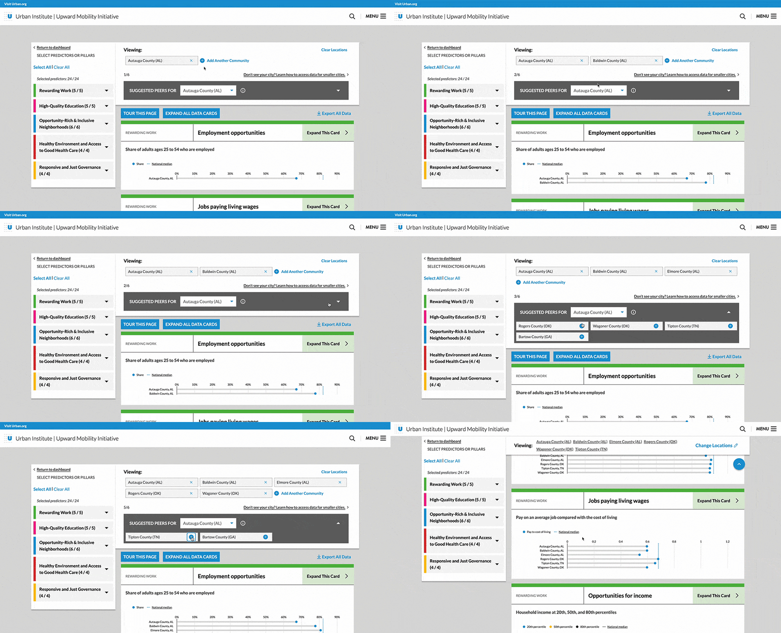
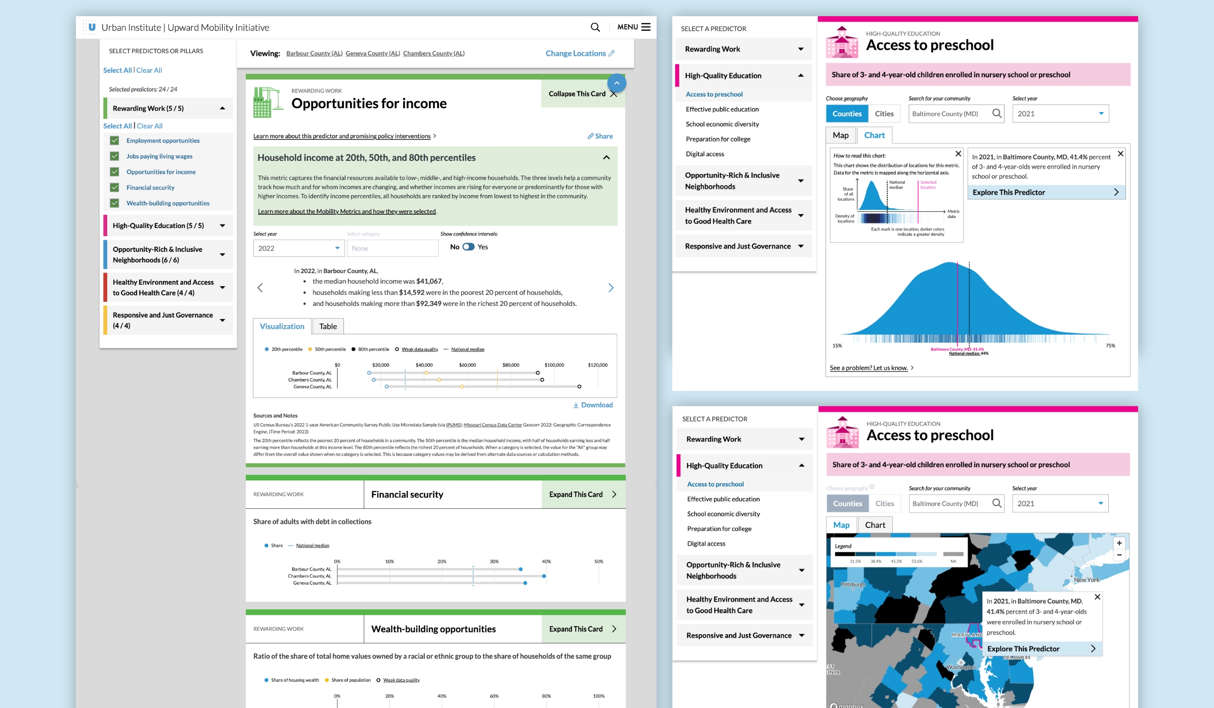
Graphicacy introduced new search functionality enabling users to select up to six communities for direct comparison through creative data visualization of predictors.
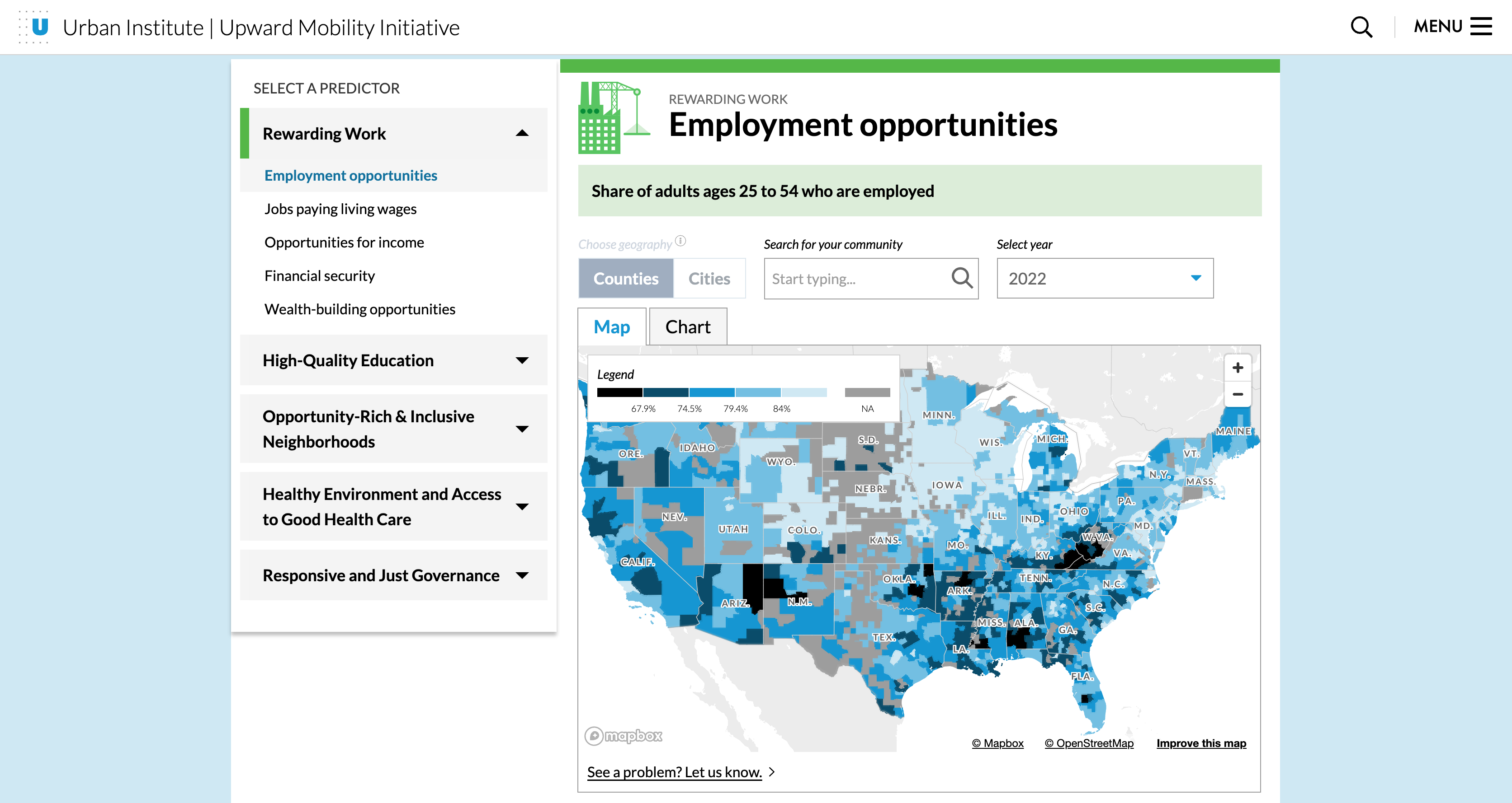
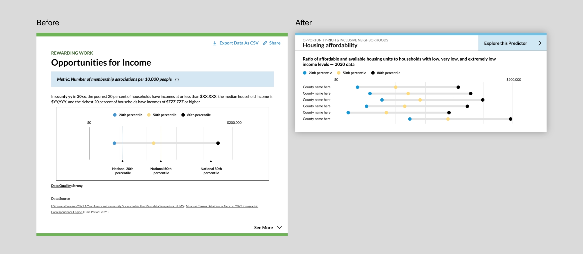
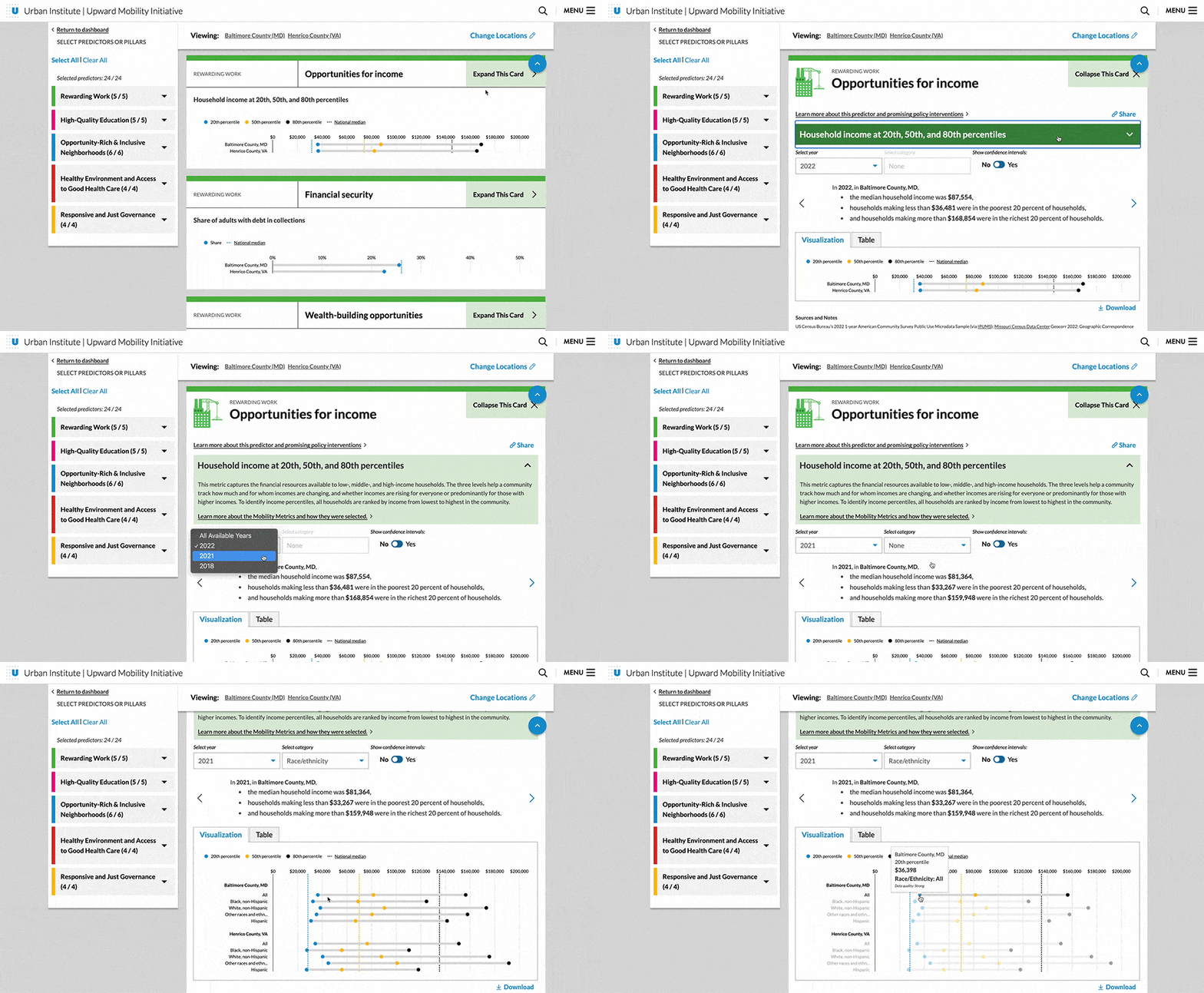
Users can see country-wide variation for a chosen metric on a map view or in a distribution chart. From there, they can dive into a single location and see more details in data cards, which reveal snapshots of a community’s performance across the 24 predictors.
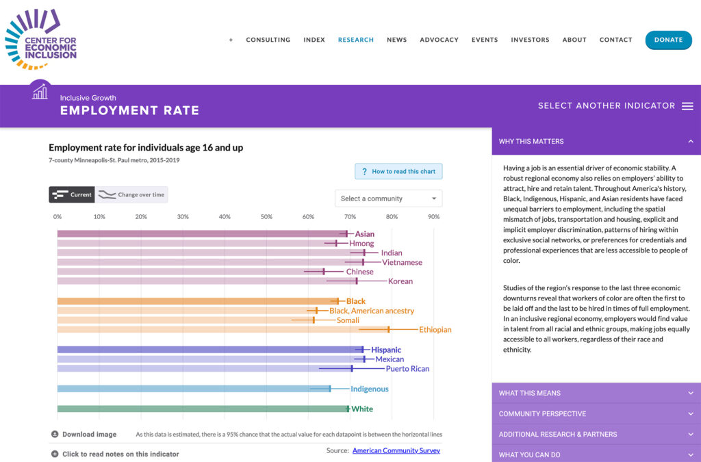
Users can also explore how conditions differ across racial and ethnic groups, age ranges and gender identities, among other characteristics. They can disaggregate some data for closer examination and to see how predictors and metrics affect different populations.
To inspire continued action, the dashboard directs people to guides and other tools designed to help them better understand their community’s data and determine their next steps. Users have the option to download the dashboard’s charts for use in presentations or generate links to share with colleagues and others interested in toppling barriers to upward mobility.
