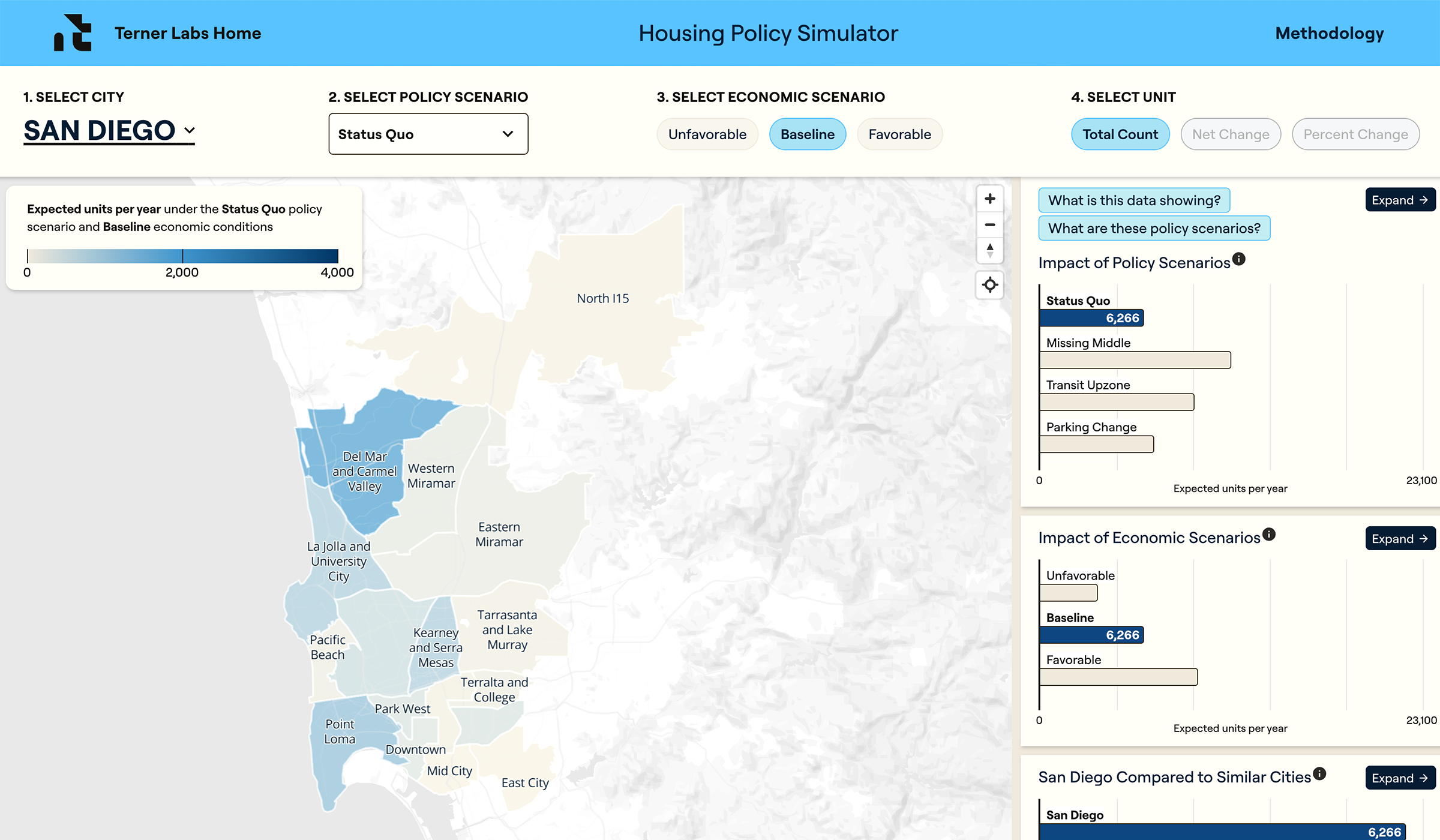
The first step involved choosing which, and how much, data to highlight. Terner’s archives drill down all the way to individual neighborhoods. In map form, however, those troves of fine-grained data would be difficult to interpret.
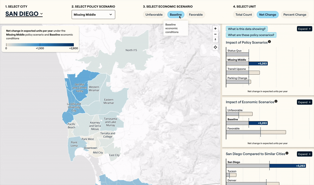
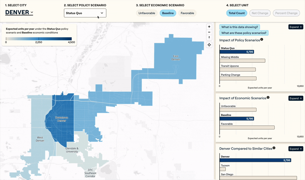
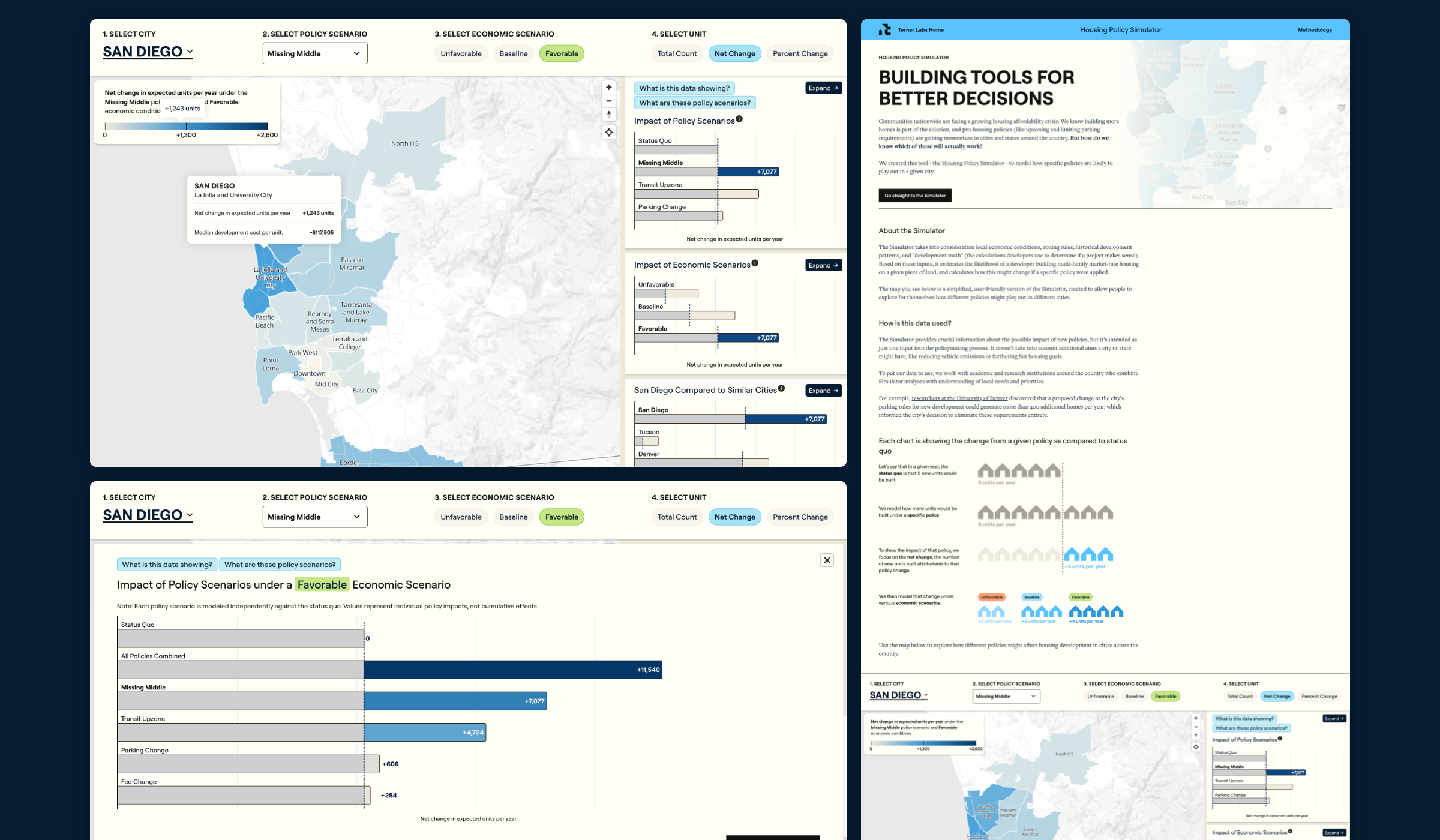
For each city included in the simulator’s initial iteration—Denver, San Diego and Tucson—Terner aggregated their data into subzones that smooth outliers but still show geographic trends the general public can relate to. Graphicacy then set up the development infrastructure to allow Terner to upload geographic shape files and label the neighborhoods in the tool. Users can see how certain policy scenarios (e.g., upzoning, parking changes and fee changes) combined with economic scenarios (baseline, unfavorable and favorable) impact the number of units developed.
The project’s next phase involved turning the chosen data points into user-friendly diagrams capturing baseline and net changes. Graphicacy balanced the color mix to provide the right amount of contrast—vital for depicting comparisons and degrees of change.
Interactive capabilities, like the simulator’s ability to toggle between economic and policy scenarios, effectively allow users to create data-based stories of their own. They can see how any given policy or economic change would affect cities of similar sizes or demographic patterns.
Because American cities and housing policies are ever-changing, Graphicacy constructed the policy simulator for seamless self-service. Going forward, Terner’s staff can easily add cities and datasets on their own. The simulator’s charts are also easy for users to download and share as images.
Graphicacy built the site to maximize discoverability through both traditional search (SEO) and generative engine optimization (GEO), creating separate pages for every possible combination of city, policy and economic scenario.