Exploring America’s Financial Health with an Expanded Dashboard

Urban Institute / 2025 / Economics, Education, Human Rights, Politics, Racial Equity

Hero image for the Financial Health and Wealth Dashboard data tool for the Urban Institute re-designed and re-built in partnership with Graphicacy.

Overview

The Urban Institute’s Financial Health and Wealth Dashboard helps city councils, state lawmakers and community nonprofits tackle economic inequality and craft higher-impact public policy. Urban worked with Graphicacy on an enhanced, expanded version of the Dashboard to simplify usability while displaying more data—including new metrics vital to decisionmakers.

Background and Challenge:

Since the mid-2010s, the Urban Institute has helped local, city and state leaders and other influential stakeholders understand the financial wellbeing of their districts and constituents. Urban’s Financial Health and Wealth Dashboard provides a uniquely comprehensive picture of residents’ financial wellbeing in regions and cities nationwide.

Funding for the original project supported data collection for one year. Renewed resources and energy enabled the Urban team to tackle a wider date range and broader set of metrics. In 2025, Graphicacy’s data visualization specialists helped design and engineer a bigger, better Dashboard.

Opportunity and Solution:

The first step involved rebuilding the data explorer to incorporate new metrics and expanded timeframes. Graphicacy replaced the original technology stack with React for a more modern front end and user interface.

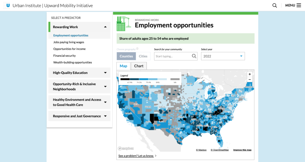
As with the prior iteration, the default view—an interactive map of the U.S.—divides the nation by Public Use Microdata Areas (PUMAs). But now users see new types of data, like indicators of financial wellness, as well as wide-ranging comparisons across metrics, so they can put each PUMA within its regional, state and national context.

When a user hovers over a specific region on the map, a pop-up box appears with a snapshot of a selected metric, such as median net worth. Expanded dropdown menus, many of which span multiple years, provide historical perspective.

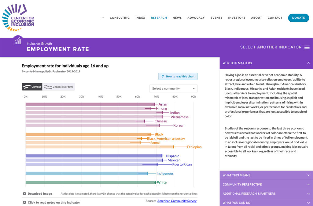
Below the map view, users can explore three categories of metrics—Daily Finances, Economic Resilience and Upward Mobility—along with demographic details, including racial composition, of the region’s population. Each category links to related resources and calls to action. Graphicacy applied a modular bar chart system to all metrics and demographic breakdowns for a simplified, consistent user experience.

Also new, the updated Dashboard expands from 100 major U.S. cities to more than 270 cities, towns and municipalities that users can search by name or zip code. They can also prepare charts or collections for PDF download thanks to a much-requested revised print view.

Montage of images from the data tool: Financial Health and Wealth Dashboard for the Urban Institute re-designed and re-built in partnership with Graphicacy.

“It was a little like getting the band back together,” said Thorson. “We’d worked with Graphicacy on our Upward Mobility Dashboard, so we were already on the same page about a lot of things. We functioned as one team to reach further and think bigger this time around, and that made a huge difference.”


Mitchell Thorson, Lead Data Visualization Engineer

Interested in working on a project like this?