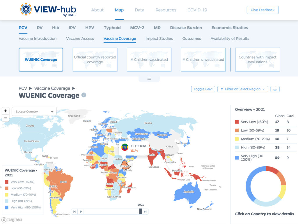
Graphicacy had an opportunity here to create a coherent data- and content-rich hub with an intuitive interface that would allow all of their audiences – scientists, researchers, administrators, funders, government officials and policymakers, journalists, or even someone from the general public interested in the topic – to quickly find and interact with the content they needed.
The accompanying brand refresh helped capture the sophistication and hopeful dynamism of their cutting-edge science-based efforts.
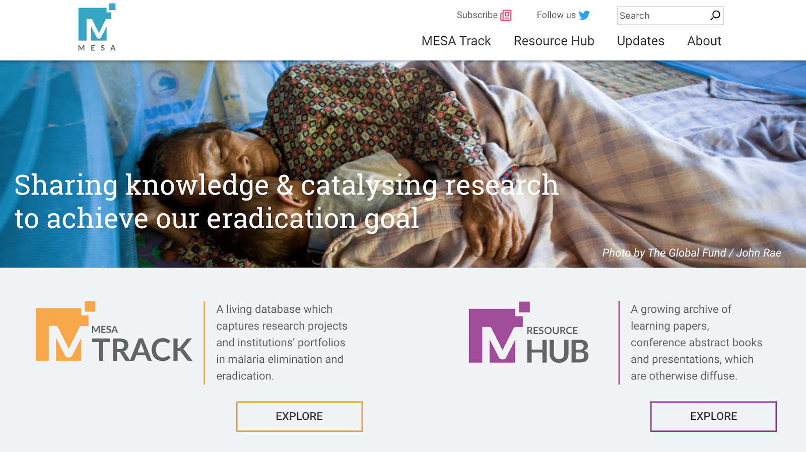
Graphicacy developed an easy-to-navigate, audience-aligned, content-driven website. Arrival at the MESA site landing page immediately provides users with the opportunity to subscribe to newsletters and updates, follow MESA on social media, search the site for specific content as well as quickly understand, and navigate to, the two main destinations – MESA Track and the Resource Hub.
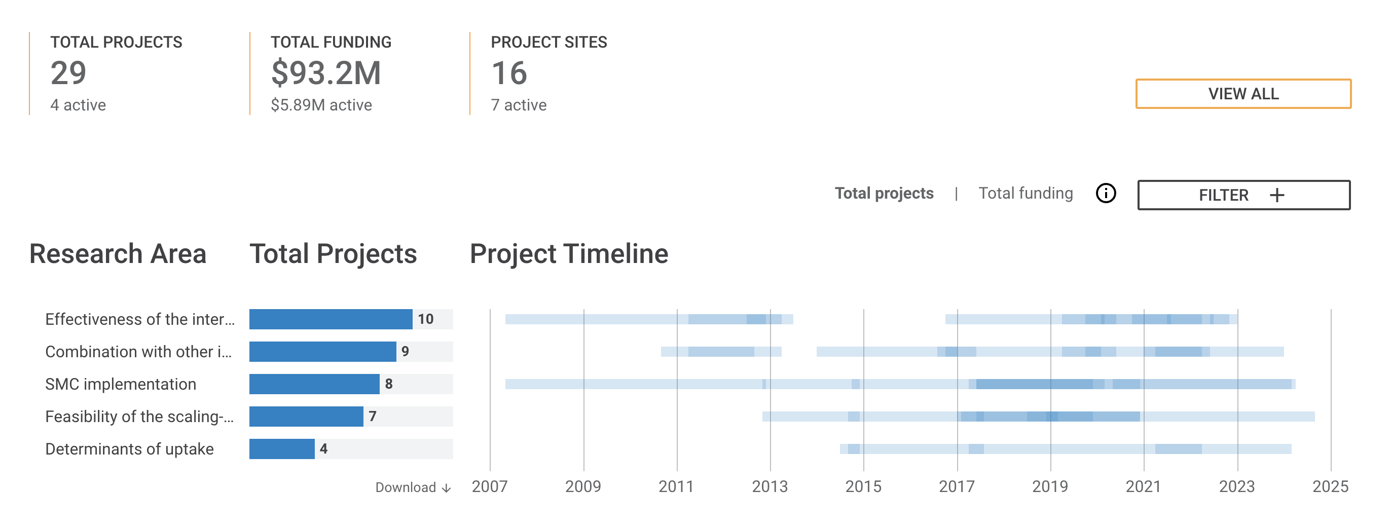
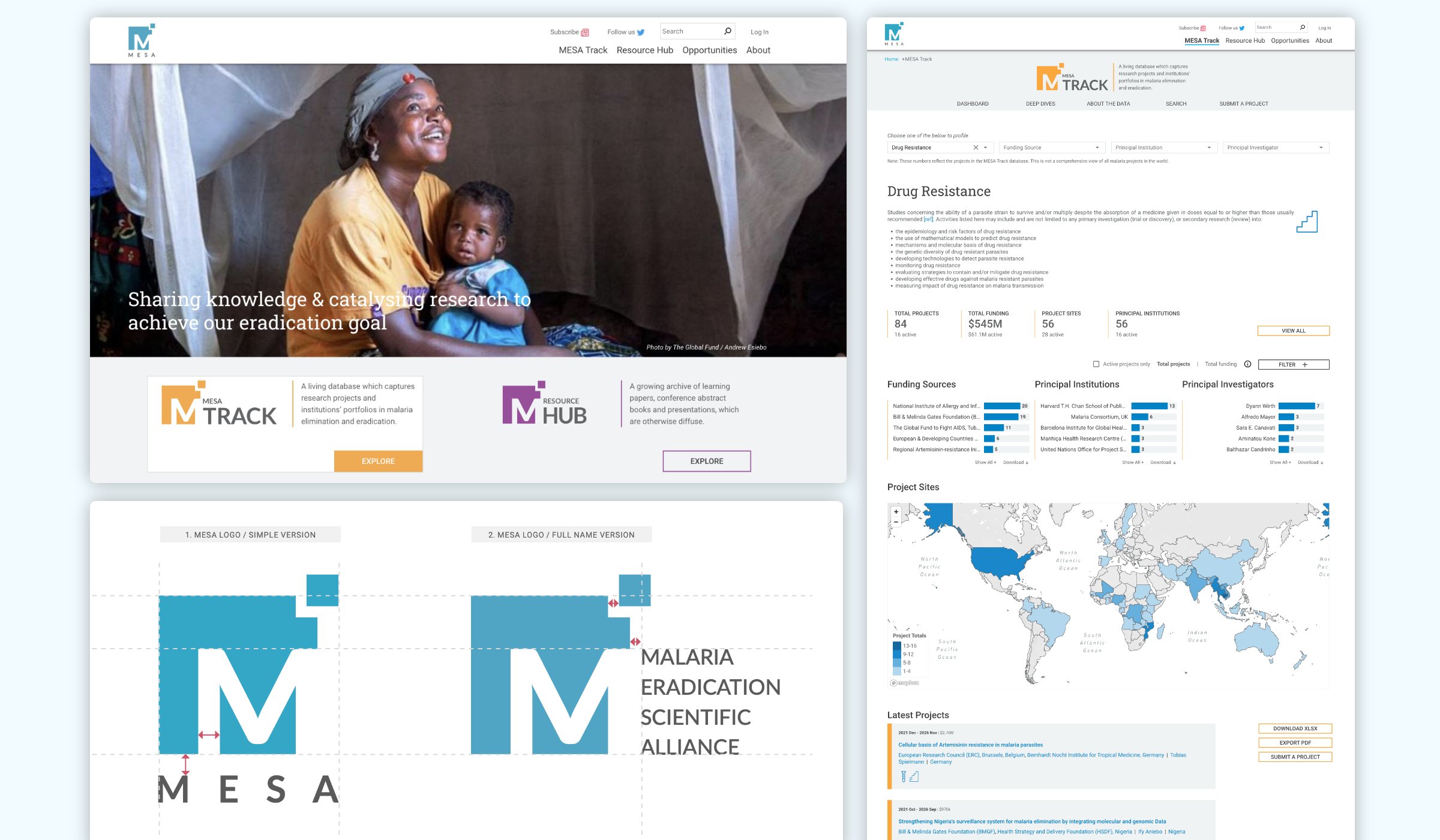
MESA Track – This page’s interface offers a wide variety of detailed options to explore, and search for, projects by number, theme, funding, location, and association with principal institutions as well as do “deep dives” into specific projects. Simple charts and an interactive global map highlight key points and provide additional access to content. It’s also possible for users to submit new projects via this portal.
MESA Resource Hub – This page features multimedia content and the latest resources as well as offering robust filtering and sorting functionality to quickly find desired assets in an ocean of options.
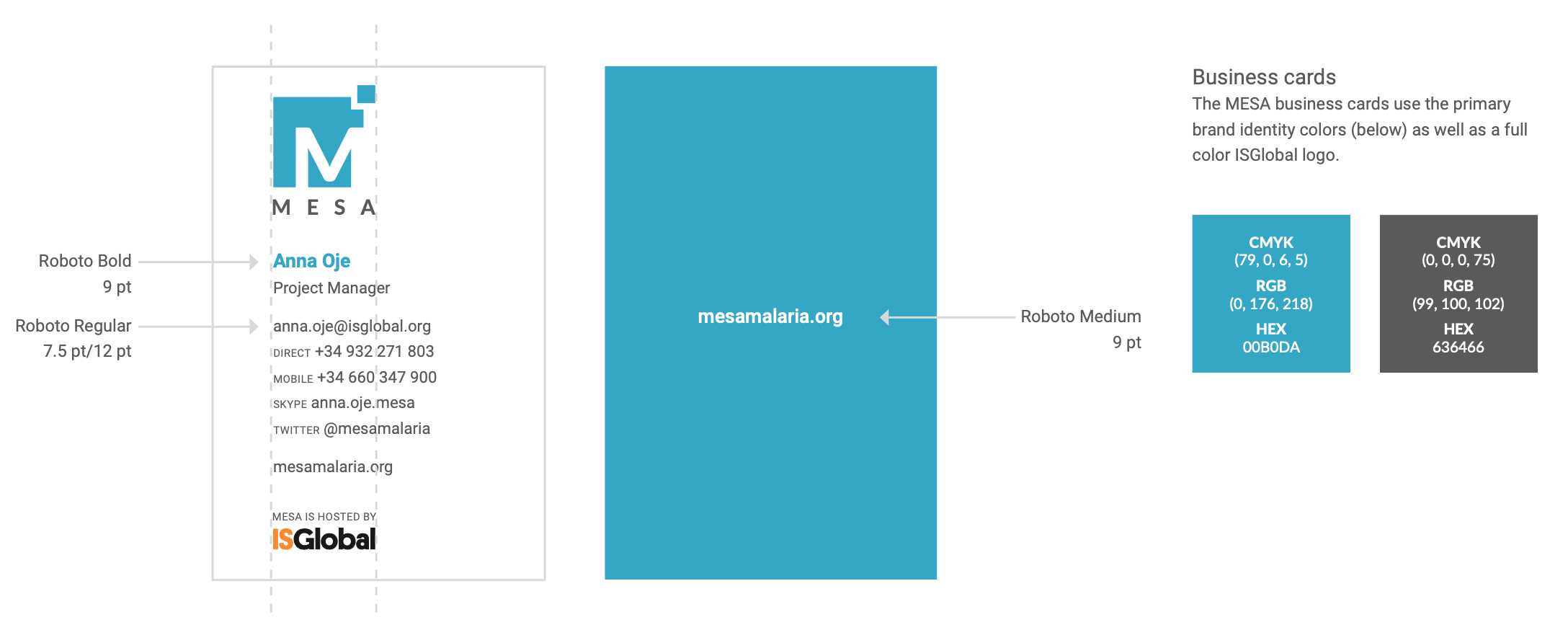
In addition to creating a new logo, the Graphicacy team also provided a detailed brand style guide to the MESA team to help them successfully implement the new brand moving forward. Photos were used strategically throughout the site to humanize this digital workspace in service of organizing and supporting the effort to improve people’s lives through the eradication of this devastating disease.
