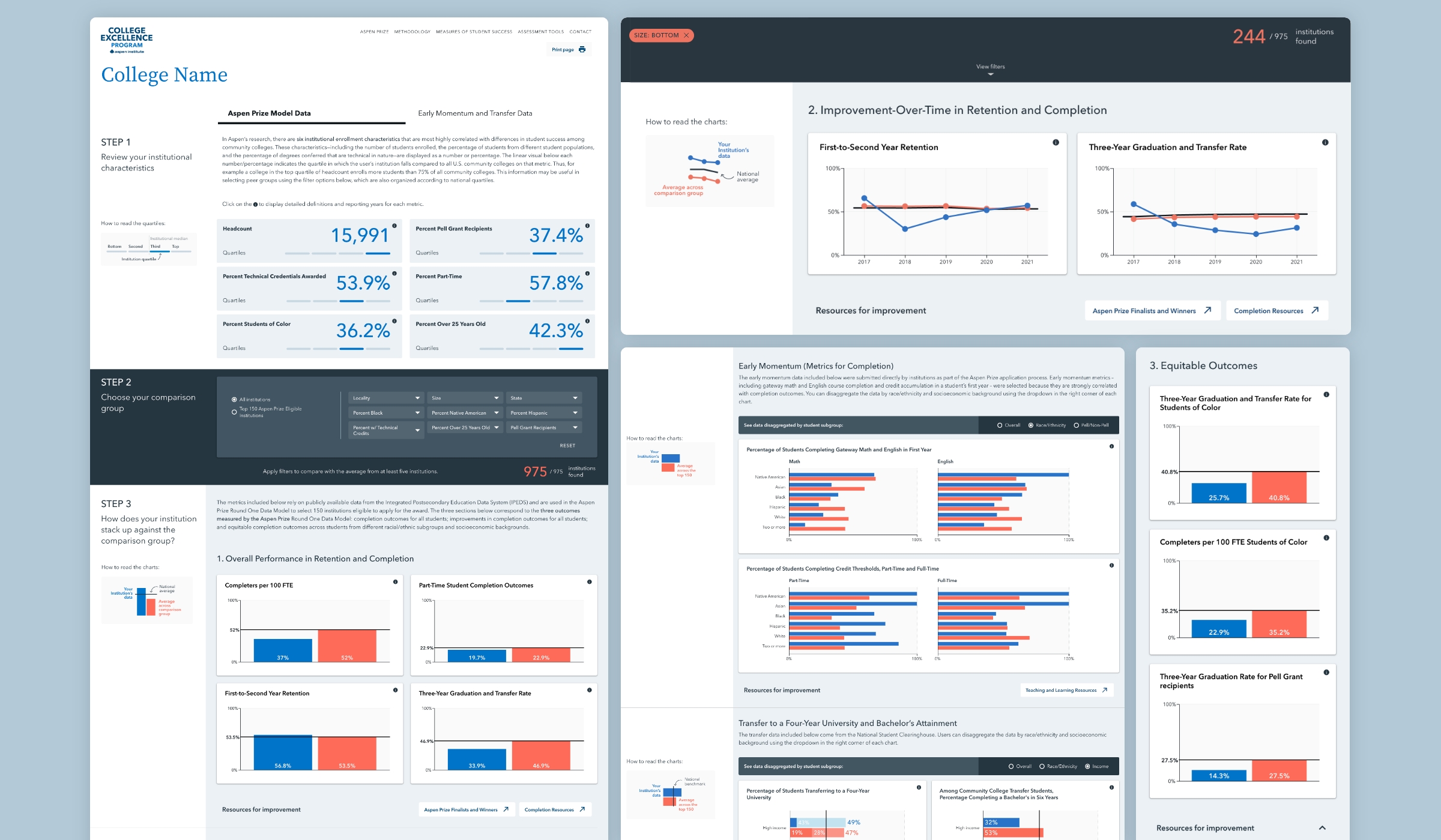
To transform such large quantities of raw figures into useful, actionable information, Graphicacy designed a dashboard of customized data visualizations on the Benchmarking Tool’s landing page.
The interface lets users explore performance information in two categories: Aspen Prize Model Data (the primary default view) and Early Momentum and Transfer Data (gathered from the top 150 institutions).
For the former, Graphicacy incorporated a three-step process:
- Institutional users can review a set of overview graphics to see how their institution compares across important characteristics like location, size, and demographics of their student body relative to all others. Clicking on information icons for each contextual variable provides reporting years for each metric along with definitions.
- Senior institutional leaders can choose filters to create a group of peer schools they want to compare themselves against, drawing either from all community colleges or from the top 150 Aspen Prize-eligible institutions. Filter categories range from locality and size to percentage of student minority populations.
- Customized charts and graphics show users how their institution stacks up against the comparison group and the national averages for the three outcomes measured by the Aspen Prize Round One Data Model.
Below each graphic, users can find links to CEP resources for improvement in each metric-based area. They can also easily generate shareable PDF reports of their results.
The Benchmarking Tool is clean and easy to navigate, reducing the administrative burdens on CEP’s staff. It also allows the team to highlight the accomplishments of community colleges and inspire other schools to improve their own results.
