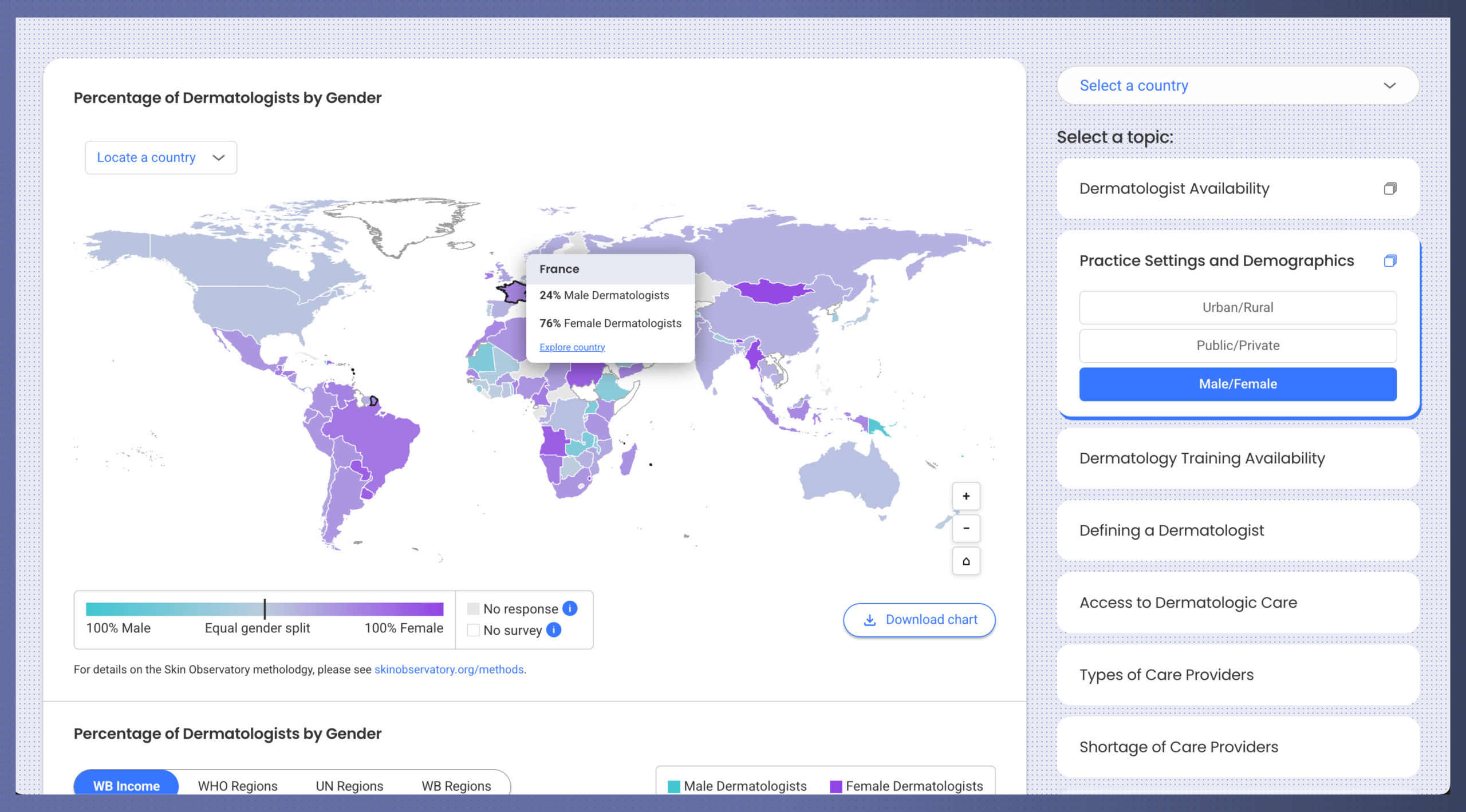
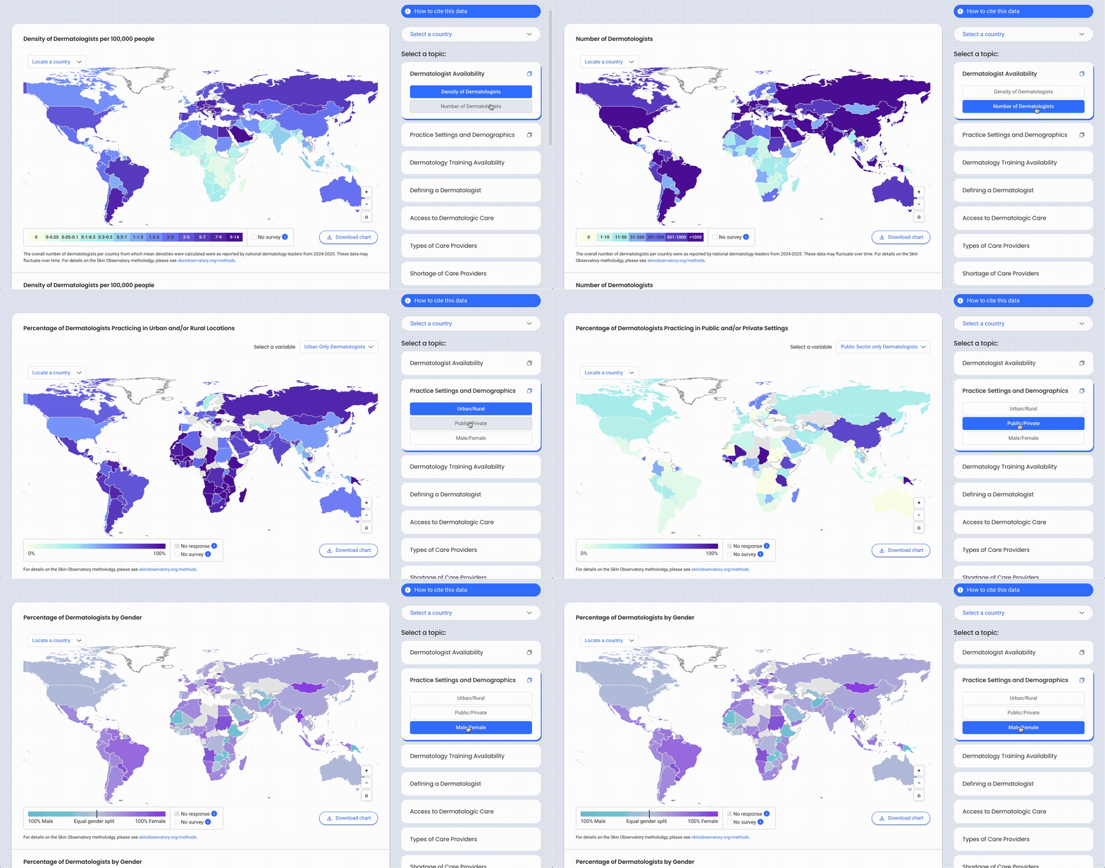
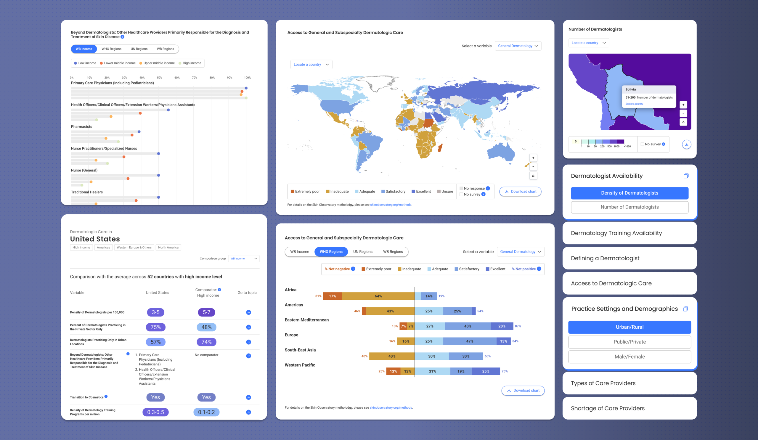
ILDS had compiled a massive spreadsheet of responses to detailed questions never asked before at such scale. Beyond simply determining the number of dermatologists in a country, for example, the survey gathered information on practitioner gender and setting type, urban or rural. The research also explored medication availability, government prioritization to skin conditions and barriers to care, among other topics.
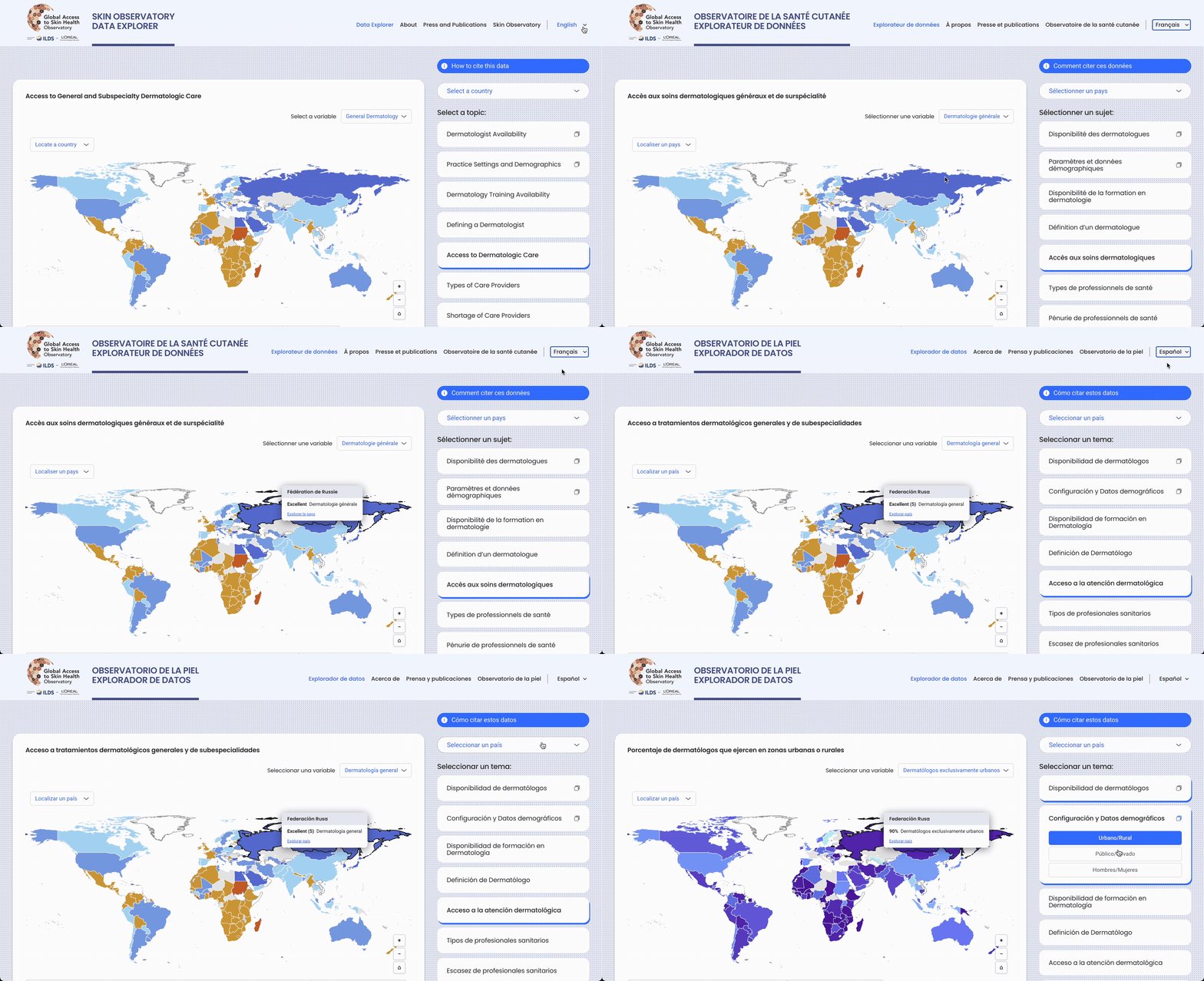
Graphicacy arranged all 15 survey topics on a vertical sidebar along the right side of the explorer. Users can navigate across the page to see results for each topic in interactive maps and downloadable charts—available in English, Spanish and French.
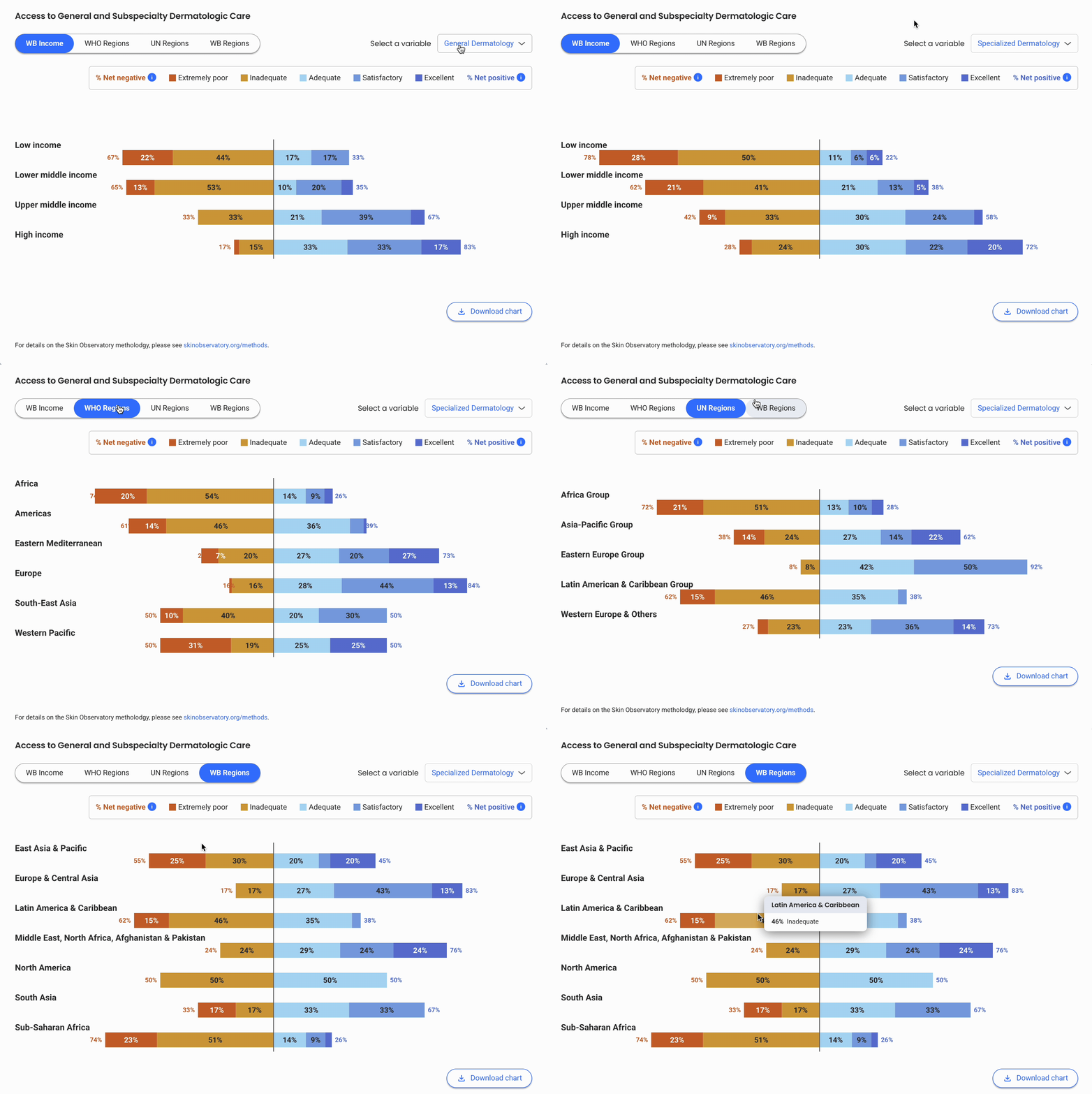
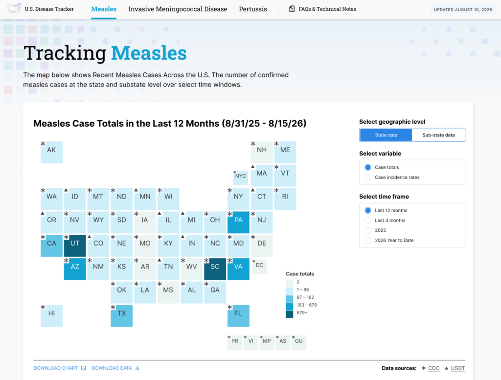
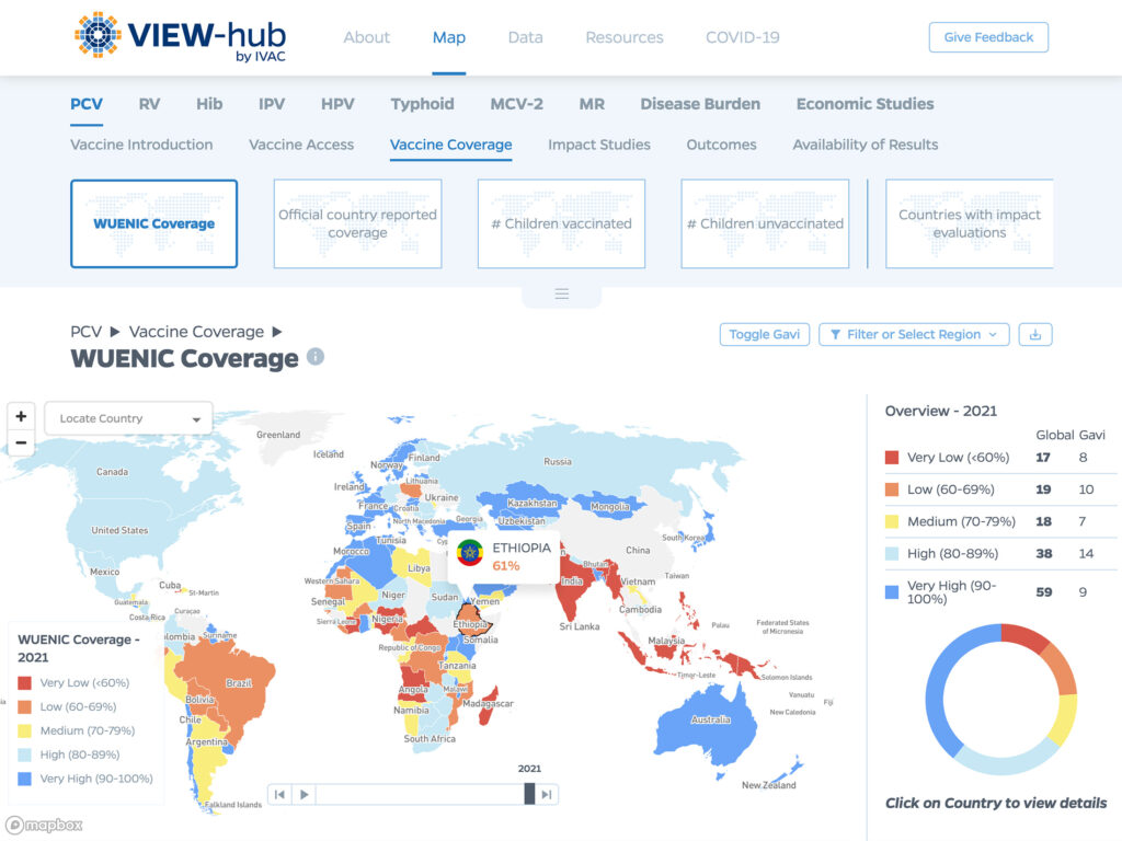
Most topics present data through the lens of a world map and a corresponding chart. Users can hover over sections of the map or click on a specific country for a detailed snapshot of the current state of dermatologic care. Each country page offers options to see comparisons broken out by World Bank-designated income levels and regions, WHO regions and UN regions. Pop-up boxes add valuable context around the survey questions.
Graphicacy built the Skin Observatory Data Explorer using a Google spreadsheet to simplify upkeep, putting the pieces in place for easy updates and expansion. They were also mindful of color choices, the nuances within these choices and possible cultural interpretations. The team opted for shades of blue to indicate positive findings and shades of red for data with potentially negative implications—a scheme most likely to be intuitive to the majority of users. They incorporated a more neutral color palette when there was no value assessment, such as male versus female and public versus private.