Childcare Deserts

Center for American Progress / 2017 / Economics, Education, Racial Equity

A map showing Childcare deserts in Pennsylvania, produced by Graphicacy for the Center for American Progress

Overview

Graphicacy partnered with the Center for American Progress (CAP) to illustrate just how many people in the United States live in a childcare desert – a full 50%! We created an interactive map that allows users to analyze access to child care with simple charts highlighting disparities among different racial groups and geographies.

Background and Challenge

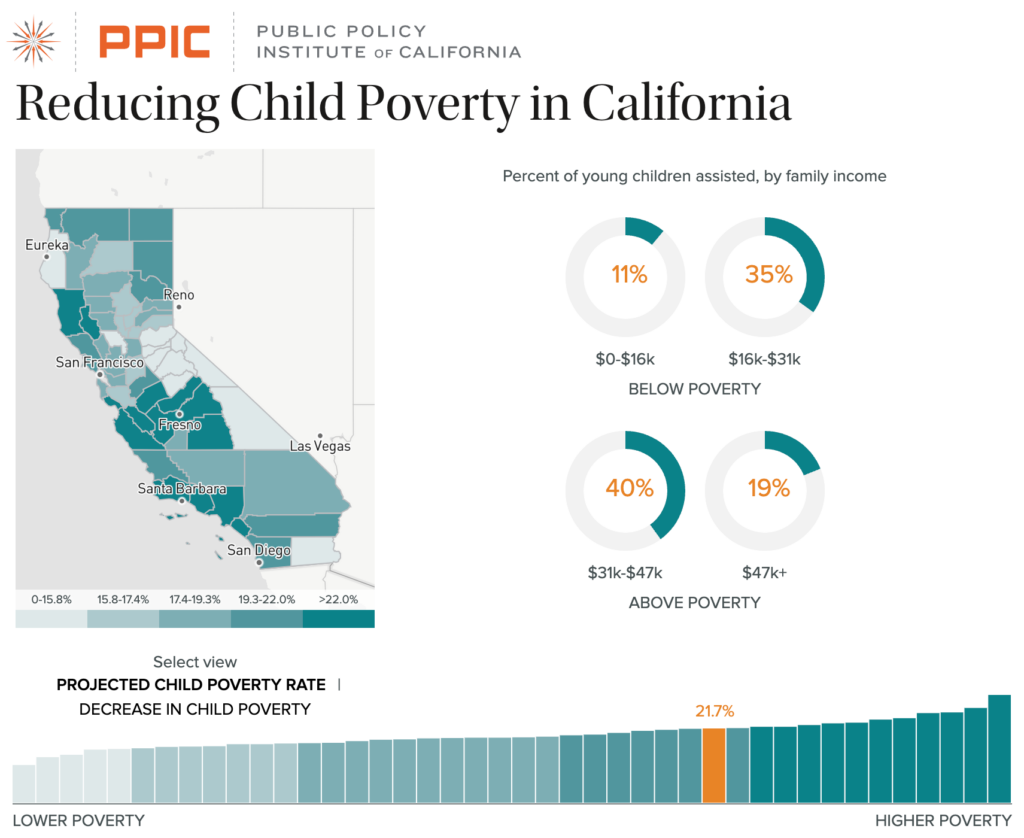
The Center for American Progress is shaping the national debate about issues that truly matter – including access to affordable early care and education for children in America. To elevate the crisis of childcare access, CAP needed a way to make the complex issue understandable, accessible, and tangible.

A team of communications staff, researchers, and subject matter experts from CAP came to Graphicacy for help in creating an interactive map-based tool that would help users understand the landscape of access to child care at a fairly granular level (both geo-coded and census tract).

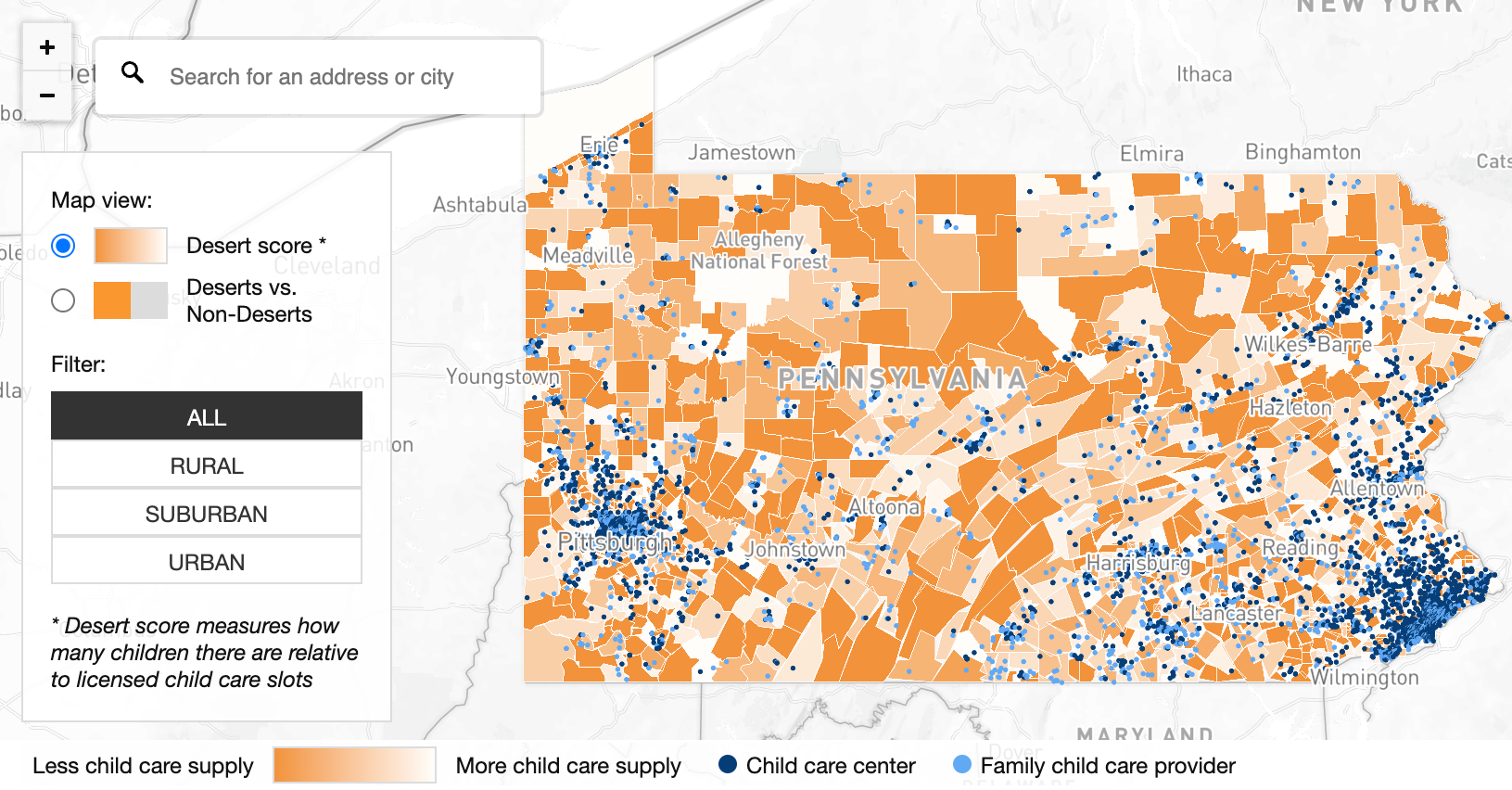
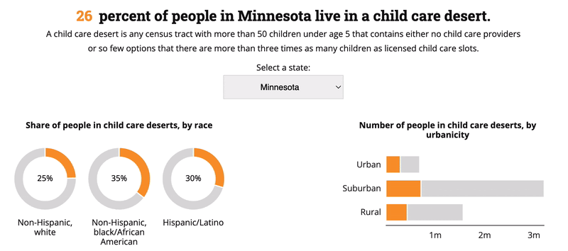
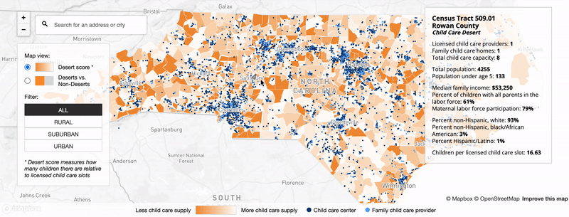
Graphicacy was tasked with designing and building an engaging digital experience with detailed data that would allow users to easily understand what a childcare desert is, zoom in and out of the map to see its impact at granular levels, change the location to a specific address or city, toggle the view between Desert or Non-Desert, and filter by All, Rural, Suburban or Urban. The new interface allowed users to smoothly access key data points either on the map or in the simple supporting graphics.

Opportunity and Solution

This was a chance for multiple key constituencies – including the general public, researchers and academics, childcare providers, journalists, and policymakers alike – to see the impact of location, race, and economic factors on access to childcare and investigate potential correlations based on these factors.

Working closely with the CAP team, Graphicacy designed an interface using the Mapbox mapping software to turn this rich data set into a responsive and intuitive experience. This interactive tool allowed users to:

  • Explore an interactive map through different geographic “windows” on the data – state and zip code, as well as rural, suburban, and urban area filter options.
  • Engage simple donut and bar charts that help in making quick comparisons based on race, urbanicity, and income
  • Quickly scan a ranking bar chart that helps users see the share of people in childcare deserts on a state level. This chart type makes this type of comparison much easier than a map would.


Interested in working on a project like this?