To execute on their vision for The Donor Gap, CAWP looked to benefit from Graphicacy’s extensive experience visually portraying social issues such as gender inequality in the U.S. and around the world.
In an extremely collaborative process, Graphicacy offered guidance around data visualization best practices along with the design and technical acumen for building engaging visual narratives. The CAWP team, meanwhile, provided subject matter expertise and shared insights about the underlying data and core user groups.
CAWP had stressed their desire to reach more users by creating a resource that looked like nothing they’d done before. They ultimately went in a conceptual visual design direction, which Graphicacy’s engineers executed for optimal performance across all devices and platforms.
In The Donor Gap, users can navigate three sections:
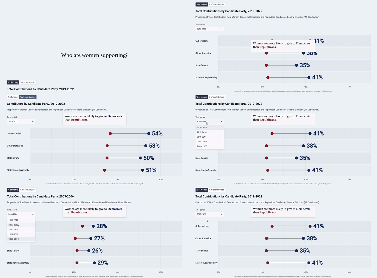
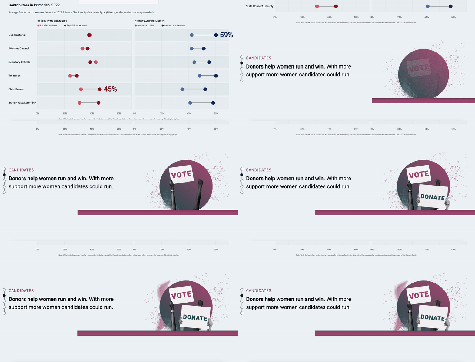
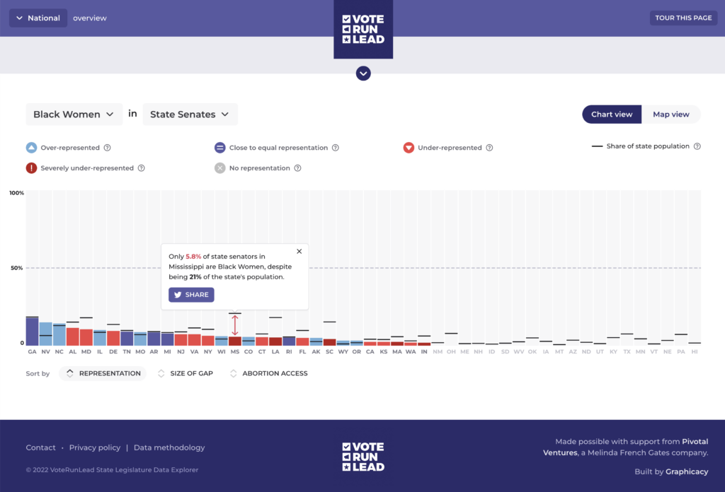
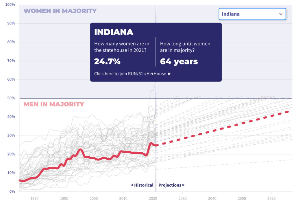
At the start of each section, users engage with illustrative and sometimes unexpected images, paired with concise statements. As they explore further, they encounter a series of data visualizations—segmented by demographics, geography, and political party offices and affiliation—to support the key message that women, when better funded, can win races and gain parity.
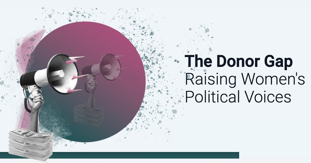
Graphicacy struck the right visual balance between simplicity and visual excitement with its tonal depiction of money and the addition of hand imagery to humanize certain moments.
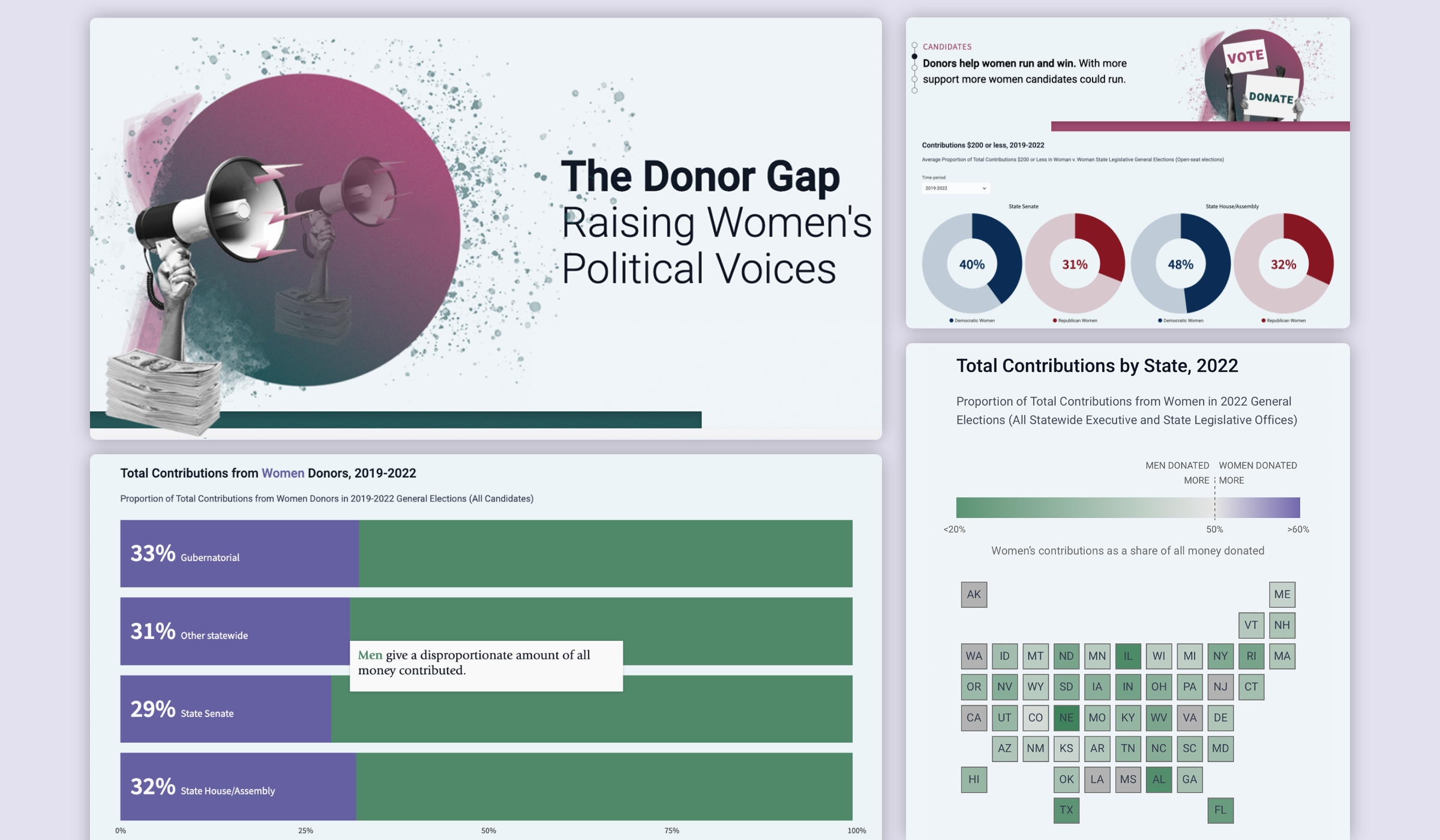
To visually portray the underrepresentation of women office holders, Graphicacy again used color in the data visualizations to great effect. From the beginning of the animated scroll, horizontal bar charts establish colors for women (purple) and men (green), while a tile map uses a palette of the same colors.
With dynamic, engaging scrollytelling, the Graphicacy team helped CAWP move from a world of static reporting to something truly revealing, where charts and graphs come alive to call out disparities.
