The Graphicacy team faced a multidimensional challenge: how to bring shape and structure to an archive of approximately 500 video clips.
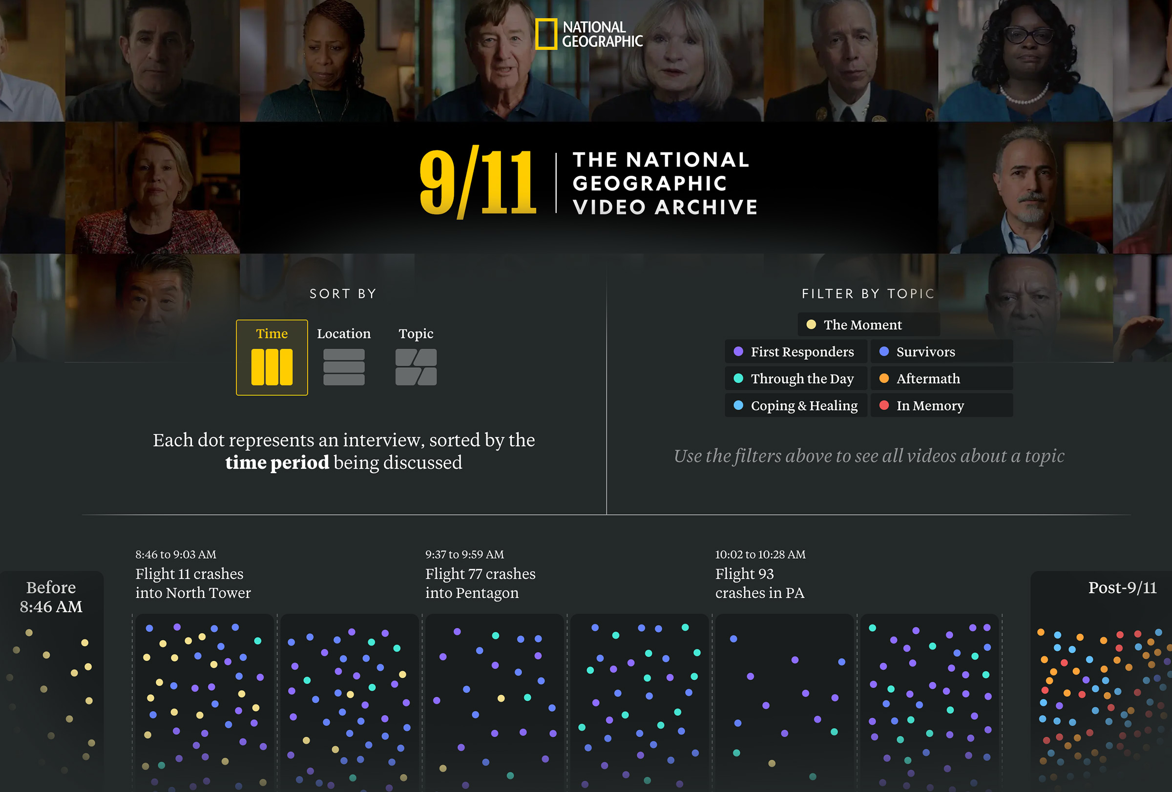
They started by giving visitors an overview allowing them to zero in on the clips they were looking for. Clips were represented by dots, brightly colored to indicate categories and topics, like “Aftermath” or “Coping & Healing.”
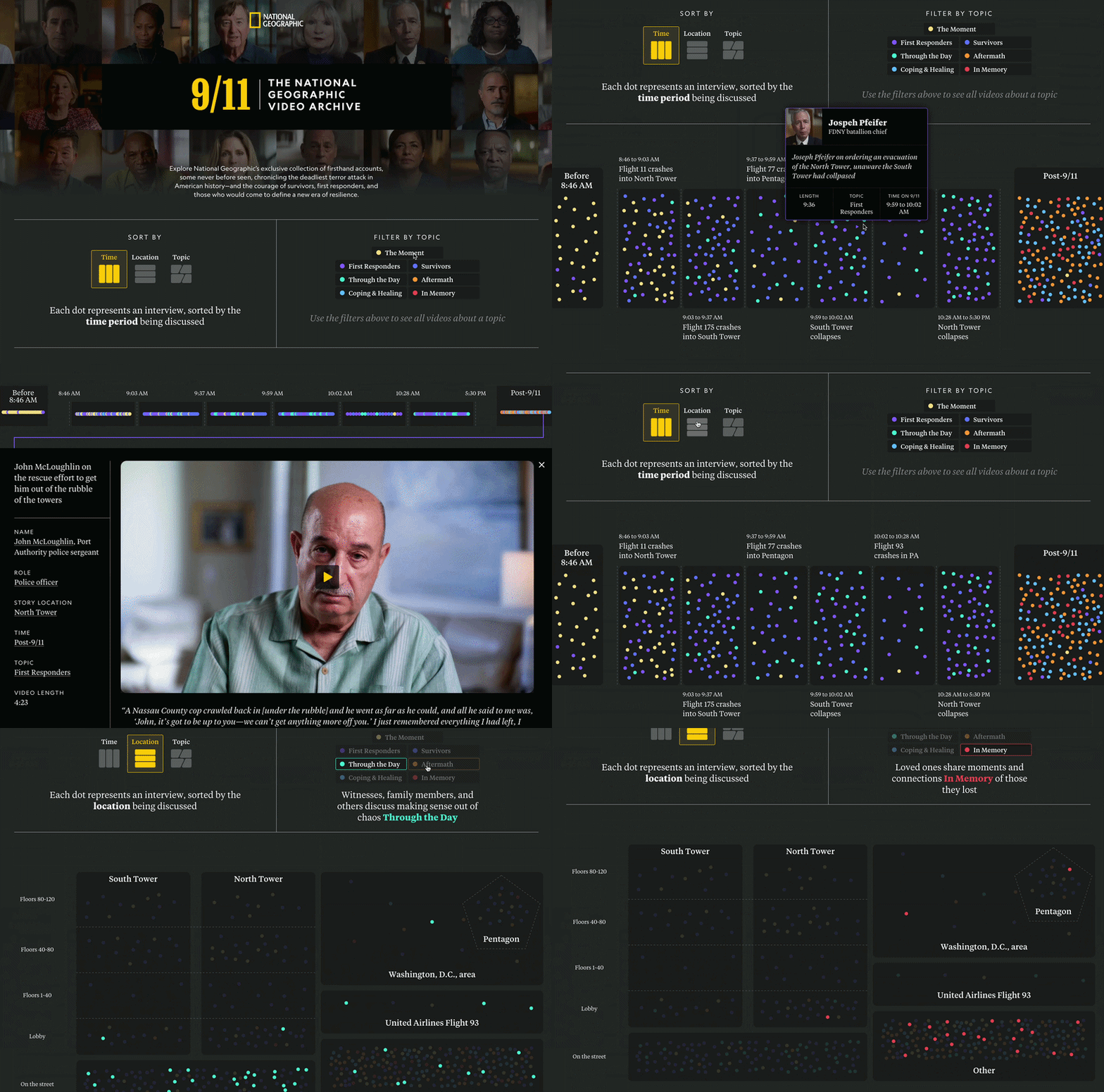
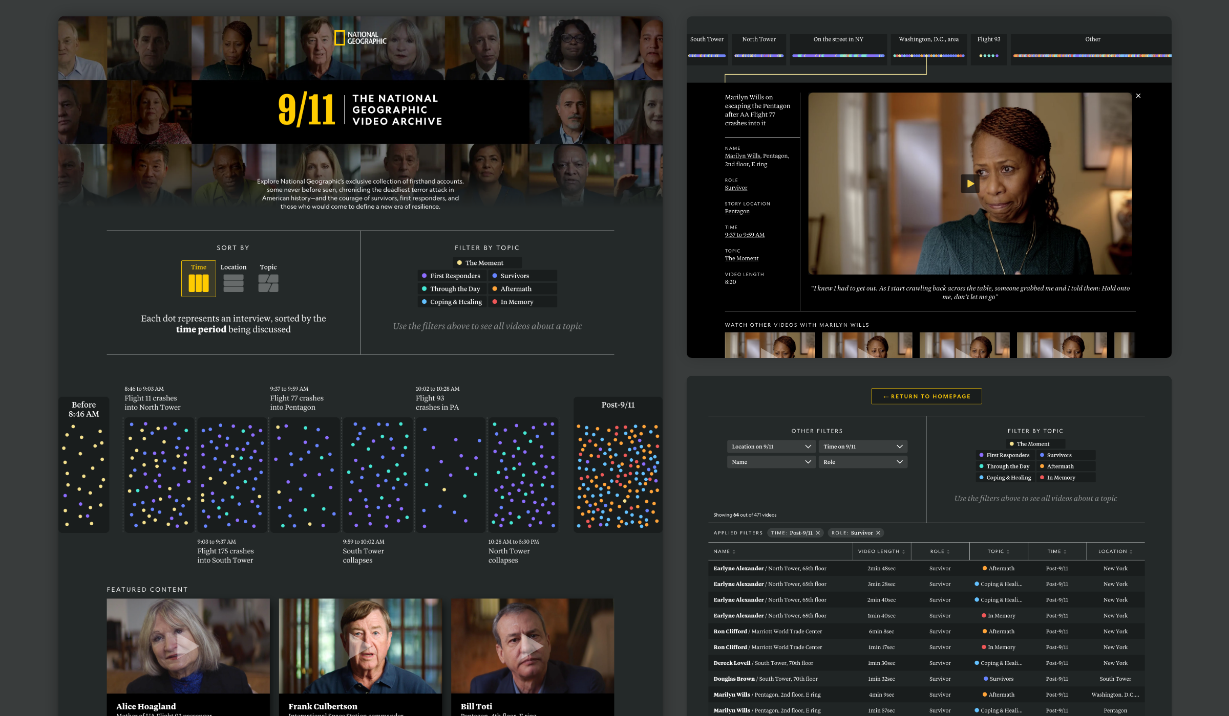
The core design philosophy was providing a bird’s-eye view of the full collection. On the archive’s homepage, visitors can toggle whether to see the videos arrayed by time, by space, or by topic. In the time-based view, memories are sorted by hours and minutes, as well as how they relate to defining moments: the North Tower crash, then the South Tower, then the Pentagon, and so on. The categories had to allow for the vagueness of memory while still capturing a useful amount of detail.
Site visitors could explore videos by space as well, through a visualization of the attacks’ geography. Survivors, relatives, and witnesses shared memories from the towers and the Pentagon, but also from the streets of New York, from across Washington, D.C., and from the hijacked planes.
In addition to the top-line sorting options, visitors to the homepage can also toggle to a complete list of videos formatted as a data table, equipped with robust search and filter options. This provided a home for secondary filtering, such as sorting videos by role, which lets the user surface unusual stories quickly—survivor, surgeon, journalist, EMT, even astronaut.
When a visitor selects a video, the rest of the archive doesn’t disappear. Instead, it relocates, compressing neatly into the space around the video player even as other clips from the same interviewee populate below.
The project serves as both a memorial and proof of the power of data visualization to enliven digital archives for public audiences.