Distressed Communities Index

Economic Innovation Group / 2020 / Economics, Racial Equity

A map of the united states as part of the data tool Graphicacy built for EiG

Overview

Graphicacy partnered with the Economic Innovation Group (EIG) to bring their Distressed Communities Index Report (DCI) to life. Together, we took the important data behind the report and made it interactive, allowing users to intuitively explore how their geographic region compares to those around them.

Background and Challenge

The Economic Innovation Group (EIG) is a bipartisan public policy organization that combines innovative research and data-driven advocacy to address America’s most pressing economic challenges. Developed in 2015, EIG’s Distressed Communities Index Report (DCI) illustrates stark disparities in economic experience at national and neighborhood levels. Organizations, advocates, and policymakers use this information to prioritize limited resources and drive much-needed change.

Previous DCI iterations presented one-dimensional snapshots of the issues at hand, including numbers that didn’t have much meaning on their own. Users had to spend time digging for information about their communities instead of accessing it easily.

One of the biggest challenges was packaging countless stories from EIG’s vast universe of data. This universe included layered data for 50 states, more than 25,000 zip codes, more than 3,000 counties, and 435 congressional districts.

EIG wanted to dramatically revamp the experience in both form and function. Their ideal Index would allow users to quickly find and compare economic data across four geographic levels: state, county, zip code, and congressional district. Greater demographic depth would enhance analyses with statistics on race/ethnicity, nativity, education level, and occupation.

A montage of visualizations built by Graphicacy for EIG

Opportunity and Solution

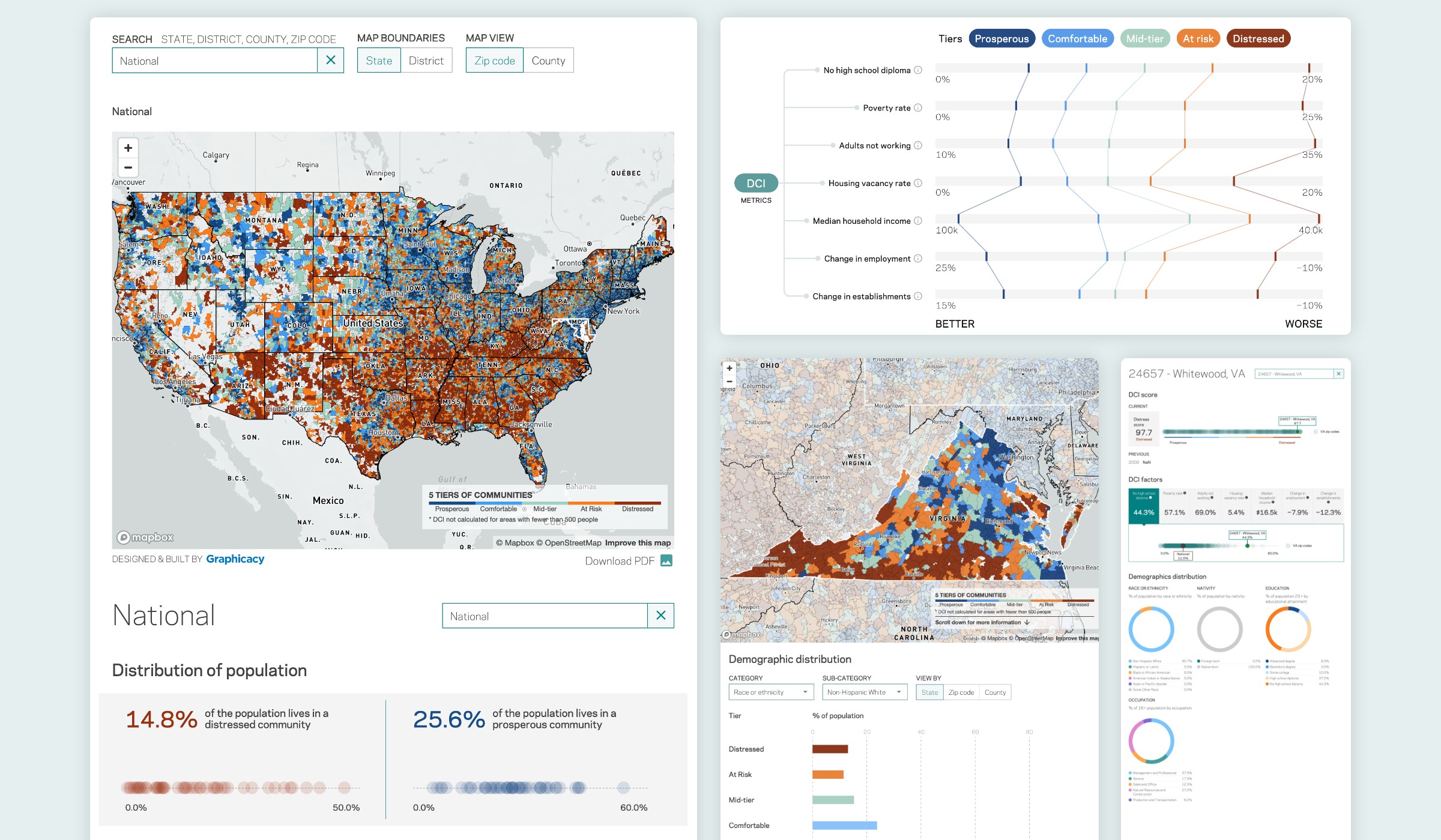
“As an advocacy group, well-presented data is our currency,” said Kenan Fikri, EIG’s director of research and policy development. “Congressional representatives don’t usually see granular data comparing their district to others in the state, region, and country. We knew the DCI could be the ideal conversation starter on where and why we need to build a more inclusive economy.”

Throughout the project, Graphicacy and EIG participated in a series of ideation sessions to explore ways to contextualize the data and tell a more human story. These sessions culminated in a data explorer tool featuring charts, slide bars, and other interactive elements to enable easy comparisons among neighborhoods. Simple distribution and bar charts added helpful, supportive context to the data displayed on the large map.

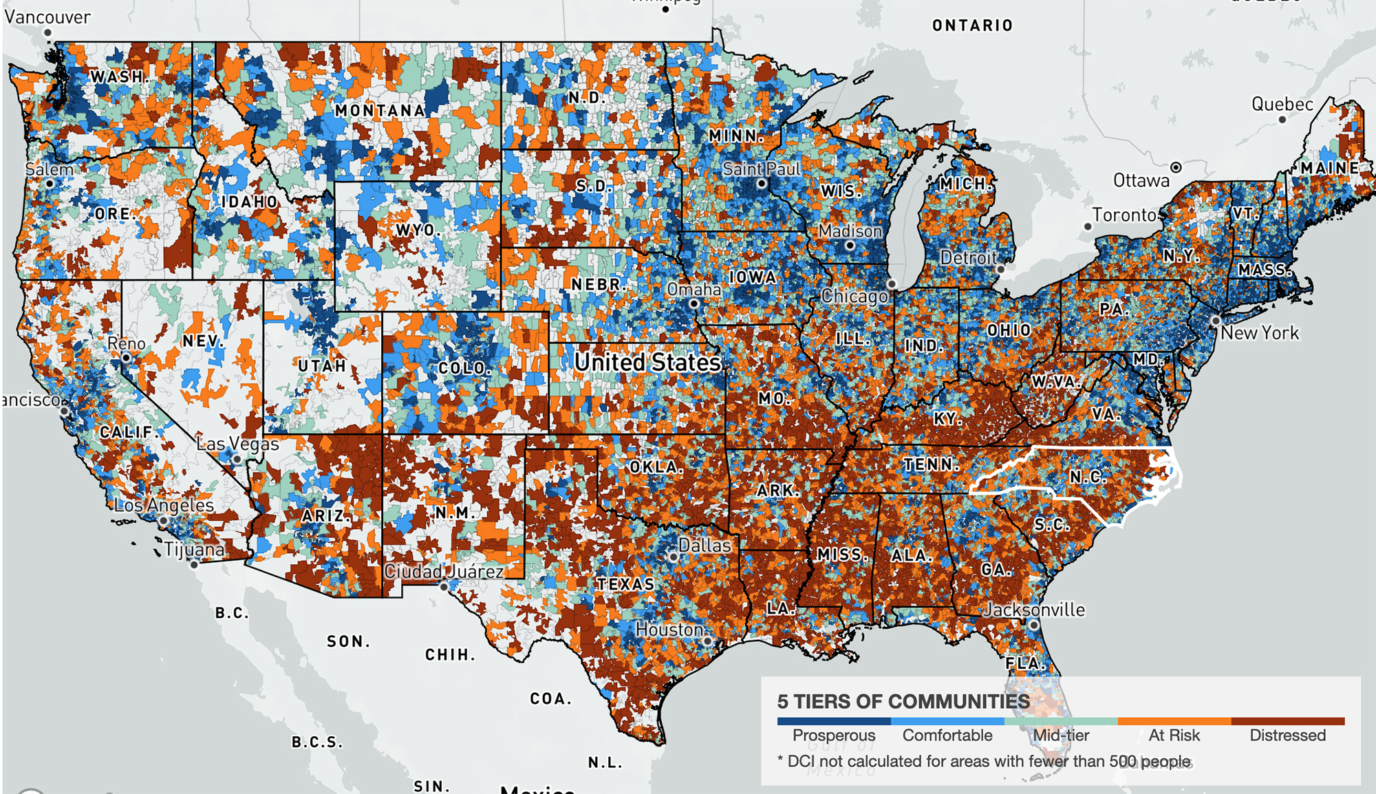
The data itself proved to be an exciting – and complex! – challenge to overcome. Graphicacy designers and engineers approached the Index as users would, tracing the typical journeys people from the report’s target audience would take while using the map. Understanding where users go, what they look for, and what they can or cannot find proved imperative to developing a more intuitive experience.

With the help of Mapbox’s robust developer tools, Graphicacy then parsed EIG’s monolithic dataset into more than 150 individual files. Engineers also gathered shapefiles to create map tiles for all four geography views that would render as requested and retain their shape at every zoom level. Breaking down files into smaller pieces ensured speedier load times since only the data required for a user’s requested view would download at any time.

To solve the riddle of showing four geographic maps at once, Graphicacy created two map toggles: one to highlight congressional district boundaries and one that switches the view from zip code-level to county-level data.


“Graphicacy’s collegial and talented team brought a truly massive dataset to life with a beautiful interactive map and data explorer tool. They lead the industry, and they helped us lead ours too.”


Kenan Fikri, Research Director, EIG

Interested in working on a project like this?